Park / Undertaker
-
 04-September 22
- Views 5,921
- Downloads 432
- Fans 1
- Comments 16
-
 78.13%(required: 65%)
 Design

RWE 85% Scoop 85% chorkiel 80% CoasterCreator9 80% Xtreme97 80% Cocoa 75% Jaguar 75% ottersalad 75% posix 75% G Force 70% 78.13% -
1 fan
 Fans of this park
-
 Full-Size Map
-
 Download Park
432
-
 Tags
Tags

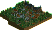
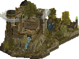
Retracing our collective footsteps
Round 4 | Match 4
Acoma Pueblo
Undertaker
robbie92 (60%)
ottersalad (40%)
Terry Inferno (100%)
Voting Rules
- You should only vote if you have viewed both parks in game.
- Take your time to reflect on each park. The poll stays open for three days, not three minutes.
- Everyone but players belonging to either team in the match may vote.
Acomo Pueblo
Toho has an awesome layout. It does fly through it a bit fast though. The station for Eototo is my favorite bit of architecture. I enjoy the level of architectural detailing achieved in LL. You've managed interesting shapes and avoided over-use of 2X2.
Undertaker
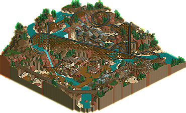
There's so much here! Each time I turned the view I found a new detail to explore. The storytelling sets this park apart. There enough staff scenes that I don't miss peeps. I love the pre-lift section of Undertaker. The ride interaction ties it all nicely together. High level parkmaking on display here.
I really resent the fact that I have been made to vote against two of my favourite builders, terry
From the overviews and particularly the screens I thought this would be an easy vote for Demigoddesses. Such a classic vibe and gorgeous esthetic. But Undertaker was so cool and entertaining. Very impressive!
Woodies? Splash boats? Western themes? Bedroom park incident or a tell-tale sign of a true 2005 match?
Acoma Pueblo: I actually stumbled upon a screen of this park from 2020 not too long ago and had to make sure they were the same park. Surprised to see this all finished up for H2HC! This is an absolutely lovely little park which fires on all cylinders and really does feel like a 2005 park. Both coaster layouts just feel right and Toho's really stands out from your average Arrow. The landscaping is stellar; the land textures look so diverse and purposeful despite LL's limited options, although I do wish there were some brighter greens to break up the earthy tones here and there. I'm also missing named staff in this park, but that's minor. Absolutely briLLiant release and some of my favorite LL this contest.
Undertaker:
Probably the toughest decision of the contest for me so far. I absolutely love both parks. I'm a sucker for wild west/pueblo themes. Both parks are also just so clean, which I really value. Some amazing LL.
wow i've never heard that before
Great job Terry - looking forward to checking this out more in depth soon.
Super proud of Otter on this map. As much as we really wanted to see some new work from Robbie this contest, this is likely the only way for it to happen. This map was finished up beautifully and I'm happy to see the commitment made to the classic nature of the contest.
Honestly after this match ends I'd like to see how Robbie left it off and what Otter finished.
I actually kind of agree on this... Acoma pueblo imo looks like the cleaner, better composed park, and with all the 2x2ism, it does a very good job at resembling classic LL. It's also impressive in a way how you could probably count all the scenery objects in this park: it's a brilliant exercise in minimalism, especially the landscaping. The layouts, as expected, were also excellent.
Undertaker was a bit harder to take in and didn't 'feel' as good at first glance, but as soon as I rotated the map, I was very impressed. The underground rooms had some detail and 'crunch' rivaling modern NCSO and were full of creative scenery use; maybe they weren't the most classic-looking, but they did remind me a lot of Roman vice for some reason. My only complaint is that undertaker's layout is questionable, but the ride interactions themselves are great.
Overall, both are really good examples of LL, but I had to vote for Terry after seeing all those small details and imaginative scenes.
(viewing both of these in OpenRCT)
Great matchup here - l always like seeing two similar-ish themes or settings with very different stylistic approaches.
Pueblo:
I remember seeing Robbie stream this a while ago and being excited about it - glad to see it got finished up. I'm getting natelox vibes with this mixed with a bit of posix and I love it. It's just really classy LL - so stylized and abstracted but at the same time clean and legible and well organized.
Undertaker:
I'm impressed with the level of detail and narrative here, and there's some really neat innovative tricks dotted around. The vertical scale of the landscaping gave a spectacular quality to the ride design too.
Tough call for me because I can't deny the storytelling and amount of content in Undertaker, but there's just some magic in the aesthetic style of Pueblo that hits different.
I'm without LL this week, but last weekend I managed to look at these maps enough to be able to confidently vote for Undertaker. Like alex says, Pueblo Acome has that rare natelox vibe magic to it. It's a great vibe to drown in. Undertaker is overwhelming in its detail, to the point I wonder whether you should've done less. Keep all details that contribute to the narrative, skip everything else. Same for the readme. Impressed by the world building, but maybe I'm missing the point! Anyway, the map is very good. Great to explore with all its nooks and crannies, and pierrot-esque detailing. It's an incredibly impressive step up from Isla del Tesoro from H2H8/8. Well done, Terry, but also otter, for extrapolating robbie's brilliant work. Rob, did you build anything new?
no, he's resting
Wrote out a long reply, and then voted before hitting post, so lost it.
Long story short, i voted for Acoma Pueblo - it felt classier, more polished, and a level above the other park in my opinion. the other park definitely had more to look at and more going on, but i didn't love anything in it the way i loved the theme and atmosphere of acoma. very strong natelox vibes, i'm a sucker for any theme where there isn't a ton of foliage and yet it still feels complete. great work
I just wanted to say thanks to the builders for this one. Another all LL match was a little unexpected. I had a great time exploring both maps.
I remember Robbie showing some of Acoma and otter did a great job finishing it up. It was very well composed and consistent throughout. Loved the layouts too. I too would like to see who did what on the overall finished version.
Terry my man! I loved Undertaker. I think it has a lot going for it in terms of fun factor, ride interaction and all of the well crafted little scenes throughout the map. It has about as much vibrancy as modern LL can have. There isn't much of a throwback vibe here but that's ok, it was right up my alley. I think the tipping point for my vote was the layered building with the coaster turn built into it as well as how well crafted the caves/mine scenes are. This also sidestepped a lot of the worst traits of this kind of style: sterility and dullness and incorporated some DKMP style stuff to elevate it a little. Fantastic work!
Winner:
sorry for missing the vote again
acomo pueblo: would have gotten my vote! I remember this from ages ago, and its lovely to see it finished. just a really beautiful and simple park. kind of a more refined version of what we were going for in week 1, landscaping wise. the corkscrew layout was great, and the archy gave me strong late-game nate vibes
undertaker: another LL theme close to my heart for sure. that layout is wicked, very cool and I love all the self interactions, and in particular the water splashes. I love all the storytelling and narrative around the map. those wheels must have taken a billion years to stack, lol. the central town was probably the strongest for me but I also really liked the mining buildings with the wooden mouse coaster
Acoma Pueblo
Really nice set of two coasters here, I like the arrow especially, the layout is fresh with plenty of flow. The overall warm atmosphere goes nicely with that cooler magenta. The architecture is great. Landscaping is quite nice, and I like the dead space generated by the sand. Nice to see this Robbie LL project finished and great contributions from Otter, really works together nicely between you two.
Undertaker
I love your work because I feel like with each release is something I haven't seen quite like it. The coaster and landscaping are beast, thje proportions of that lift and the canyon or with the massive train bridge and small rustic town for scale is really awesome. The micro in here is really incredible. For me I have a lot of fun with maps that have so much scenes and sotry telling pieces to go through, and in such I spent quite a lot of time looking at this one. It is instantly one of my favorite LL designs tbh! really awesome.