Park / Cape Solari
-
 01-September 22
- Views 4,829
- Downloads 352
- Fans 0
- Comments 14
-
 75.00%(required: 70%)
 Gold
Gold

Camcorder22 80% posix 80% bigshootergill 75% chorkiel 75% CoasterCreator9 75% G Force 75% In:Cities 75% RWE 75% Scoop 75% Terry Inferno 75% ottersalad 70% Faas 65% 75.00% -
 No fans of this park
-
 Full-Size Map
-
 Download Park
352
-
 Objects
1
-
 Tags
Tags
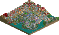
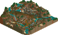
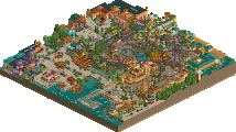
Retracing our collective footsteps
Round 4 | Match 3
Pirate Entrance Area
Cape Solari
Cocoa (80%)
Ethan (18%)
Babar Tapie (2%)
Steve (45%)
Magnus (45%)
Xtreme97 (10%)
Voting Rules
- You should only vote if you have viewed both parks in game.
- Take your time to reflect on each park. The poll stays open for three days, not three minutes.
- Everyone but players belonging to either team in the match may vote.
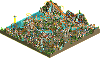
Cape Solari
Really charming park with some incredibly strong coaster layouts. Pleasantly surprised; this could be at home in a modern H2H. The biggest highlights for me are the layouts, landscaping, and general atmosphere.
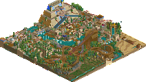
Pirate Entrance Area
Feels quite Cocoa indeed. The "Pirate Mansion" is quite well done. Landscaping is quite phenomenal as well. I think the park as a whole could've used another layer of polish.
I'm not sure that either park felt very classic to me - but it's certainly a treat seeing work from all of these names.
Structures and colors are just beautiful in Solari. I find myself mildly annoyed by all the instances where the rides just clearly clip through something. I don't see a real reason for it, did you just commit to the structures first? Other than that, lovely collection of well-designed rides, tons of stuff to look at, great atmosphere that leans on a lot of cliches without feeling lazy in any way. Maybe relies a bit too much on modern parkbuilding sensibilities.
Pirate Entrance Area, love the commitment to the HP roofs. There isn't a wow factor this one quite like there is in Cape Solari, maybe could use another ride, or if the water park section was bigger, or better integrated? It's a bit too much for a small hotel, not enough for a park. The ride names are cute, but the entry as a whole doesn't quite lean enough in to the humor if that's the angle though.
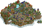
Veteris Lemuria Shores:
Helionaut might be the longest queue I've seen, and I love it for how ridiculously long it is. Coaster layout is pretty solid too with an insane amount of interaction. The overall look/vibe of everything is wonderful. But I agree with Ling, there's some odd choices. namely how Minas del Sol goes straight thru the flume track lol. Also, this park doesn't feel "classic" at all to me. The flume ride was cool though. Well themed, as expected from Steve.
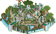
Pirates 2:
Well shit, a park making tongue-in-cheek jokes about pirate themes? Should I scrap my pirate island project? Also, glad to see this stuff completed from you Cocoa. I love the entrance area/arrows looper half of the map. Dramatic landscaping and atmospheric, and then the other half of the map doesn't seem to fit. The giant buildings don't match the scale of the other half of the map. The mansion is BIG. Seems like two different parks smooshed together. The water slides though are cool, and I love the interaction with the turrets.
Two excellent parks, so congrats all around. Like others have noted, neither felt very classic to me. It felt more like two modern H2H parks rendered with a few quirky object choices to make it feel dated. Not necessarily a bad thing, honestly really interesting to see, but they are missing on some of the macro 'classic' vibes that we've seen elsewhere. Though I'll give props, the generic themes definitely feel more classic, lol.
I really love the overall design and layout of Priates, with the tight entry leading to a picturesque bay, a coaster tucked into the rocks, it all felt really well crafted. While this has a lot of the tried and true pirate features, there were a few smart ideas that freshened it up like the interiors and the pirate ship on the launch. There were a few places where I feel like the park felt a bit chaotic or heavy texturally, and it sometimes felt like this was on purpose to make it feel more classic. But I could see this rendered with a few modern choices and becoming an high scoring gold by modern standards, which I think says a lot to the quality of its design.
Lemuria 3.0 is honestly really impressive, a lot of beautiful architecture and really well constructed buildings and interactions. I can't say much of it feels that fresh conceptually, but that doesn't take away from the quality of what's been produced here. I think the macro feels less intentional than Pirates. Solari feels like someone used the cutaway tool to show the best little patch for a full park, but a lot of the context got cut out of the sides, while Pirates felt intentionally organized for viewing as a little bit of park. That being said, I can't deny that Solari has two beautiful coasters with a lot of really amazing interactions. This at least feels a bit more classic, with more of a focus on crafting unique rides then necessarily realistic ones.
Overall, I think if one park felt more classic than the other I'd lean that way, but with neither feeling very PT2 to me, I have to go with Solari as having held my attention just that little bit longer. Congrats all around, a really high quality round so I don't think there are any loosers here.
Solari is obviously a strong park, but it doesn't really feel like much has been changed for the contest. I don't see much difference in building style (or even location/theme/palette) between this, Blue Sapphire, or even Lemuria, and while I think this park is on that level, it very much feels like it was built on autopilot. The inclusion of modern objects stands out to me: catwalk pieces instead of the classic sunken wooden/multi-dimensional coaster, 1k loop support braces, square footers. I don't know, I guess we've all leaned on modern conveniences to some extent and clearly this contest has inspired different interpretations of "classic style", but I would have liked to have seen something a bit more unique and specific to this contest. Hard to complain when the result is a steady stream of quality work, but sometimes I want to change my order
Pirates won my vote primarily because of its quirkyness. The use of niche objects in an effective way speaks to me more as a builder and gave this park a really distinct look. It takes confidence to use base game pirate ship and seafood stall objects to create a kraken attack scene, but I think in this context it works because it's clearly trying to create something within constraints. It doesn't feel very 2005 either, but to me there's a more honest attempt to adhere to classic object selection and limitations. When the parks are close enough in quality to be unsure, that's been the deciding factor in my votes
Pirates is immediately impressive upon opening the map. Love the elevation and the clay paths. Waterfall is super well done and believable. Love that the water ride goes around the coliseum. The interaction of the water ride drop and the coaster is so good. The fort with the slides is cool, but a little lifeless compared to the rest of the park. Mansion ride is sweet. The interaction with the water ride is A+. Foliage and landscaping is great - although I wish the foliage would have been a little more cohesive. Perhaps sticking to darker colored trees and shrubs would have made the rocks and grassy areas pop out even more. But that's just nitpicking. Overall a great map and a ton of fun to explore. Always stoked to see more Cocoa work.
Solari is beautiful. A classic Steve style map in every sense. Super great to see Magnus back in action on this - the fact that you guys have blended so seamlessly on this is very impressive. The color combinations are so pleasant, and the ride and path interactions throughout the entire map are top notch, I really like the sun motifs everywhere.
All in all a tough match to vote on. Both maps felt appropriately classic with some exceptions of course. Quality-wise, Solari edges out ahead of Pirates. But fun details and uniqueness leans more towards Pirates. Congrats on these two great parks
This is probably the best match of the contest for me so far with both parks being excellent. It is also the most difficult vote for me yet for this contest.
Solari:
This park feels so clean. Everything looks so well composed and all the shapes and buildings are awesome. The coaster layouts are cool and fit in well within the rest of the map. Favourite little detail is the theming for the swining ship. The log flume reminds me a bit of the log flume in El Dorado which I loved so I love this one as well.
Pirates:
After seeing Solari I thought there was no way this park was going to be able to match it but I was pleasantly surprised. I love this park. The weird objects are very cool. I love how you incorporated the base game pirate ships into the map including that double pirate ship. Looks really cool. Loved the coaster, loved the big building with the dark ride and the waterboat ride. Gives me sort of disney vibes in a way. I also really love the pathway which has cliffs on both side and the sort of "port of entry" area. Lastly I love the area with the water slides.
This was the most difficult vote for me yet but in the end I went with Pirates.
Not finding a ton of words about these parks for some reason but I'll do my best.
Cape Solari: Love this so much. Obviously a very Steve park; I knew he would do some serious damage this H2H and the return of Magnus is a real surprise as well. Of course Steve and Xtreme are also a power duo and of course they'd put out another Lemuria. All in all it just makes for a very lovely park.
What I really love about this park is the sun motif. Everything from the ride names and lights to the overall sunny atmosphere really brings it out. A lot of great H2H parks have something like that which ties it all together and gives it a unique identity. My favorite little detail might be the use of the boat hire track for the path detailing. Ride design and interaction is absolutely top notch and really feels like Steve in his element. There are two big downsides here though; there's quite a few instances of clipping/glitching as others have pointed out and the use of palette, objects, and CTRs make this park feel very modern. I wish more attention had been paid to both of these issues; doing so would have made this a true highlight of the contest. After much deliberation, though, this was the park that ultimately got my vote.
Pirate Entrance Area: Honestly the best way to describe this park is Cocoa. It just has big Cocoa vibes. I wasn't exactly sure what to think of the pirate injoke; maybe it's something too old or esoteric for my tiny brain to comprehend. It finally clicked once I got to the Old West area and stumbled upon Western Ice Cream. Bravo Cocoa. What's actually on the map is fantastic; Pirate River Adventure is especially nuts. The amount of scenery and interaction is insane. Special mention also goes out to Pirate Mansion for those interiors. Would not be surprised if that was Ethan's contribution. Really close with Solari overall, but there was just something about Solari I liked slightly more. Great park though!
Pirate Entrance Area
Pirate River Adventure in this area is awesome. Tons of great little scenes and details throughout the map. This entry feels more like a section of a larger park than any other so far. The waterpark section is really nice. The lazy river CTR is pretty funny looking. I don't know when it came out, but it feels 2005 to me. Pirate Mansion also has some fun object usage.
Cape Solari
A really pretty, clean, and open style in contrast to Pirate's density. Helionaut is a great coaster with each element purposeful and well showcased. The swoops on Minas del Sol look so nice in the entrance area. Ride design is great in this park. I really like the compass path decorations.
Winner:
Loved both parks, really great work everyone.
I thought the better park won, Steve you somehow manage to have a really identifiable style regardless of what the theme is... this really felt like a Steve park, which is awesome. I enjoyed Pirates a lot too, lots to find and some really great theming choices, but ultimately parts of it felt less polished and I preferred the other park.
Pirate Entrance:
Disaster Bench map? I really enjoyed this. Perhaps a bit messy in places but it had a fun, carefree atmosphere and I thought the ride design was a highlight.
Cape Solari:
This was very beautiful. There were some moments where I wish you had gone more classic, like maybe using old school supports or something more themed than the B&M beams. Likewise with the mine train layering - could have done without it. Still, gorgeous park and I'm envious of your abilities to make this style of building look so effortless.
Really loved this map quite a bit. One of the more memorable parks of the contest for me.
Congrats on the gold papa coco
I went back and looked at both parks again, both really really good.
Cape Solari would have a good shot at winning any H2H matchup. It's a really great park, great theme, outstanding atmosphere, awesome coaster and a beautiful log flume to support it. Pretty much the perfect area, 5 of these in a big park would be one of the best parks ever.
I enjoyed Pirate entrance area so much more on second viewing. I think a lot of the objects (maybe WW/TT?) make it kinda hard to look at, but once you get in there and actually work out what's going on it's excellent. The arrow coaster has a fantastic layout, and the areas by the water are just really great and atmospheric building.
Thanks guys, loved both parks.