Park / Reef Valley
-
 29-August 22
- Views 4,202
- Downloads 274
- Fans 0
- Comments 19
-
-
 60.00%(required: 60%)
 Silver

ottersalad 65% RWE 65% Scoop 65% Terry Inferno 65% Cocoa 60% Xtreme97 60% chorkiel 55% Faas 55% posix 55% Liampie 50% 60.00% -
 No fans of this park
-
 Full-Size Map
-
 Download Park
274
-
 Tags
Tags
Retracing our collective footsteps
Round 4 | Match 1
Coldwater Valley
Reef Valley
Lurker (100%)
Lilith (70%)
CoasterCreator9 (15%)
In:Cities (15%)
Voting Rules
- You should only vote if you have viewed both parks in game.
- Take your time to reflect on each park. The poll stays open for three days, not three minutes.
- Everyone but players belonging to either team in the match may vote.
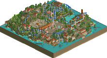
I have yet to dive deep into these parks (pun not intended), but I already know that Coldwater Valley is probably the most 2001 park we've seen in both H2HC and H2H8/8. That's quite a feat.
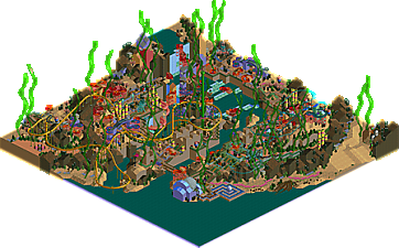
This is a tough vote, I think Reef Valley is a bit more innovative, I'm impressed with the seaweed, stacked candy scenery, and coral tubing, the visuals are effective in both macro and micro. Coldwater Valley is great too, it actually feels like Chris Sawyer should get a 10% share because I'm so convinced you just opened up a scenario and went nuts on it. Liam's right, this is approaching pre-2005 levels of classic, great job
Hey look it's Point Nemo in LL! I like the idea of all the corals with virginia reel pieces, and the layout of Moray was quite nice. I think this park is a nice attempt at an underwater park in LL, which I imagine was extremely difficult.
Where Reef Valley was pretty abstract looking and had a lot of innovative ideas, Coldwater Valley stuck the extreme basics - which I can appreciate! It definitely feels like a Lurker solo. It's so classic that it almost feels pre-2005. I won't knock it for that though. I really liked the layouts, and the single-wide paths were done mostly in such a way that in some areas they give the illusion of wide paths with planters and such.
Tough vote. Still deciding! I may null vote.
we have been blessed with a lilith park. very glad to see such colourful and unconventional ideas and execution. I expect nothing less
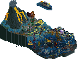
Coldwater Valley: Lurker said screw 2005, I'm building like it's 1999. And that's in no way a bad thing; this really does feel like a lost scenario that's been completed in a beautiful way. Every coaster feels thoughtfully and uniquely designed with little nods to their real life counterparts. The jagged landscaping screams classic LL and the foliage and little open vignettes complete it. Really the only thing I can call a con about this is that it's a bit on the safe side, but it's also Lurker playing to his strengths and making something really lovely out of it. Beautiful little park.
(And can we talk about that 145% share? Crazy stuff.)
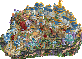
Reef Valley: Riff Valley and now Reef Valley! I've been excited to see the LLilith park this contest; I always remember her asking when the next H2H8/8 was, and now she finally got her shot and ran with it. Awesome to see CC9 and Josh picking up LL for this park as well; I feel like this contest may spur a little LL renaissance. Definitely the more ambitious of the two parks; I don't know if this theme has ever been tackled in LL before. The use of the candy theming was really smart, as was the big ol' strands of seaweed rising up. I also love the coral throughout; it reminds me of the waterpark from Discovery Bay. Moray is an awesome layout and I love how it brings its half of the park together. What I think this park lacks which Coldwater Valley has in spades is liveliness. Even though this park is also peepable, it feels oddly sterile in areas.
Tough vote; will have to give this some good thought.
Another tough, tough vote..
Coldwater Valley
Pop off Lurker. This has such great ride interaction, the landscaping is so lovely. The mini, sawyer-esque vibe is resonant and I think you also expand a beyond that with some of the cute motifs. I like all the layouts, I love your approach to small but path scenic roller coasters. Just so wholesome. The light spooky theme is pleseant.
Reef Valley
This is a really cool body of work. Very creative landscaping scheme and I love the colors. The path flow, architecture and that entrance all have such excellent vibrance. I am just a sucker for the the maxed out loopy colors. The arrow sus has some really epic moments of landscape interaction.
Reef Valley
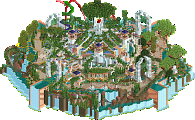
I want to like this park more than I do. The coral aesthetic is really nice, especially around the entrance and the big mound in the nearby corner. The coloured land spikes, the virginia reels, the seagras... It's a great vibe. Is the dark land supposed to be dead coral? Well, that's my interpretation of it and I like it. Moray looks good, and it's got some great swing - absent from many suspendeds that I've seen recently. The snail and the pearl are nice simple ride ideas that enhance the theme. What I didn't like much about the park is the simplicity which goes a bit too far in some places. The area around Stingray hardly looks different from the stuff I built when I was 8. Doesn't detract from the fun stuff but it's not impressing me. I can imagine you were running out of time here. Also: I'm glad you added peeps!
edit: forgot to mention: nice logo
Coldwater Valley
This is the park I wish I built when I was 8. It's lovely and easily your best work. Great organic park layout, good coasters, crunchy aesthetic... The dense foliage is doing wonders for your work. Been wanting to see that ever since you started sharing your stuff. There's not a whole lot to highlight here, but a few things do come to mind: the medieval huts around the wooden coaster, Spectre's layout, and the way you use path additions to add 'detail' to your rooftops and archy. You even used benches on a rooftop. Who does that? Lurker does. Rotwood is a great ride name.
For your next park, I'd like to see you sell some kind a narrative, something that ties everything in the park together. And not just 'loose horror theme'.
Vote goes to CV without a doubt! But both parks are very enjoyable!
Winner:
Reef Valley marks my debut share on an LL project. I’ve dabbled before, but I haven’t actually managed a release. I was responsible for a bit of foliage here and there, the sunken ship (naturally) as well as the layouts for Stingray and Moray - I am very pleased that people enjoyed the layouts, they were a blast to build.
Reef Valley was fun to look through, bright colors, nice use of trackitecture (Especially liked the seagrass) and some bold land type choices for the abstract look. Coasters were fun too, nice interaction, good flow to them and I like the choice of ride types.
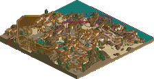
As for my park, it was originally going to be more tan colored like my 60x60 solo, but then I was listening to doom metal while building it it gave me the idea to make it more "gloomy" or spooky, with more grays instead.
Overall, great match Demigoddesses, that was a nail biter to the very end. And thanks to everyone that commented and/or voted.
Unfortunately I had a BIOS issue that wouldn't let me run my VM in time for this round but I still wanted to leave some comments. What strikes me about Coldwater Valley is its unconventionally small but consistent scale. But, it works perfectly with the peepable single-wide LL style, and as others have mentioned feels like an even earlier shade of creative LL. Only having one train for each of the main coasters is a bit of a letdown, but the mix of rides is great and I love the layouts.
Reef Valley feels like the more ambitious and creative of the two, but is missing some clarity around its flavor of fantasy. The seagrass is a great touch and very iconic, helps this park stand out for this round, but there are a lot of very random things that are seemingly supposed to be corral, almost nothing else decorative is named and then the rides are very scenario-esque in how they are just kind of placed evenly around the map, no elaborately themed queues but also no clear intent to hard sell the fantasy. The water at the bottom of the map gives it a Bikini Bottom "how is there a lake underwater" feel, so again it's not clear if I'm supposed to read this as an elaborately themed area executed in LL, or if the fantasy flair begins and ends with the seaweed and coral. It also just feels a little... empty compared to Coldwater. I feel like it sounds like I'm coming down super negative on Reef but I do really adore how bright and colorful it is - Moray is a great suspended swinger and those are hard to pull off.
coldwater valley: i ended up liking this a lot more than I expected based on the overview. just a classy, classic, castle-spooky theme executed very well. the landscaping is especially the highlight for me, but the coasters are well designed and just feels old school and fun. almost like LL corkscrewed or something.
reef valley: also super cool, I have no idea what I would have voted for. some really smooth curves and interesting design here. I love to see new design philosophies and ways of playing this game, and this doesn't disappoint. just really... interesting... is probably the right word. stoked to see it.
That was a good move! It probbly would've felt more generic if you didn't. This is a good step for you!
Two cool parks. Unfortunately I could not view them ingame with textures so I couldn't really vote.
Coldwater valley: This park is awesome. Like others already mentioned it feels like an RCT scenario. It reminds me a bit of a mix between Diamond Heights and Fort Anachronism. Excellent park, the wooden layout was probably my favourite together with the station building for it.
Reef Valley: Also a really cool park. From what I can tell it looks like this is probably a bit more reliant on LL textures so its difficult for me to really properly review this. From the screens I have seen this park looks like it would be something right up my alley. I love the colours and the use of the candy objects to represent underwater plants.
Judging from screens I have seen if I could have voted I may have gone with Reef valley. But without seeing the textures completely ingame I didn't feel like it would have been fair to vote.
Coldwater Valley: Big props to Lurker for not only finishing another entry, but winning too, and in such a short time frame. As others have said, it feels way more classic than anything from 2005, but the dark, moody atmosphere looks so good. The dark foliage, jagged rocks, and small grey castles dotting the landscape all come together nicely and gives that classy 'garden' look that a lot of early LL has... it is very scenario-like, and, imo, easily the most nostalgic entry of the contest so far.
Reef Valley: This is also a very nice park as well with a pre-codex feel... mad respect for doing what is honestly a really hard theme in RCT. Like a lot of LL, it looks very abstract, but I could immediately tell the theme on viewing it, It does seem to take the minimalist route, however, some medieval castle pieces probably could've really enhanced this. With that said, I like how layered and levelled this looks, which is rare for LL. I also love that orange roof land texture used around the suspended, it looks so good.
Coldwater Valley
Very classic look. Lurker's top skill may be full tile landscaping. The amount of elevation change and density of foliage is impressive. The coasters and architecture are nice with a familiar vanilla appeal. The wild mouse is a stand-out layout. For me, peepable LL is totally worth it. I would like to see how far you can take it.
Reef Valley
Such and ambitious theme to take on. I find it to be very successful. The macro is beautiful. The colors are perfect and a highlight of this park for me. The simplistic architecture blends in a bit too much with the surroundings and lacks enough detail to hold interest. I really enjoyed the unique take though.
Thanks for the kind words on Reef Valley. Was a fun intro back to LL for cc9 and myself. Lily had this awesome coral reef idea thing that she shared and we both jumped at helping get it finished. Total build time was very very short - we definitely rushed it a bit in the end. But We wanted to hit the R3 deadline so we could get it behind us and focus on the future rounds.
I did a lot of the landscaping with the dark rocks, peach ground color, and foliage. Also a lot of the stacked candy pieces and seahorse garden. cc9 did the sunken ship and the coaster layouts. Lily did the main map shape, tall sea grass, and basically about everything else. She also moved the Great Pearl theatre thing that I made and put it where it is now, which is way better than before haha. All in all a very fun map and great build experience.
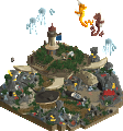
Here's one of the first screens Lily shared with us before we started on it;
Coldwater valley:
The small scale here is quite fresh - it has a miniature/diorama effect which makes the valley feel much bigger than it is, and it also gives a very textured feeling to the map. The 4x lamps on roof tops made for a cool detailing motif. My main criticism here would be that none of the coasters particularly stand out - they are all of similar importance and kind of just blend in and out of the landscape. You could perhaps say the same for the architecture actually - it might have benefited from a standout feature or centerpiece. It's a lovely park though and I'm excited to see more of your LL work.
Reef:
Love the bold colours and object choices. Sometimes the angular land forms are a little jarring and it lacks the softening that you would normally get through foliage - but I really admire how stylized it is.