Park / Riff Valley
-
 21-August 22
- Views 6,407
- Downloads 350
- Fans 0
- Comments 26
-

-
 71.50%(required: 70%)
 Gold
Gold

RWE 80% SSSammy 80% In:Cities 75% Scoop 75% Xtreme97 75% Jaguar 70% ottersalad 70% saxman1089 70% Terry Inferno 70% Cocoa 65% Liampie 65% posix 60% 71.50% -
 Description
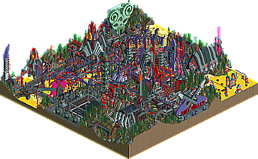
Welcome to Riff Valley, the world's most brutal scream park! Come catch New Hellement Music Festival 2005, play a duel guitar solo, drink some blood soda, and meet Satan herself!
-
 No fans of this park
-
 Full-Size Map
-
 Download Park
350
-
 Objects
1
-
 Tags
Tags


Retracing our collective footsteps
Round 3 | Match 3
Riff Valley
1kjungeltheme.park
Levis (40%)
Camcorder22 (35%)
CoasterCreator9 (25%)
Kumba (99%)
Recurious (1%)
Voting Rules
- You should only vote if you have viewed both parks in game.
- Take your time to reflect on each park. The poll stays open for three days, not three minutes.
- Everyone but players belonging to either team in the match may vote.
I just love this match-up. Two very high quality parks. Kumba stopped making classic Kumba parks around the time of H2H5. Roman Vice was his peak. After, we got Virginia Key and eventually Scientifica, but otherwise it was mostly scraps here and there and (great) maps that were stylistically different. I didn't know Kumba was still capable of doing something like this. Even though it's in jest, there's still some high quality ideas like the iguana bridge. Amazing. Riff Valley is also partially a joke and a park that stands on itself. Cam finally finishing Metal Masters, even though it's a different map altogether. Finally a good new example of creative supports, which I've been missing the past 15 years. Stupid B&M supports set killing our creativity...
Possibly the best throwback match so far, and I'm also happy to see exploration of classic styles beyond the Artist-Turtle-x-sector style.
Leaves one question. Why the yellow water? Is that piss, beer, or something else?
s u l f u r
We didn't dare to make it red incase people would think it was blood and link it to war or something .
.
Now this is Head-2-Head Classic.
Leo and Aki's Excellent Adventure: It's like they never left. Levis and Camcorder22 have traveled right from 2005 to the present day and created undoubtedly the most classic park of the contest. I mean come on, no one builds like this anymore! The real surprise here is CC9; he really acclimated to the chaotic base block barrage. All the guitar sculptures and the big green skull by the Tenacious D ride are just bonkers and make for an amazing overview. On the topic of the Tenacious D ride, the Virginia Reel timing hack is super clever. As somewhat of a rock n' roll enjoyer myself, I loved all the metal references sprinkled throughout (am I the only one who got Surgical Steel?) as well as the little self-references like Duel Guitar Solo. Unfortunately, this park is kind of a mess and really hard to read. I also do wish the water were red despite the controversy that might come out of it. What's with the piss water? Sneak Pantera reference? Either way, this is a highlight just for how spot-on it is and to see Levis leading the charge after a decade hiatus is crazy. Love it!
1kjungeltheme.park: Screw it, time to gas up my team. Before Ethan and AVC blew my mind, this was far and away my favorite park of the contest and it's still very high up there. Watching this go from huge land blocks and an invert to what we're voting on was inspiring to watch and really made me respect how prestigious Kumba's time at NE has been. The dude essentially made a park to laugh at himself from 17 years ago and it's still unbelievably gorgeous and detailed just because it's Kumba in his element. The water coaster and the Macaw area with the mural are inspiring. I had a ton of respect for Kumba before but now he's way up in "I want to build like this guy" tier. Awesome park and not the last banger you'll see from us.
Riff Valley brings back memories of Mala, a builder whose work I never really resonated with, but seeing it now done like this, it makes me want to go back to explore more of Mala’s old work. Huge maximalism energy, crowded towers and overlapping levels, this park is so fun and creative, and it’s admirable that the team committed to a full out Mala style park. While the style itself is not my favorite, there’s so much to appreciate in the content and ideas here, really fun entry. I particularly love the mosh pit and the huge sculptures throughout, and the tons heavy metal references are super clever, so fun to see it translated into this mega mass of structures and rides. That green mask sculpture is amazing! The main coasters were really fun to follow despite being a little hard to see in some angles, but that’s not a huge issue for me; I like digging through the density to discover hidden things. Great great park here.
1kjungeltheme.park is another masterclass, now in Kumba style chock full of his -isms that make him so great. Jungle flowers, crazy themes with narrative rides and entertainers, creative sculpture work, frenzied atmosphere. I love that you included a battle arena (your favorite theme apparently) and you also got your corner-reverser coaster in there that was scrapped from Papilio! Love the invert layout but I love the layout of the launched aquatrax even more. The iguanas were a highlight, and the whole park oozed fun with the tongue-in-cheek humor. Really enjoyed exploring this one.
I really have no idea how I’ll be voting yet… this is super tough. Both teams did an amazing job, I’ve gotta sit on this a little more.
Riff Valley: Been wanting to see a park with this theme ever since I played Brütal Legend. The riff medley is a perfect background to set the right mood. The density of the park make it a tough one to read, but I wouldn't want any of the ideas to be cut. The dueler layout is great and a nice nod to Rift Valley. If Hard Rock Park had been like this, maybe it would still be open.
1kjungeltheme.park: What an advantage to be able to reference yourself in a classic style. The overhangs on Sherpa Adventures are a cool idea. The Macaw mosaic is another nice throwback and fits nicely. Speaking of the Macaw, the intertwined cork ending shapes so nicely in the game. Each bit of map offers some extra detail or idea to see. The amount of features crammed into the map would not be out of place in a modern park.
Echoing others, this is a really tough matchup to call. These parks are doing such dramatically different things, and I think they succeed in different ways that makes it hard for me to pick. 1kjungle is a classic Kumba park in a contest that was begging for a classic Kumba park. Ironically, I'm not sure if that really makes it PT2 (when Kumba scrapped together a retrospective of what seemed like a storied RCT career at that point, lol), but it doesn't feel out of place with the general vibe of the contest. It succeeds so well in reveling in what Kumba does best; unique and often fantastical ideas, heavy amounts of content and fun things to explore, huge changes in elevation that manage to read well, and themes that are somehow always different and always the same, lol. In this way, the park feels super nostalgic and really engaging to explore, which was always central to classic Kumba parks. If this was any other contest, I think I'd knock the park for being another chapter in a well-tread style for Kumba, but that is basically the point here. Is it fair to criticize it for not feeling fresh? I don't think so, but it did cross my mind...
Riff Valley was really fun to see, as I remember Cam's OG unfinished Metal Masters park. To see y'all return to that and see it more fully realized is a lot of fun. The maximalist style, with tons and tons to look at, is very reminiscent of early NE parks. I think it may have overshot it a bit compared to what really defined PT2, this feels a bit more PT1 to me, but in a contest aimed at more classic RCT styles, this feels right at home. The bold style again is super nostalgic, and I'm really impressed with the overall impact of the aesthetic. The sculptures were also a beauty to behold. The hacks, thought a bit hidden, were cool to see (particularly from a hack legend like Levis who I never thought we'd see build again...)
Ultimately, I found myself leaning ever so slightly toward 1kjungle and voted that way. I think what it came down to was the readability of 1kjungle compared to Riff Valley. Both were packed with details, but 1kjungle made them easier to engage with. Riff Valley was just really hard to follow, between the colors and the overlapping nests of supports and buildings and coasters. I realize that's part of the aesthetic Riff Valley was aiming at, but when comparing it to 1kjungle specifically it was the one thing that made the difference for me.
Congrats to all the builders on another great round! Another match with a lot of fun history to explore!
riff valley: love the name and love the vibe. so much fun! I remember looking longingly on the unfinished metal masters and I like that this reclaims some of that nostalgia, with a hint of mala. its probably a bit unreadable and dense but I love it, the dueling coasters are just so big and fun.
1kjungle: 'reed me' killed me, although I can't say I really understood the dialogue. Should have featured more of corkscrewed and xcoaster being brutally murdered in kumba's mazes... but the park was great. I first thought that macaw was just a gaudy joke but it actually is a really lovely layout that pops nicely in that setting. actually, I really liked all the ride design---the aquatrax, chairlift thingy, and sherpa adventure were all great. And of course, the park was bursting with vintage kumba and walks the fine line between satire and homage. Got my vote for the atmosphere and composition, funnily enough. I spent a long time just scrolling through it watching everything
This matchup is probably my favourite so far, both very cool parks that have a lot of merits making it really hard to decide between them!
Riff Valley:
I had an absolute blast viewing this park, so much to explore and it's fun to just let your eye wander between various things that catch the attention. I think you've perfectly captured a style from that era with the use of the 1/4 block shaped sculptures and the extravagant WME-style duelling coasters that we've lost to time somewhat. Great theme too that the park gets a lot of use out of in the various names and ideas, and awesome custom music medley. Not sure on the yellow water, though it contrasts really nicely with the dark colours of the rest of the map.
1kjungeltheme:
This was equally fun, though in a different way. Feels like the sort of park that can only be made when you have a body of work as big as yours and have such an instantly recognisable style. Love all the self referential humour like the iguana bridge and the obsession with frozen/moving staff and mini golf lol. Main coaster is very cool, colour scheme came across a bit Superman at first before I clocked the Macaw theming, but it stands out nicely on the map and the station is a great statement piece. Definitely feels like the kind of park I could still be finding new stuff in after an hour or something.
Between the two it was such a difficult decision, both excel at their respective goals very strongly, but I voted for Riff Valley in the end.
Riff Valley:
Love the metal theme, and these classic "Everything is base blocks" parks are a style I really like in general. It's a ton of fun to look though for all the references and sculptures. Dueling main coaster was pretty fun to watch as well.
1kjungeltheme.park
Also a fun one to explore, so many references and small scenes. I like the general atmosphere and landscaping/foliage in general as well, also some nice sculptures.
Overall two fun parks that fit the classic theme of this contest quite well, was a tough one to vote on.
Riff Valley was still a super strong and creative park that deserves plenty of praise, I never thought we would see another Mala-esque park again, and this did it justice and then some.
Great work to both teams, y’all didn’t make this easy.
I'm going to have to think about it for a while. I really liked Riff Valley's architecture and rides but it's a little overcrowded. 1kjungeltheme.park was underwhelming in the macro but has lots of little interesting details to slowly draw you in. I'm usually a more impulsive voter but in this case I'll have to think on it a bit.
Alright, I've looked at the parks again and I made my decision. A pretty tough choice and I won't tell anybody who I voted for until after the poll closes.
Some further thoughts, bullet list style:
1K
- I want a Kumba Quoute t-shirt!
- Multi-level maze!
- Flight of the Macaw is pretty excellent
- Nile Flat looks so good, I really like the little pueblo style building next to the bridge
- Iguana bridge, no harm in highlighting that again. Brilliant
- That devil looking head near the pirates
- Is the firing cannon object new? Probably not, but I've never seen it before.
- Sun Wheel looks like an Emergo guest spot in a Kumba park. Gooood
- Such a Kumba thing that is exemplary for other people not adhering to realism: the parrot show in the queue for Macaw. I don't know how you do it. You have a gap, and then you just come up with something. No gaps allowed.
A critical note: I don't think it was necessary to satirise yourself while building in this style. Also could've applied this to a proper theme, without the extra spelling errors and forced cliches. But it's wonderfully creative and nostalgic all the same, so it's hardly a real complaint. Park kept me busy like your parks did in the old days. Great job
Riff Valley
- Great music choice, contributes to the park a lot. Love that you included the Stranger Things soundtrack too
- I just like the unrestricted fun you had with the architecture
- Yellow water, whatever it is, looks good.
- Duel Guitar Solo supports are 10/10. I also like the way they contrast against the yellow water.
- Pick of Destiny drop is a nice touch
- Rapids in boat hire mode, also clever
I've run out of superlatives. I'll just end with a screen that I love.
Impossible choice, but now that I ended writing down my thoughts, it's time to choose. Impossible. I think I must go with 1K here, but it hurts. I'm so sorry!
You know we can all just see on who you voted right
Winner:
Dot map as requested! I think this angle understates Levis's contributions a bit.
The name "Riff Valley" popped into my head at the beginning of the season and I decided to build a metal park in the style of Mala. I originally intended to near-solo it which would've been a mistake given my building speed and the density of this thing. Luckily, after I did the macro and dueller layouts, Levis and CC9 volunteered to jump on.
CC9 had separately built this impulse (which became Distortion) that looked like the perfect fit for this park and we used a lot of the motifs throughout the park.
I had no idea how active Levis would be at the beginning of the season, or how quickly he'd get up to speed with OpenRCT2, and he clearly blew away all our expectations! I should've known a hackmaster like him would pick up on the possibilities of Open quickly and even still, come up with some new hacks (and plugins!). Due to personal issues and obligations, I didn't build much other than the macro for a few weeks, but asked to keep Duel Guitar Solo unthemed as I had a plan for that. Meanwhile, CC9 added the Distortion and Stage Dive layouts and Levis filled in almost every other corner of the map with the stage, archy, rides, and hacks.
In the last couple weeks, I finally got the chance to do the station, theming, and supports on Duel Guitar Solo. I was obviously looking to the duelers in Rift Valley for inspiration, particularly to try to capture the controlled chaos of the support structure. I think the smaller map impacted the readability quite a bit (Mala just frames the stand-out elements of his duelers so well), but I still enjoy looking at the mess of spaghetti I created. Mala is challenging to imitate because if you just try to copy his forms, you'll likely just end up with a mess. Not saying I didn't end up with a mess, but I tried to pick up on his building patterns a bit more. While his macro was clearly planned, the interaction between supports/ride tracks/paths seems a bit more left to chance, and he handles them in an improvisatory way. Ride track in the way of where the support column would go? Just put another arch over it, it will look sick! Having this freedom honestly made this build go pretty smoothly and really fun.
To address a few other questions/comments, we did indeed try blood water, but the contrast against the sea of red supports and track was not good. The yellow popped the best against the supports and made it the easiest to read. And who doesn't love a little mystery? Is it sulfur, beer, or piss? Just kidding its definitely piss.
As we approached the end of the build, it was really getting hard to have the eye latch onto much of anything in the center of the map. That's why we ended up adding the accent colors of green, pink, and yellow on the Big Four Tower, the entrances to Stage Dive and Duel Guitar Solo, and Distortion, to draw the eye to these a bit more. Its still obviously chaotic, but hopefully a bit more chaotic [complimentary].
Not only was it an unexpected treat to have an H2H5 reunion with Levis, but we were hyped for an R1 rematch with Kumba. Given our luck in H2H5, we should've known it would end this way lol. When I joined NE in 2007, DRC was the first new spotlight I saw released as a member, so it occupies a special "classic" place in my mind, even if the peak Kumba style is a bit post-PT2. 1kjungel is a testament to how distinctively Kumba has built his brand as a builder and member, maybe morseso than anyone else here. I could ask why a Nile, Amazon, and Himalaya's section of a park exist so closely together in a "jungel" park, but the answer is Kumba. Why not shove everything awesome and cool in the world into a 60x60 map? That building philosophy certainly had an influence on my work. I'm always impressed by the sheer amount of details, scenes, and easter eggs you get into your maps, and the amount of time you can spend exploring. Anyway GG Kumba, we'll definitely be back to finally beat your ass in 2035 (insert old school NE flipping off/peace sign emoticon)