Park / Batwing - Six Flags America
-
 15-September 22
- Views 1,724
- Downloads 414
- Fans 1
- Comments 9
-
 58.50%(required: 65%)
 Design Submission

In:Cities 65% ottersalad 65% CoasterCreator9 60% Faas 60% G Force 60% saxman1089 60% Scoop 60% Terry Inferno 60% Liampie 55% RWE 55% chorkiel 50% posix 40% 58.50% -
 Description
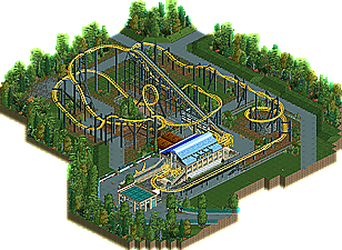
Recreation of Batwing, Vekoma Laydown coaster. I only used Google Maps/View, RCDB and the horizontal locked POV on YouTube for reference.
-
1 fan
 Fans of this park
-
 Download Park
414
-
 Objects
1
-
 Tags
Tags
![park_3324 [H2H7 R1] Circus Circus & Adventuredome Atlantic City](https://www.nedesigns.com/uploads/parks/3324/aerialt2970.png)

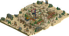
Clean and tidy. Love the support work.. looks like it was tedious, but definitely worth the effort. Sticking to the source material is honorable, but it seems a tad lifeless as a whole. But, the coaster itself is great! Clinical.
Interesting pseudo-NCSO and a pretty nice recreation in general. Perhaps not the most exciting setting or layout, but an admirable effort indeed.
Lifeless is right, clean and tidy is not what you're looking for when recreating SFA. That may be my biggest criticism, otherwise this is great work, and it brings me back to when I was there!
I would've tried to make the layout more compact but that's pretty hard to do. This totally works.
Layout, station and supportwork are great. Unfortunately there is not much else to see on the map. I'd either go for a bigger area to recreate or for adding more of your own twist to it.
Indeed what's here is really nice, definitely a lot of great details for what is effectively NCSO. Interesting and unique take on the layout too.
Not a bad park design but I feel that the corner where the peeps are facing up after the first loop should probably be downward facing. From what I remember riding flying coasters it was a lot more interesting to go down then up while laying on your back.
 .
.
I feel like the queue is to small and doesn't interact with the coaster to much.
Would have loved to see the dual station actual functional but I understand that is hard to do still.
It's a shame that there is no music playing
Some of the random foiliage with flowers/jungle trees etc on very short grass felt out of place a bit.
Is it me or is the spair train the wrong way around?
Overall not bad but it feels like it's missing some polish.
I appreciate this a lot.
Nice clean work with the station and support indeed. Some objects jumped out to me in a wrong way texture-wise, and the foliage along the edges was a bit too messy/random for me. Three less different tree types would have helped I think.
Great effort, I think with some more effort (and maybe a recreation of something less lifeless) you will get a design with something like this, but to me this barely misses that threshold.
Recreations like this are some of the most difficult to score... there is not much on the map, yet that is accurate in regards to what it is you are recreating. The coaster and its surroundings really do look largely like this, and what appears to be very plain and underdetailed is actually a solid reflection of what the real-life version looks like. For this reason, the landscape subtleties are crucial, and I believe that is what is keeping this from hitting the Design threshold.
With DKSO scenery, you've managed to recreate the station and surrounding architecture with lovely precision. I also appreciate that you used colorable custom versions of the WW/TT scenery, as they are not only visible to everyone, but they are not constrained to a single color scheme. You've translated the structures here with remarkable precision, and with full-tile RCT, that can be particularly difficult. You've worked wonders with the Raptor track--I would not change a single thing about these supports.
It is the natural elements that fall short here, and these need to be as strong as everything else in order for everything to come together. The tree placement seems a bit random, and those yew trees with the shadows do not blend with any of the others. I've not seen that object before, but I would recommend eliminating it from future projects. As a whole, the foliage cuts off from the plain grass in perfectly straight lines, particularly on the side of the map with the inline twists, and this gives it an overly manufactured look when it should appear more natural (as it does in the real park). There is also very little going on in terms of small foliage, so the terrain cutoff line is even more noticeable. Your next assignment is to closely study the foliage shapes and textures in your favorite NCSO realism parks, as this will help keep the landscaping consistent with the growing quality of your architecture and infrastructure.
You are very close to hitting Design here, and I believe that, with more work on the natural aspects of a map, you will pass the threshold very soon.
The macro is nice, clean as others have said, the landscaping is solid too. For me I do think this misses my "design quota" with not having an official themed area, or such worth of content. However, with what is here, the supports are a really creative solution and the overall object choices are really fresh and cool. The small bits of architecture are quite unique but clean with the unique object choices.