Park / Strawberry Shortcake Dream Land
-
 24-August 22
-
 Strawberry Shortcake Dream Land
- Views 1,066
- Downloads 257
- Fans 0
- Comments 8
-
 49.00%(required: 65%)
 Design Submission

CoasterCreator9 60% Xtreme97 60% saxman1089 55% Terry Inferno 55% Faas 50% In:Cities 50% ottersalad 50% RWE 45% Scoop 45% chorkiel 40% Liampie 40% posix 40% 49.00% -
 Description
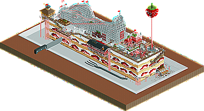
My first Rollercoaster Tycoon project with custom scenery objects - Strawberry Shortcake Dream Land is a miniature world on a giant dessert.
This was quite time consuming but was my way of learning the ropes of how to use custom scenery objects. -
 No fans of this park
-
 Download Park
257
-
 Objects
1
-
 Tags
Tags


This is very cute and charming. I like the way you perched stuff off the side with mine train track. Certainly very creative and a very nice first step into custom scenery. I think the middle gondola station was the strongest architecture in the park; the rest was a bit square and not quite as interesting. That being said, you're leagues ahead of where I was when I first tried CSO, so I think you'll do great with practice.
Really fun concept with this, love the knife and fork as an extra touch too, and the buildings fit better than I would think. It's a really solid first CSO.
This is great! Very fun concept and execution. I love your creativity and commitment to the theme. Color palette is perfect.
Welcome again!
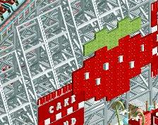
Unique concept. The details I enjoyed most were the strawberry topper on the drop tower and the crumbs around the base. I think you could have gone further with the crumbs to better sell the cake look and to make the edges less sharp.
ha, this is great. really fun. I've said before this reminds of the new kirby game, and it has that kind of whimsical nintendo/ghibli silliness to it. I particularly like the little buildings hanging over the edges---lovely design.
Sorry it took me this long to reply, but I was afraid of opening this. I knew it would trigger my gluttony. I only know dare to view the park, for my fridge is empty.
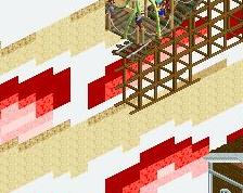
The map is just lovely! I admire how every strawberry slice on the sides is unique, that's really well done. All the 3D sculptures are cute too, but I must say that the strawberry mansion is my favourite, though it's not a sculpture in the same way as the others. The red to white gradient is so fitting, I can tell you were looking at real strawberries from all sides while building this. The knife - also so good.
What holds this back a bit is how all rides are just plopped on top of the cake without any interaction. Get rid of the cake, and it loses most of its appeal. Idea for your next cake: make part of the cake eaten away, so you have a slope with and can have a ride interact with the inside of the cake, plus maybe a smaller chunk of cake elsewhere so you also have an excuse to deviate from the rectangle.
This park is pretty cool. I really like the concept and many of the ideas are really cool. I do think the park could be a bit more refined in places but for a first park its pretty good. I loved the cutlery and the red chairlift station and the little strawberry sculptures and signs were well done. I do think the path layout could have been done better, it feels very on the grid atm. I also think this park could benefit from having fewer guests in the park. It looks way too crowded atm.
Overall good effort for a first park and lovely concept!
This was fun. Props for making it, but beyond the gimmick it didn't have too much to offer.