Park / Paradise Island
-
 20-October 07
- Views 5,437
- Downloads 2,650
- Fans 4
- Comments 10
-

-
 74.38%(required: none)
 Gold
Gold

MCI 100% 5dave 80% Cocoa 80% Liampie 80% Fisch 75% Louis! 75% Poke 75% Stoksy 70% FredD 60% geewhzz 55% 74.38% -
4 fans
 Fans of this park
-
 Download Park
2,650
-
 Tags
Tags
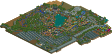
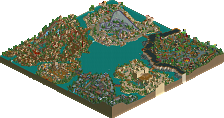
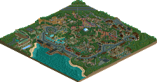
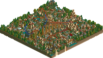
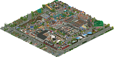
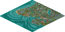
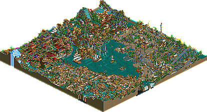
These days at NE it seems like we have a new parkmaker shooting up the ranks everyday while the old favorites mostly fade into the background. Recently we have seen CP6, J K, 5Dave, Fisch, FK and other rise up the the ranks of the best parkmakers at the site right now, but at this time all eyes are on Faceman who has now given us his breakthrough NE Blockbuster park, Paradise Island!
Please post your comments below.
You know my thoughts, Face and I'm so sorry that you didn't won spotlight with this.
I love every little detail of this park and I love the ideas you had there.
Kumba mentioned that you didn't have enough own ideas but I can't really comment on that.
I haven't looked at most of the NE spotlights because they're amazing but they're not something that really catches my attention too long.
Your park does though.
Especially the Curse and Qomolangma are amazing!
Congratulations!
Fisch
A few things I liked:
- The "basements" of some of the buildings were an excellent addition.
- The archy was outstanding.
- The coasters. I don't know where Kumba got the idea these were not so good, The Curse has one of the most interesting layouts I've seen from a B&M sitdown in a while, and the duelers' timing was very impressive, and nice that it was Flyers and not Inverts for a change. The wingwalker layout was a nice take on that new Disney coaster, too.
A few things I didn't like:
- The HUGE amount of water from Congo Rapids doesn't connect to the main body of water in the park, and it only flows over a small falls that goes off map. It doesnt "flow naturally" or seem realistic that all that water would bottleneck like that.
- In some places, I thought the extra wide dimensions of the Qomolangma trains needed additional space along the sides of the layout.
Edited by ride_exchanger, 21 October 2007 - 03:45 PM.
It was a really joy to watch it, since it gave me a flashback of my first days of RCT. It was one of the first parks that really amazed me. The coasters were excellent, the athmosphere was overwhelming and the architecture outstandig.
However, I'll try and give you a review in german. Congrats, to bad it didn't made Spotlight.
Peeee
for a german parkmaker, you're pretty good
i would never have seen this come. well done.
I hope this isn't my last park here and that you enjoy this park and my next projects.
Face
Avalon seemed like a filler. Lift hill, three circles, back to station. Not very creative.
Dark Knight had a bad layout and didn't have flow. Most of the descents were flat feeling and didn't have the flowing ups and downs a real coaster would have. Maybe more of the steep incline and declines would have helped more. I think the timing was off a bit too between the duelers, but it's really difficult to time these perfectly.
The Panther.... I don't even know what this was about. Slow, and boring. Not to mention very short.
The Curse was okay, except for the couple of awkwardly slow inversions.
And Qomolangma just isn't my cup of tea.
It seemed like nothing in this park looked like a realistic coaster.
The only section architecturally I didn't like was the Asian area. Too various in colors for this type of scene. It reminds me of how Kaibueno would have made an Asian theme (for you old schoolers like me).
Overall it was good. Looks like a Spotlight winner from 4 years ago though. Like mentioned before, it just looked too familiar and Kumba was correct in not making this a Spotlight.
As I promised, a small review:
I liked:
The archy was great throughout the park, although there were too many buildings for my likings.
I loved the Dark Ages area.
The Dark Knights were awesome.
I liked the whole atmosphere.
The park reminded me a lot of Artists and Turtles work, which is a good thing - I like that NE style :]
I loved that small track in the pit before the lifthill at The Curse.
The foliage and landscape in the Dark Ages area was great!
The interaction of the miniature railway in the Tibetean area was awesome too.
I didn't liked:
The entrance area was pretty small. (I can't imagine thousands of people coming through these small gates)
The pacing on some of the coasters were bad (Panther and The Curse).
The trackitecture in the Tibetian area (just isn't my cup of tea).
The trains of Qomolangma. (normal Intamin Giga or Schwarzkopf trains would probably look better - the layout is very cool though
the unnamed things in the park (staff,...etc)
Avalon conists of one large left-turn ;]
The water park was a bit too crammed in that corner.
Congrats for winning Blockbuster!
I hope too that this one wasn't your last park!
"MFG"