Park / Between The Rivers
-
 10-August 22
- Views 6,452
- Downloads 321
- Fans 1
- Comments 28
-
 70.63%(required: 65%)
 Design

CoasterCreator9 75% RWE 75% Terry Inferno 75% chorkiel 70% Cocoa 70% In:Cities 70% ottersalad 70% posix 70% Scoop 65% G Force 60% 70.63% -
1 fan
 Fans of this park
-
 Full-Size Map
-
 Download Park
321
-
 Tags
Tags
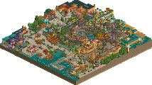
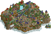
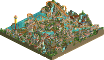
Retracing our collective footsteps
Round 2 | Match 2
Between The Rivers
Eden
SSSammy (70%)
Milo (20%)
Xtreme97 (10%)
In:Cities (60%)
MorganFan (25%)
Fisch (15%)
Voting Rules
- You should only vote if you have viewed both parks in game.
- Take your time to reflect on each park. The poll stays open for three days, not three minutes.
- Everyone but players belonging to either team in the match may vote.
Please note: the creators of Eden have requested that viewers use the latest develop version of OpenRCT2 to be able to correctly open the park.
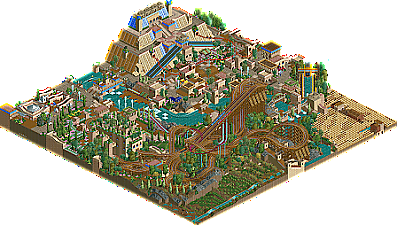
Between The Rivers: Some hot LL here, probably the best of the contest so far. The Barnacle Heads have an amazing lineup of rides with the dueling woodies taking center stage. Love that water coaster as well. The Mesopotamian theming is super unique and executed really well, especially the ziggurat and the gardens. The marketplace deserves a special mention as well; all the hacking with the monorails, minigolf stations, and exits gives it a ton of variety. This is a park I'm gonna have to study the hell out of; seeing all the effort that went into this makes me want to level up my LL as well. Damn good park Barnacle Heads!
Eden: Absolute insanity. Favorite park of the contest so far. I'm just a sucker for over-the-top fantasy and this delivers in spades. The centerpiece with the forbidden fruit and Temptation wrapping around is sick, although I can't help but think a single rail coaster wasn't exactly a good choice for a 2005-esque park. A normal twister coaster I think would've done the job really well. The other supporting rides all work really well though. The theming is so lush and opulent and over-the-top and it works really well for a biblical theme IMO. The flooded paths were a neat touch. The use of flowers for fades near the waterfalls is a cool substitute for the usual safety nets and I may or may not have to steal that. The staff and stall names are hilarious and a great finishing touch to the park, and of course ingame audio is a must if you want to experience the Genesis of NE. Amazing park, stoked to see this level of quality come out of H2HC.
Hot hot match but you know my heart belongs to Eden. Good stuff Fish City and Morganman!
EDEN:
Dang this park is super nice. The rides are superfun, I love how integrated they are. I would love if the trains ran better through all the layouts. The river rapids had a lot of backup and the minetrain, the trains were stuck by blocks a lot and the trains didnt go by often.
The minetrain is my favorite of the rides, i love how much the vines cover the ride and the supports. All the vines and garden stuff is really well done. Its so full!! Its cool that two temple parks went against each other, They’re both so different! I love how the whole park is the temple. The integration with the water gives me gauntlet dark legacy vibes.
The best detail is the small little apple, its giving Fabrge egg! Obsessed!
Between The Rivers:
This is so clean and well done dang! The layouts are all really good, thats a fantastic mobius! Thats so fun. They deul alright though but the lift hills and the flybys are stellar!! The station for the woodie is great too, really looks impressive and gorgeous, Reminds me of like Maze Runner too.
The water coaster looks so good, the curvessssss. The spinner is so fun, this temple is such a good weight on the map, its really well done. The custom flat is great too!
My fav part is all the farms, they fill the map in a good way and i love doing thatttttttt.
Fantastic work from The Barnacle Heads - very SSSammy feel, I definitely can tell he had a major hand in it. Truly very solid LL, one of those parks that leaves you wanting more LL.
I love how both parks have somewhat similar themes, as far as bronze age near eastern civilizations go.
Between the Rivers
Congrats to our team for finishing this park, honestly it's a very refined piece of LL; very vibrant and full of great composition and architecture. I won't say too much because I'm also on the Barnacle Heads, but the wooden layout and the ride interactions in general are excellent. The area around the ziggurat is also very nice for such a large structure, I really liked that queue area.
Eden
This is kinda like cBass meets Levis, with some Old Red thrown in there for good measure, it's very reminiscent of a road rally park you'd see on rctspace. Perhaps the RMC takes a little away from the 'classic RCT2' feel, but also emphasizes that this is a modern twist of it. Overall it's quite a beautiful park, with a lot of subtle good ideas like the 'naked' peeps or the flowers at the base of the waterfalls.
Just a quick reminder that although OpenRCT2 has done amazing work in increasing the accessibility of RCTLL, they are fundamentally different experiences. RCT2 was obviously an advancement and improvement on LL, and as a consequence, similar things are expressed differently. Open is a great way to access LL parks, but for the experience that is most accurate to how the builders experienced it, LL parks should always be viewed in LL! Thank you for considering this when deciding how to view the amazing LL parks you will see this season.
I've attached some screens to demonstrate how differently the two games draw the same screen.
It is insane how both our parks focus on the beginning of modern humanity, almost a bedroom park incident but with vastly different interpretations of the brief.
Eden is a thrill to look around. Josh, MorganFan, and Fisch are all proven builders, and it is exciting to see what they have built together. I think the main thing that jumps out at me when viewing the park is how the tiered structure building to a central focal point is pulled off without seeming contrived or dull to explore. I love the extremely 2005 single rail coaster as the centrepiece. I remember not being able to move for single rail coasters back then. single rail coaster is perfect for this kind of ride because the track is extremely dynamic all while being unobstructive. the loops around the fruit are fantastic.
I was less enamoured by the supporting rides but that isn't a huge concern in a concept-heavy park like this. The audio tracks are delightful, and it was really fun to search through for all of the easter eggs and shitposting throughout this park. the demigoddesses must have had a blast brainstorming stuff for this.
Enormous well done to Jischfan, and I am interested to see how you guys built it!
As for our park, I am going to leap at the opportunity to highlight the contributions of Milo and X. I may have physically built the majority of this park but Milo was in my livestreams heckling me from his workplace for most of the process, and when he took the savefiles it would always come back to me more authentic than how it went to him. X also swept in and inspired me when it came to the village area and added some much needed dynamism to the spinning coaster. The rest of the team were always there to encourage me or stop me before I did something too stupid.
It was extremely fun to have to work without codex aesthetics. I think there is only one thing in this park that is anachronistic to that era. I think this limitation is what made us pick a direction that works, that we had lots of material to steal from, and would give us a feel that doesn't ask the audience any favours to believe.
If i had one wish for the rest of my time in the context it is a Milo led LL park. I am publicly calling you out.
I think this round will be one of those where the real winner is the community. And I hope that makes you feel better when you lose to us.
It is funny how our teams did have a similar theme to early humanity. Yours focused on the mythology and ours on the mundane.
Eden is lush, inviting and fun to explore. The map layout is ambitious and pulled off well. It is reminiscent of H2H and Pro Tour parks of the era. There are tons and tons of foliage tricks. The jungle bush trees were pulled off as well as I've ever seen, the vine work on Exodus was awesome and the little flower gradients were also great. The highlight is the centerpiece, both the apple tree with the great use of the lily pad and the sculpture itself.
Temptation is of course a modern touch but not an unwelcome one. The sculptures are mostly done in an older style and help it blend in. Exodus was solid. I didn't love the pacing but it looked great. The Flood looks awesome from the main angle and gives off some Mala and Escher vibes. I liked the little touches of maze although a peepable one might have added some extra activity to those layers. I see a lot of classic objects, including the sloped wooden poles with the unfortunate glitchiness but that adds to the charm. The hanging shrub trees stood out a bit but I liked the execution with the flowers inside.
Great work overall Morgan In:Fisch! It looks like you had a blast making this. The Adam and Steve bit would have earned my vote if I weren't in the match. I look forward to more from the Demigoddesses as this is what I was hoping to see from this team.
As for our map, it was fantastic to work with Sammy and Xtreme. I've long felt that Sammy and I had complementary styles and would work well together. We've been on the same team before but it just never happened so I'm glad we were finally able to give it a go. Sammy really got the ball rolling with the woodie and the ziggurat. Thanks to some quiet periods on my end we were able to interact on stream more than I expected which helped move things along with the instant feedback.
I agree that the build techniques were fun to do. It was a personal goal of mine to use Beast primarily and I don't recall doing anything in codex that Beast couldn't do. We did use codex to speed the process up in some spots but otherwise we did go for a period appropriate approach. The team and build process helped me hold back on my instinct to over-detail. Much of the map involved one person setting something up and the other 1-2 taking it home. Xtreme's contribution cannot be overstated. He was able to map out difficult chunks of the map and his macro plus Sammy's meant I could focus on elevating my areas and then emulating what they had done with the foliage and aesthetics. The rest of the Barnacle Heads chipped in with helpful advice throughout the build. It was a lot of fun!
Sammy, you drive a hard bargain. Let's head back to Discord and see what we can come up with
Two very lush parks from the beginnings
Eden
Epic macro and creative object usage. Massive summit and everything trickling down, very monumental. Great balance between the symmetry and something special around each corner. The themes are strong, definitely gives the atmosphere of genesis. Very creative coasters/track rides throughout, they are fun to watch for I think each layout has a degree of unpredictability and I like the willingness to push the envelop within the style. The flowers and foliage flowing throughout is so nice.
Between the Rivers
That mobius wooden coaster is fantastic. The composition is really good along that river lol. Water coaster intertwined is ballsy but I like it. The fields are so nice and that diagonal spatula thing is so crazy. So much great lush landscaping. Marketplace is also super nice. Classic vibe through and through with that theme and the macro but it also has something quite fresh about it. Tight knit, very clean and classy but also very flashy in a good way.
Heated round, great job to both teams.
Are you trying to make an argument for how similar the two screens are because I don't see many differences. Or enough to alter my viewing experience.
I can see his point of view and do support sammy's argument. But maybe that particular screen isn't the best to illustrate the differences lol.
Took me quite a while to differentiate between the two. Granted, I'm not as familiar with LL as others.
If you need help downloading and getting LL to run on your computer, reach out to others on your team or admins - I'm sure there are resources to help provide access. For fairness sake in this contest, it is definitely best to view the maps with the game they were created in before voting. But I do sincerely hope that Openrct2 will be able to display LL maps correctly in the future!
those screens look really good, pity i can't view the LL park. congrats though, really nice job
Between the Rivers is really solid. Succession is quite a large and looming layout that interacts very well. The station was pretty neat too. The pyramid/ziggurat looks like it took forever to make! Great work guys. Love how both entries use mazes for theming.
These are the two best parks of the contest so far, I couldn't really decide so I flipped a coin. I would have voted for both if I had an eligible burner account
Between the Rivers: Love the flowy dueler layout. Entwining another coaster in there too is a cool choice that breaks the grid in a way that is tricky with LL. I really liked the period-appropriate Sky Sway. Having it on the diagonal is a nice way to keep it fresh. Macro is really nice. I only wish the ziggurat had a little more space available to it.
Eden: So much content crammed into a small map. I found something new every time I rotated the map. Love the foliage techniques. The single rail layout very interesting. I agree with Gustav that a twister may have been more appropriate.