Park / Culinarium
-
 08-August 22
- Views 5,597
- Downloads 404
- Fans 0
- Comments 19
-
 67.50%(required: 60%)
 Silver

chorkiel 70% Cocoa 70% In:Cities 70% RWE 70% Terry Inferno 70% CoasterCreator9 65% ottersalad 65% posix 65% Scoop 65% Xtreme97 55% 67.50% -
 No fans of this park
-
 Full-Size Map
-
 Download Park
404
-
 Tags
Tags
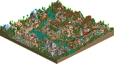
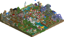
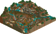
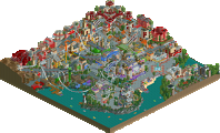
![park_3324 [H2H7 R1] Circus Circus & Adventuredome Atlantic City](https://www.nedesigns.com/uploads/parks/3324/aerialt2970.png)
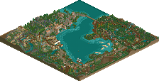
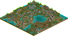
Retracing our collective footsteps
Round 2 | Match 1
Culinarium
Vinh Long Ceramics
Faas (95%)
Gustav Goblin (5%)
wheres_walto (1%)
WhosLeon (95%)
Scoop (5%)
Voting Rules
- You should only vote if you have viewed both parks in game.
- Take your time to reflect on each park. The poll stays open for three days, not three minutes.
- Everyone but players belonging to either team in the match may vote.
Absolutely gorgeous park, Leon and Scoopyman. You two absolutely nailed the theme and I'm not surprised to see something like this from Leon. Clay Pit Lacuna may be my favorite coaster of the contest so far; it's right up my alley.
Building in LL is really fun! Ghost train windows and not being able to hide paths and all that are hella annoying, but there's so little detail to worry about and I can just focus on the big picture. I may want to do a hackless LL park of my own after this contest with no deadlines or pressure or anything like that.
More to come after the results. Hawaii 2-0!
Sadly missing LL, but very much enjoying the RCT2 offerings! Some great fun coasters, really liked the reel and the suspended especially. The big grey rock formations reminded me of Toon back in the day, feel like he had an unfinished group park thing with huge grey rock formations. Love it.
Vinh Long Ceramics:
Awesome park Leon (and scoopy boi), super atmospheric and quite original in theme and style given how commonly used those pagoda objects are. The atmosphere is super strong, feels like a really well realised environment, and love the use of the thick jungle trees and gardens. All the coaster layouts are super tight and well-designed, great use of space to make them standout individually while not cramping the map. Top one for me would be the launch clay pit mine coaster which is really fun. Also want to commend the design of the flower pots by the virginia reel, excellently made, and the general use of various wall objects for layering is great.
Culinarium:
Cute idea for the theme, feels familiar and there are a lot of great avenues you explored with the overarching idea. The entrance is excellent, some great and unique object choices, particularly the donut shop for ticket booth is very fun. That's something that this map excels in I think, such as with the use of the hot dog stall in the miniature cityscape area. The Mexican and Italian areas feels super classic as well, love the variety in the Mexican archi. Enjoyable and endearing map overall, great job!
Great entries.. but I null voted since I cant open LL. From what I can see, I really like Culinarium.. In terms of Vinh Long Ceramics, I enjoyed the style, but this doesn't at all feel "classic" to me. Rather, just a modern design using the PT2 bench. I also am curious how zero clearancing works on the main suspended coaster.. I dont mean to nitpick, but it seems like the coaster clips in places and doesn't have enough height clearance when the coaster crosses over itself. The peeps would lose their legs on this! Beyond that, it's a lovely atmosphere and great creative object usage throughout. Lacuna coaster was neat too.
This was a fun match with two very different but effective styles. I don't think either really hit the mark for the general 2005 meta but both are effective uses of the tools and general palettes available from the time. It is very hard to unlearn modern techniques and at this point it's either cherry picking things to emulate from the era or just jumping in headfirst into a limited workbench or LL and doing what you want.
Culinarium seems to be the latter and, as a result, was a lot of fun. From the very beginning at the entrance with the creative use of shops and moving on to the cheese block (with mold!), then going through each area after that. Nothing stands out as particularly memorable but nothing really lagged behind the other parts either. The urban area was perhaps the weakest but I have a soft spot for creative use of those textures, and music, so I think it was one of the most fun parts of the map with all the hotdog stalls. Faas, Gustav and walto were able to cook up a fresh feeling LL style with an ultra old school approach but adding in high concept themes that were not usually done as effectively when no-hack projects were the norm. I know it's a drag but I think even a style this loose can do with a little polish. Naming rides and just generally making sure rides can be repaired do help the viewing experience of a park like this; if nothing else they're an opportunity to inject more levity and personality into the project.
Vinh Long Ceramics was probably going to be easy to guess who had a hand in this one if builders weren't revealed. Kagato was incredibly clean and refined and this really carries on that same feel. It includes a great use of some (possibly underused?) Toon land blocks. They look familiar but I also don't recall the last time I saw them. It is very easy to get sucked into the atmosphere of the natural settings and the mix of dense parts with more serene and scenic parts. Some fantastic, fun and compact layouts rounded this out into a great entry. I think enough of the usual objects from the era are there and it feels like a fresh use of almost all of them. I was a little unclear on why the boats outside the water were all vibrant primary colors but the ones the peeps actually used were so drab. Great job on a damn near flawless entry.
Meant to attach screenshots on this, but I'm on my other computer.
I greatly enjoyed both parks!
LL has such a fun charm to it, which is why Faas Goblin Buffet is even more enjoyable. It's awesome how his style can shine through even in another game. The theme was a blast, and very well executed. Super impressed with how both him and Gustav picked up the game for this contest. The entrance area was probably my favorite. Warm, inviting, and creative. The wooden coaster is probably my favorite thing on the map. It does feel a bit cramped in spots, which isn't necessarily a bad thing. Super nostalgic and absolutely nails the classic vibe for me.
Pottery Barn was a pleasant surprise! Also fun to see Scoop as a floater this h2h. Nice work. I love the grey cliffs. Landscaping throughout this map is super strong and well thought out. The interactions between the rides is also extremely well done. Theme-wise, I appreciate the creativity. Although the execution was top notch, my biggest criticism for this map is that it doesn't feel like early 2000's classic parkmaking. Though I should be one to talk - I'm sure I won't hit that mark either with my park lol. So much more difficult than it looks.
I ended up going with the Ice Cream Queens this round. Despite thoroughly loving Faastopia2, I was drawn more to Ceramic City. From a macro to a micro level, that map is pure class.
Great work to all involved!
I'm going to sound like a Milo echo here. Pretty much agree with everything he said.
This was a bit of a tough decision for me, as both are very solid, fun work.
Vinh Long - Let's get it out of the way, the coaster's clearances are a massive oversight. Really hard for me to ignore personally, and it's a shame because the layout is phenomenal. However, the overall vibe and use of land blocks is a wonderful touch. As some have said, it's definitely got a modern twist, but it's all very lovely work.
Culinarium - Pleasant piece of LL work, and a fun theme to boot. The park plainly oozes atmosphere, and has a wonderful nostalgic feel. It was a little unfortunate that rides kept breaking down, but the level of execution without using hacks is quite high. Really wonderful work that you guys should be proud of.
In the end, I think it came down to just the slightest bit of execution and polish bringing one park a notch above the other. Both are truly well done, and great work to all involved.
So I finally got LL to work so time to do some reviewing.

My vote went to Culinarium.
I've looked at it in openrct2 (with LL installed and connected) so I believe that should be the same viewing experience but if not i'm sorry.
==Culinarium==
Pros:
- The dueling looping coaster is small but very nice!
- All the puns are FANTAstic!
- The fondue falls area looks very nice, love the atmosphere there, but I am really missing the chocolate!
- The use of some of the shops was very nice
Cons:
- The wooden rollercoaster felt like it went a bit to fast through the elements and therefore I didn't like it to much.
- The green path sometimes used in roofs etc feels a bit off, the color of it feels to "sharp" and doesn't really match with most of the pastel colors in the rest of the park
- Not sure if this is still a thing but I found it pretty hard to figure out which rides I should look at and which I don't in the ride list. What happened with putting something in front of rides names that are used mostly for theming so you can easily distinguish them?
- No gender-neutral toilets
Overall a very nice park with very nice atmosphere. I would have loved to see peeps in it too, think that would have made it a bit more lively too. Overall it had a nice atmosphere but seemed to just miss some polish.
== Vinh Long Ceramics ==
Pros:
- Some nice architecture
- The woodencoaster brige queue is a very nice idea
- The vases look nice
- I really like the archy at the wires without function
- Peepfriendlyness!
Cons:
- I really don't like the canoes going of the map and glitching in the blackness for a while and coming back
- The area around master the craft felt to cluttered with all the foliage, it really didn't appeal to me.
- Like other said the clearance issues on the track annoy me too
- To many pots and vases very where, as a Zelda fan I get to much urges to smash some.
- No nice park description, it's still the PT2 bench description
- What's up with the wires without function? Unless I'm mistaking they only seem to be attached at one point
I think this park looks quite nice but it really doesn't give me a "classic" feel at all. I think this is mostly due to the grey land use and the use of some small objects which aren't really usefull in many other situations (for example why do you need objects of rowing boats if you can also just get them there with a ride). These kind of objects normally wouldn't make it to a bench that quickly unless they where really important (because of the object limit).
I like how Hawaii 0-5 did basically the same thing Sundae's Best did last round.
Culinarium feels like a bit too much. The entrance area is very warm and charming but none of the themes have enough room to breathe. It is absolutely jam-packed full of rides though, and that can be hard to pull off. Tsunami Kobayashi takes the spotlight for me, has almost an OG Knott's Windjammers feel to them. The faux-urban area was also the most interesting/different looking area of the park, and I wish it had been more of that instead of 5 (?) distinct themed zones on such a small map. For real though what's up with all the buried hotdogs?
Vinh Long Ceramics has a wonderful atmosphere, although it does feel very modern, just with an old map. Nothing wrong with that though, as these older benches have always been very versatile. Pottery coaster is awesome, although the pots themselves are maybe... out of scale? There's something about them that is incongruous with the rest of the map, like they are one step further in to full-on fantasy parkmaking than the rest. They make for nice colorful setpieces though. The clearances on Jambhala did stick out straightaway which was a disappointment, and I don't understand why the canoes couldn't have just had their station on the map somewhere, as the chunk of stuff off in the void plus all the lost guests was just... weird? But the entry overall has such a clarity and focus that on the whole I think it is the better H2H park.
Two real nice parks, here. Always love seeing new LL and Culinarium is no disappointment. The wild mouse area was especially nice I think, as was the integration of the wooden coaster into the landscape. You packed a lot in here, perhaps even too much? Sorta gave a little bit of an unfocused impression as a result.
With Vinh Long, you have what is probably a far more modern take on a historical bench style park and concept. Overall I think the parkmaking here is top tier but just doesn't feel very 2005 to me (not has Culinarium particularly does either), the biggest offender probably being the gray rocks which just wouldn't have been done then I think? They do really create a stunning visual appearance for the park though, very impressive that this was done with almost entirely old objects as it looks fresh and new in the best way possible.
Yeah so maybe neither park really feels very 2005-ish to me, but on their own both are pretty dang nice. Ended up gong with Vinh Long, just felt a bit more focused and nuanced, something I'll go back and look at more in the future.
If this is an indication of the quality we'll be seeing going forward, this contest is really gonna surpass my highest expectations, keep it up!
Another difficult match for me to chose, but I once again went with my gut feeling towards my choice.
Culinarium
The entrance is awesome. Overall nice flow of landscape and the food theme is pretty brilliant as I feel like LL has a very edible aesthetic. I am not sure if intentional but the wilted flowers make for good underbrush. My favorite parts are the Tequila Tango area with the colorful architecture and the cheese/fondue section with that clever wild mouse and really lovely flow around that fondue falls. I could see myself walking through there and the smell of melted cheese in the air, and seeing that drop out the cheese mountain. It ain't easy being cheesy.
Vinh Long Ceramics
I am definitely a sucker for this kind of macro/micro approach. Dense urban colors against rough landscaping. Lovely foliage and that ride design is really solid. I just love how tight knit that suspended coaster is. A very specific theme but between the micro motifs and atmosphere created it is done so well. A really strong atmosphere. My favorite scene is probably the coaster lift and drop tower lined up with that string of buildings and the gate over the stream from the west or east views. Nice dense, humid sweaty grunge vibes.
Sweet match. Both parks are great and it was a difficult choice.
Winner:
Good match Scoopymen! Big props to Leon for leading a beautiful park and Scoop for adding a dollop of his identity. Can't be too mad about losing; this was a fun one to work on.
I wasn't slated for Culinarium at first; it was all Faas with Walto helping out near the entrance later on. Walto installed LL after the contest began and immediately became a total freak with it. Typical Walto. I was working on a park at this time (spoiler alert), but I was running into a wall and completely overwhelmed with frustration and self-doubt. After I decided to shelf it for the time being, Walto suggested I join Culinarium as a third builder to help push it to completion while resting my mind. I covered some important gaps that remained outside of rounding out the edges of the park and making any finishing touches. It was a very relaxing change of pace from trying my damndest to churn out a good park while never being satisfied with it.
Swiss cottage-style fondue restaurant with waterfront seating.
Urban waterfront with a bridge connecting the leftmost edge to the area across the river. We considered a ferris wheel which I was personally all in on, but we couldn't find a way to make it look good. The extra go-kart awnings were Faas's addition.
Culinarium: The ride names, theming, and signage are all so immersive. Impressive to pull off with such 'limited' objects available. I want to be a taste-buddie for sure.
Vinh Long Ceramics: The fishing village area is awesome. The foliage, rockwork, and makeshift structures are all placed beautifully. The different architectural styles seemed to clash at first, but the look grew on me the more I looked through it.
Thanks everyone for the kind words. I really enjoyed making this park, and I hope everyone discovers the little easter eggs. I purposefully made this park hack-free, since imo hack-free means hassle-free, and LL is a perfect medium to build without worrying too much about overdetailing or hacking.
I get the remarks about there being a bit too much content for a small map, but I am just an idea-driven builder that wants to put every idea I have into a park.
About naming the rides that weren't actually rides: I have a hard time believing people go into the ride menu when opening a park to check whether the trackitecture etc. is named, but maybe that's just me.
@Sundae's Best: Certainly a skillfully-made park. I apreciated the viriginia reel as a not so often used ride type. I'm not sure if this really nails that classic vibe, but it just goes to show that it's hard to nail that vibe. Content-wise this was a bit weak imo, considering the fact that 50% of the park was empty water or island.
Congrats again on the win!
culinarium: really lovely park. such a good excuse to use the somewhat-ugly food stalls, especially those donut stalls in the entrance area. great vibe and some pretty ride design too
vinh long: wow, this park is absolutely stunning. feels like a mix of red river delta, isole calabria, and RoB, with some more modern landscaping composition. just a beautiful park, with lovely rides and atmosphere. the ceramic tub ride was my favorite of the bunch, so well executed, but the suspended was up there too. Just a great great showing, so restrained and beautiful.
Couldn't really view culinarium in game, don't have LL or the textures so it looked all wonky in ORCT, but from the screenshots I've seen the park is super cute and well done. Love the layouts, all are compact yet flowing. The themes are clever and atmosphere looks really nice throughout.
Vinh Long was so so good, masterful composition and unique landscapes. The pottery ride is so cool as perfectly done! A Clay Pit Lacuna is fun as well, all the layouts have the trademark Leon touch with perfect angles and clever overlapping / repeating track elements. Everything is really on point throughout, and has some unique object usage that brings it to another level for me. I'll be referencing some of the waterside foliage and sticks / poles out of the waterways for my own parks, inspiring stuff. Loved it.