Park / A Tar Pit Lacuna
-
 28-July 22
- Views 6,357
- Downloads 329
- Fans 0
- Comments 23
-
 69.38%(required: 65%)
 Design

CoasterCreator9 80% ottersalad 75% In:Cities 70% posix 70% RWE 70% Terry Inferno 70% Xtreme97 70% G Force 65% Milo 65% Scoop 65% 69.38% -
 No fans of this park
-
 Full-Size Map
-
 Download Park
329
-
 Tags
Tags
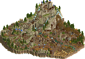
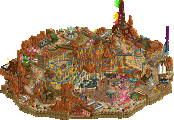
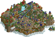
Retracing our collective footsteps
Round 1 | Match 1
A Tar Pit Lacuna
Limelight Lake
Cocoa (80%)
Ethan (10%)
][ntamin22 (10%)
Liampie (60%)
Scoop (20%)
bigshootergill (20%)
Voting Rules
- You should only vote if you have viewed both parks in game.
- Take your time to reflect on each park. The poll stays open for three days, not three minutes.
- Everyone but players belonging to either team in the match may vote.
What an overview. Both parks have a very great macro it seems.
Also fun to see Scoop doing more LL. 3 caps building in the first round. What is this - H2H?
Nice work getting these submissions together by the deadline!
Limelight Lake is so classic! I like it a lot. Nice job of getting some of the most overdone themes out of the way
Enjoyed both of them a lot, love that we have a double-LL matchup in the first round!
Limelight Lake:
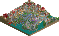
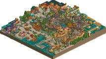
Love the classic four corners approach, feels like something right out of that era both in its execution of themes and the way it's put together. It fully embraces the H2H2-3 LL aesthetics as well. Lot of great ideas and motifs - the big pyramid entrance to the wooden coaster (probably my favourite area, perfectly restrained execution here and so atmospheric), the roof style of the Chinese area, the red helix ending for the dive coaster. I also love how it feels like a scaled down version of a typical full sized park of the time, sort of like an homage where a normal H2H park might focus on a singlular vision.
A Tar Pit Lacuna:
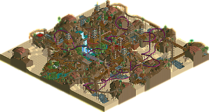
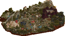
This was immediately recognisable as a cocoa project (would be interested to see where Ethan and ][ contributed tho!), oozing with atmosphere and a well envisioned concept. Feels like it draws from various elements of former parks of yours like your MM3 final, your NEFC entry etc. Where Limelight Lake takes the approach of mimicing a four-corners park this goes in the opposite direction with the common H2H direction of an immersive world populated with rides. The landscaping and overall macro are obviously stellar, love the choice of the Asian scenery set for the archi too but divorcing it from its typical theme, and choosing an overall rustic style. Martian music was also a solid choice to enhance the vibe.
Between the two I'm finding it very difficult to choose who to vote for. Both are very well crafted and where I think Limelight captures the classic vibe more, Lacuna is more engrossing. Will have to sit on it. Loving the contest so far!
Great little SLC in the Asian area of Limelight. The foliage throughout is just excellent. It all blends really well for having four distinct themes and color palettes. I do think I'd like to see at least one or two of these areas have more room to breathe though. Also almost everything was broken down when I opened it and kept breaking down constantly, which was a little strange because nothing looked that hack-y.
A Tar Pit Lacuna feels so distinct. I can't quite place the theme and I imagine that's intentional. Curious and eclectic collection of objects but I really like the macro. This one definitely doesn't feel as "classic" as Limelight but I think it is the more visually interesting of the two. Shame Lacuna is not peepable - I imagine you could have sorted it with one more pass at the section over the water.
Absolutely stoked to see two LL parks in an H2H match in 2022.
Limelight Lake: I really love that dive layout; really prominent focal point and a unique layout to boot. The other layouts didn't do quite so much for me. The four corners-central lake approach evokes some classic feel for sure, but I do agree that there was perhaps a bit of a content deficit in places as a result.
Lacuna: Cocoa and ][ in a nutshell - significant atmosphere and very immersive with some really clever stuff mixed in. Pretty cool that we're still seeing new/uncommon LL techniques all these years later. The landscape really puts this over the top for me. The visual excitement is both a pro and a con; while very immersive and interesting, it can be a bit much to take in at times.
Tough one to vote on, but amazing to see such high quality LL from some newer faces in 2022.
A Tar Pit Lacuna: This is the most Cocoa way this contest could have started. The sandy landscape, the dramatic rockwork, the dense atmosphere; all it needs is some marshmallows. The tar pits are a theme I haven't seen approached much in RCT, and the bones sticking out really make them shine. Surprised you got the mushrooms to work with the foliage as well. The air-powered coaster awnings are a cool approach I don't see tackled very often. All of this contributes to a very unique and adventurous aesthetic.
Lacuna is a really interesting layout but those stats! Yikes! I know stats aren't everything and it's tough to maintain lateral Gs in LL, but that still kinda rubs me the wrong way. Nice lineup of supporting flat rides spread evenly throughout the park, and the suspended monorail with the mine train track on top has a really unique look. The names really make this one shine, especially when you view them all in the rides window. It has an esoteric atmosphere (much like another esoteric park with a cool rides window) which makes me not surprised that Ethan had a hand in this. And as a cherry on top, it's peepable! Hard to do that well in Loopy Landscapes. While the less 2005-looking of the two, I have to applaud this park for diving into themes and concepts that aren't commonly taken on and rocking them.
Limelight Lake: A stark contrast to A Tar Pit Lacuna and definitely the more traditional of the two. Clean, simple, and charming; a classic LL park for sure. It definitely feels like a condensed version of a classic four corners park you'd commonly see in the PT2 era, and each theme is recognizable and immersive. The entrance is gorgeous with the multicolored buildings, the dock, and the ferris wheel overlooking the water. The castle area looks great and I love the viewing area around the dive coaster. The Mayan area is excellent and has a great classic woodie as a fitting centerpiece. The temples are a highlight of this park for sure, especially with the rapids coming out. I think the Asian area is my favorite of the park, though; beautiful landscaping and architecture augmented by a classic Liam SLC. All in all, a very classic and homely little park you can get lost in.
Tough vote for sure; I'll really need to deliberate on this one and vote last second. I love parks like Tar Pit Lacuna that go out and do their own thing, but something about how classic and traditional Limelight Lake feels works very well for a 2005-themed contest and just sits right with me. Great parks from both teams!
OddmentsAlchemyLab Offline
The first one I opened was "The Tar Pits Lacuna." I really love the earth tones and was excited to see what this team could pull off. The use of color did not disappoint! It is easy to look at and trace the paths, but I was confused by the Asian architecture throughout the Tar Pits. Ultimately I considered the single coaster and single theme as feeling more like a single themed area (an awesome one, to be sure) and that swayed my vote.
"Limelight Lake" was my favorite for this round. It wasn't a landslide as the competition is really strong! But I loved each coaster and the smooth transitions between themed areas. It felt like the most complete park to me. Very traditional and nothing surprising - but a clinic in NCSO mastery and park building.
A Tar Pit Lacuna:
I know this was from my own team, but I just wanted to point out how atmospheric I thought the park was. As someone with no experience with LL it was really impressive to see. I think the tar pits themselves turned out pretty well.
Limelight Lake:
I like how you guys went for a compressed four corners park rather than a typical H2H style map. It gives this map its own character. My favorite section was the wooden coaster/mesoamerican temple area. I know it is not easy to add even this much detail to LL, so I find it very impressive.
Sorry for my lack of knowledge on LL, which results in not-so-insightful commentary. Two great parks nonetheless!
Shit I voted for my team I clicked too fast, can I delete it?
This was a great matchup and LL vs LL is always fun to see.
Limelight Lake
It is a tried and true formula and something about the execution here just works as more than the sum of its parts. The distinctive entrance and good mix of coasters really help sell the scaled down full scale solo feel. Only thing I could think to add is a custom flat.
A Tar Pit Lacun@
I was excited when I saw the overview as the dramatic landscape looked very interesting in the overview and seeing it in game did not disappoint. Ed's area in Amity Cove always had a distinctive look for how little was actually completed and this carries on the idea well. I think the only difference maker here was I was not feeling the rides as much, although they were all well executed. The landscaping and unique, effective object set make for a fantastic setting though.
Tar Pit Lacuna: I love the novel theme. The tar pits read surprisingly well. The dramatic landscaping is awesome and I'm always happy to peeps in LL. I think the prominence of the water sections could have been reduced in favor of more tar.
Limelight Lake: The nature of fitting a four corners style park into a map this size inevitably leads to it becoming cramped. Despite the constraints, I think the coaster layouts are excellent - particularly the SLC. Definitely a park that captures the LL ascetic of older parks. I don't know what's going on in the center of the lake though.
Winner:
* One vote was submitted by a member of the participating team and has been deducted from the final tally.
Really enjoyed both parks. Tar Pit had such a cool aesthetic and a fresh concept, and Limelight was so perfectly composed with some really nice layouts. Was a really hard decision between the two since both were so great in different ways, but I ended up being charmed by the simplicity of Limelight.
(Just to clarify, ours is a design submission lol)
Happy I get to view Lacuna in game! Love the double launch. The layout going through all the canyons was hard to follow, but would be a blast to ride! As everyone already pointed out, it is a dramatic scene you guys have made here. Really interesting that I saw the prototype of this back in h2h8/8. Glad to see the idea fully realized.
This was a sick first round of the contest! Both entries are very refreshing and high quality.
Tar Pit threw me for a loop thinking it was LL, but it's really fun to look at, and the atmosphere is lovely.
Limelight Lake is a sweet little park, and I love every coaster layout here. The architecture of the Japanese section is one of my favorites for its simplicity.
In the end, I didn't vote because I was moving right when this round dropped, but I think I would end up giving it to Tar Pit Lacuna. I love experimentation and the fact that a park like this was done in RCT2 really is special.