Park / Smooch Hour
-
 24-July 22
- Views 2,989
- Downloads 368
- Fans 3
- Comments 11
-
 80.00%(required: 65%)
 Design

CoasterCreator9 85% In:Cities 85% RWE 85% saxman1089 85% WhosLeon 85% ottersalad 80% Scoop 80% Terry Inferno 80% G Force 75% posix 75% chorkiel 70% Cocoa 70% 80.00% -
 Description
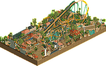
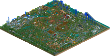
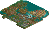
Built for the Pimp My Ride building challenge on discord, with a layout based on Crush Hour.
Part I (Coaster Layout): Luketh
Part II (Area Layout): Narc
Part III (Station + Ride Details): Xtreme97
Part IV (Finishing): Xtreme97 -
3 fans
 Fans of this park
-
 Full-Size Map
-
 Download Park
368
-
 Objects
1
-
 Tags
Tags
![park_2614 [NEDC2 #1] Winter is Coming](https://www.nedesigns.com/uploads/parks/2614/aerialt2316.png)
Finally some good fucking food.
Well I don't think any of my layouts have ever looked this good. All kudos to Narc & Xtreme for seeing this thru. I got a laugh that the Smooch Hour name stayed the same!
Great stuff, Xtreme. Very cozy vibes.. the archy here is very pleasant and detailed. In terms of the coaster, I can only imagine how badly this ride would hurt my knees lol
I enjoy the headchop moments throughout the layout, whether it's from overhanging track, the tangle of supports, or the rock bridge near the end of the ride. Also, I appreciate the open-air station too.
You're my idol, Xtreme. The textures on Shell City and the coaster station building are absolutely gorgeous and for my money, your foliage work is the best in the game. I know I'm gonna be coming back to this one for a long time.
This is awesome. Feels totally believable as a real ride.
New parkmaker?!?
Nice work Steve...I mean Xtreme? Feels like a Logan's Run submission here - certainly not a bad thing in the slightest. Really impressive collaboration, feels like a complete and cohesive submission. Layout is fantastic, theming is very immersive and well done. Nice work, guys.
this is so xtreme, I love it. classy, cute, great landscaping and some beautiful little buildings. Only reason I didn't rate it super high was that its a bit small! overall very high quality
The archy in this is so insane. The use of textures is so good. Really nice work.
This was very enjoyable. Reminiscent of old designs that are small like this and have a clear focus on the coaster.
I loved the vibe you've created, your trademark organic and warm atmosphere that's usually a winner. The way you articulated all the little features from shops to the rides all made good sense, and it was easy to dive into this park. And when you zoom in enough there's actually quite a bit more to see than you might think at first glance.
I'm not sure I loved the layout all that much, but it was fine. Perhaps next time you could diversify a bit from your formula, and try different things with landscaping. Maybe you could do something like a non-coaster section like a big garden area with picnic tables, slides, a boat hire, some scenic paths, greenhouses, etc. Something very British, but the Welsh version of it? Think alex and ar2910. Could be decent practice perhaps.
Congrats on the parkmaker X! Even though I voted 75% on this it's still well deserved, hopefully it doesn't stunt your motivation or ambition on future projects (or object making). Always hoping for more content from you as I've loved everything you've done in the last couple years.