Park / Ghillie Dhu
-
 10-July 22
- Views 3,347
- Downloads 499
- Fans 3
- Comments 14
-

-
 73.50%(required: 65%)
 Design

CedarPoint6 80% posix 80% RWE 80% chorkiel 75% In:Cities 75% Xtreme97 75% CoasterCreator9 70% G Force 70% saxman1089 70% Scoop 70% SSSammy 70% ottersalad 65% 73.50% -
 Description
When walking in the forest alone at night, beware of Ghillie Dhu.
-
3 fans
 Fans of this park
-
 Full-Size Map
-
 Download Park
499
-
 Objects
1
-
 Tags
Tags
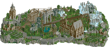
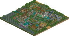
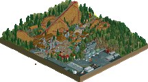
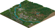
Loving this comeback. The aerial is wonderful. Great original theme. Close up it shows some rustiness in your building, like some bare foliage patches are inconsistent scale in the architecture. But there's a lot to like. The trim work on the station is beautiful for example, the and overgrown look as a whole is very successful. Lastly, before I run out of superlatives: it's impressive how quick you're adapting to 2022 building styles. Can't wait for more.
Dang, welcome back sir. Scale here is massive.. didn't really get a total sense from the overview or screens you shared.. but this is big! Gives a sense of grandness and importance to what are seemingly ruins and ancient temples/structures? Really cool. The coasters were cool, but I guess I expected more dueling/racing. They almost sync up which is great for how massive the layout is though. I guess when I enjoy one track way more than another, its a knock for me. Ghillie Dhu 2 was better imo.
Anywho, really enjoyed the textures, the architecture, landscaping, basically all of the worldmaking is top notch.
It's great to see you return, especially with something this good. Overall composition and macro is fantastic, and the architecture has some great object choices and use.
Great to see your comeback after so many years away from the game JK. This is a solid design, I think it showcases some of your strengths very well and shows that you're quick to update your style with modern objects without hesitation. There is a bit of roughness to it however, but shaking off the rust is all part of coming back after a long break I suppose and with more time I don't doubt you'll adapt even more..
A duelling coaster surely feels like a JK classic now, and the diagonal double lift element is quite striking among the gritty landscaping. It feels a bit fast through the second half though and I miss some duelling portions that could have elevated this a lot imo. The setting is really atmospheric and clearly well inspired, love the haunted scottish theming and some of the verticality. Things like the stone pillars and the moss-covered structures are very nice, and I also love the runes on the wall of the cave area.
The map isn't without flaws though, and I think the biggest concerns for me were the scale of the buildings being quite absurdly oversized and the sense of roughness, with some areas looking unfinished in the back and a little rushed. As I understand, you wanted to get this done quickly as a sort of re-energizing project so I hope you spend more time fleshing out the details and making sure your next project has that extra finishing detail applied.
Some really nice stuff here, it's clear you haven't lost a step with how quickly you've reacclimated yourself to a very different game than what was present years ago. I really liked the foliage and how you made the architecture feel atmospherically.
Some things did feel off though and in general perhaps a little rushed and basic which I totally get as a first serious project back.
I liked how you experimented with the coaster too even though its not the most impressive type/layout ever, it certainly was memorable.
Overall a pretty solid design and a great first submission back, really hope your here to stay and we can see what you can do once you're fully acclimated back into the landscape of RCT in 2022.
I'm gonna sound like an echo here, so I'm just going to say it's lovely to have you back.
Great stuff with a bit of rust as others have said. Really hopeful we see a full size J K park in the next few years.
+ The epic scale, landscape, and scene setting throughout. Fantastic.
+ I love the huge buildings; more people should build bigger lol.
+ Felt like something out of a book, in a good way. I guess you could call this one atmosphere or ambiance. I really liked the feel of the area.
+ Graveyards were surprisingly well done, nice creative combo of objects.
+- Texture overload. Had that crunch for sure though. Took my eyes some time to adjust, not sure if I like it or not yet...
+- Track flow. It's janky, it bothered me quite a bit at first but it's growing on me, maybe intentional? Fits the theme a bit the more I think about it.
- Pacing. Sorry man, felt like the pacing could've been a little more polished. Rushed through some elements that could've benefited from slowing down a little. Also, the absolutely neck-snapping stop in the station since the other train is sitting there. I mean even in the most ridiculous fantasy movies, there's usually somewhat of a slowdown from quick to stop.
Great submission and great return. Overall, 75% if I were on the panel. With some work on the pacing, I'd be in the 80%-85%+ camp easily with no other changes to the map.
The scaling is quite cool, very bold move. Lovely to see how fast youve come familiar with the style these days, the foliage and landscaping in this looks nothing like in your old parks. The architecture feels a bit messy in some parts, but it definitely works and creates a wonderful atmosphere together with the graveyards, that might be my favorite thing on this map.
The coaster is definitely fun and i like the huge diagonal double lift in the middle, but as pointed out by others its not the best part of this map. I respect the unusual coaster choice though.
All in all im very glad to have you back. Looking forward to see what youll come up with after youve had more experience with the style these days. Keep it up!
Owe you a review on this one, it's so exciting to see you back in action, you haven't lost a step and I can't wait to see what you come up with next
+ your style is accentuated so well by the new possibilities in Open, Djinn and Ilmenite were incredible displays of crunch and texture at the time and it's already clear you're taking that to the next level
+ incredible use of Fisch rocks here, lots of people struggle at first to make formations look natural but varied, but you nailed it on your first attempt
+ gothic vibes are immaculate, the music and church building are great fits
+ great height variation throughout, you get a surprising amount of height on some of your buildings without them ever looking repetitive or forced
+ this is a master class in layering and composition. Every angle works well, you nailed the macro, and there's an impressive amount of micro detail throughout to give a unique feel
- there's not much movement, every location on the map is well developed and dense enough to stay interesting, but peeps feel like a bit of an afterthought
All in all a super impressive return after such a long hiatus, it's immediately easy to see your underlying skill as potent as ever, and it's only highlighted further by the advancements in RCT
Congrats on the Design J K. What a comeback after a 10 year hiatus (had to look that up). It's incredible that you've picked up so quickly. I loved this design with all the grand ruins and the coaster going through it. The scale is epic. Loads of 'Hagrids' vibes. The backside with the blue lettering is brilliant.
Only nitpick I have, is that the peeps come out of nowhere in a straight line to the entrance; I would've loved to see some of them go into the ruins and the graveyard. Have them scared shitless in that graveyard-rave-party you got going on in the rightdown corner.
Beautiful setting and architecture. I love the supports. I wished it had more attractions to activate some of the dead zones and give the entire area purpose.
this is lovely, so jk lol. I love that you showed up again and did something novel and refreshing right off the bat with a totally new set of objects. I love how epic the coasters are. bring back big mine trains I say
I've been meaning to give this a review for awhile now. First off congrats on the design. It feels very surreal to be reviewing new J K stuff after all these years, but what a treat this was to explore. For me, this project felt like a moment captured. It seemed like I could see J K exploring modern rct. There are different textures, different applications of new and old pieces, very unique and sometimes surreal or even abstracted compositions. For what this may have been lacking in polish, it made up for in a sense of exploration, like we could visually see you try different things. And I like the vibe of creating something new and quick and dirty but also a bit mythical and magical. It felt like an exercise in embracing modern rct without letting the time between this and previous projects bog down your parkmaking. This makes me so excited to see what more you might do in a second go at this whole rct thing, lol. Welcome back and congrats!