Park / Tropicool Waterpark
-
 06-July 22
- Views 3,088
- Downloads 420
- Fans 1
- Comments 14
-

-
 79.00%(required: 70%)
 Gold
Gold

RWE 85% SSSammy 85% bigshootergill 80% In:Cities 80% Jaguar 80% posix 80% saxman1089 80% Xtreme97 80% CoasterCreator9 75% G Force 75% Scoop 75% WhosLeon 70% 79.00% -
 Description
Picasso said this famous sentence: "It took me all my life to know how to draw like a child."
That's what I try to do in my parks: find my childish eyes.
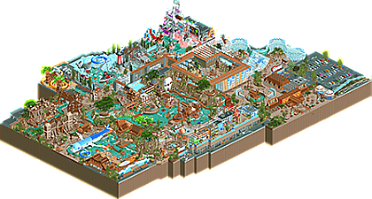
Tropicool is a strange family park where fluffy cats, Che Guevara and Sigmund Freud meet.
I tried to experiment with architecture in a contemporary "French" style: ecological buildings with massive use of wood and "gabion" (rocks with wire mesh) -
1 fan
 Fans of this park
-
 Full-Size Map
-
 Download Park
420
-
 Objects
1
-
 Tags
Tags


![park_3324 [H2H7 R1] Circus Circus & Adventuredome Atlantic City](https://www.nedesigns.com/uploads/parks/3324/aerialt2970.png)
Very colorful, playful and fun, and very lively with great busy waterpark atmosphere. Like your previous parks I like the sculpture work throughout, my personal favorite areas are the pirate ship area and the corner with the rapids ride.
Wow, really creative, joyful and atmospheric work here Babar! Especially loved the entrance area, the architecture that comes right after that and the Totem und Tabu area.
It does feel a bit cramped though, almost if you got a map limitation put upon this map, especially near the edges of the map. Could've used a bit more breathing space I think to zone it out a bit.
And some music would've lifted the atmosphere a bit more, feels it's missing that extra bit in spots.
Great work tho, keep producing this high quality work!
babar tapie please keep making exactly what you want to make. your parks are an absolute delight
wtf babar how do you build so fast? This park is really special, i think it might be your best one yet.The little deails and sculptures are good as always and i also really like the playful colors and atmosphere. The architecture seems to be the thing youre improving the most at the moment, i agree with SF about the entrance area, its pretty fantastic!
Thie biggest negative point i find while watching this park is the map cropping. I think some edges felt a bit rough and it might improve your stuff even more if you give it some more breathing room.
All in all wonderful release. Keep it up!
People have called it above, just more breathing room to admire all the small details you're adding to your parks. It was an absolute joy to look at this, great job, can't see what you'll build next!
Congrats on another release! You're proving to be quite the prolific builder, we joke that you're a shoe-in for H2H glory next season but honestly we don't need to wait that long: you're proving it now.
+ your playful style shines through as brightly as ever, I really see Kumba influence in your work with intense commitment to themed areas, over-the-top sculptures and set pieces, and good-natured humor. You build for peeps enjoyment as much as ours
+ there are too many clever sculptures to name: in one small section of the map I noticed a watermelon bar, palm tree towers (great use of glass roof objects), and an inflatable whale. The kitty corner with the pigeon and her royal highness was another highlight
+/- a common thread in some of your work is ambiguous indoor/outdoor spaces, that's tough to pull off because it requires walls that break up continuity. It's not strictly a negative because you execute well but I do wonder if it deadens parts of the map and hurts immersiveness at times. Even here with walls it's tough to tell where the structure ends and roof begins
Really great stuff, you're making me want to try a water park. This should easily win Gold and could get you parkmaker status
Does this need more community votes? Or is it in accolade voting? I mean Walto's design already has a score and full scale aerial and was released the same day... Not to be rude or anything but come on guys (community and staff)... you're not even trying to hide the nepotism/favoritism here, kinda poor PR (plus some other recent releases still missing full scale aerials compared to Walto's insta-service by the site team). This is a great site with great staff and great content, let's at least try to keep the nepotism down and pretend to care about the not as famous players...
Sorry about opening with that, but I think it had to be said, and I say it out of love for this site and this community. Kinda some tough love, if that makes sense.
Anyway, onto the park. It's really different than what I usually gravitate towards, but I just can't help loving the creative and fun atmosphere here. Absolutely fantastic Babar, love the use of colors here especially. It's so bright and cheery. A little cramped is my only complaint, but the quality of everything there makes up for the crowdedness.
Congratulations on releasing this, and I can't wait to see your next project.
It's in accolade voting.
Don't mistake people's busy schedules or forgetfulness with favoritism. Scoring a park is different than scoring a design, as there's so much more to see and take in.
Personally, I just forgot to pop in my community vote like I normally would, despite spending a good amount of time viewing the park in game.
Also, being that the admins divide up work in different ways - it's only natural that some things are done quicker than others. I wouldn't read too far into it. Especially because Babar has become quite the favorite around the community very quickly. Also keep in mind that our latest spotlight is from a basically unknown member. Favoritism/nepotism doesn't necessarily hold up.
I do think however, that large high quality releases like this one, Amusement Park, DisneyEarth, etc are prioritized over comparatively "low effort" releases - as they should be imo.
This is super charming and fun. What I love about your work is that there is a playful but believable fun factor to it. This feels like something I could visit in reality, but more over the top and ambitious than anywhere that currently exists. I really love that feeling and can't wait to see more from you.
I love water parks in RCT - I think I may have enjoyed it even more if there were more peeps wandering around, but that's a nitpick - your use of scenery to add movement to the pools was a nice touch that gets around the game's limitations.
Great stuff, hope to see more soon.
Very happy to see another submission from you Babar, and in such quick succession! I'm consistently impressed by your ability to build so fast and with strong character, and once again the map is absolutely packed to the brim with ideas. There's so much to pick from, I hardly know where to start. Straight from the get go I think the entrance sets the scene very nicely - love the blue and white posters up on the wall, solid use of those shapes.
The pirate area (sort of merging into the cuban theme too) might be my favourite bit of the map. The shape of the area is well layered and easy to follow, and all the sculptural details like the ship, the skull and the alligator feel really fun and fit the atmosphere perfectly. Though I have to question how anyone gets up to the pool on the roof lol.
The rest of the map is filled with great scenes and details that it's hard to list them all. The skull mounds, the surfboard station roof, the rotating tube pickup/return areas, the little arctic area with the whale and the research ship. And of course the ridiculous cat-themed ride which I adore. I think if I had any issues it would be how restrictive the map feels. Perhaps a bit moot given how spontaneous it seems the building process was, but the map edge cutting right up to some of the rides and areas sort of makes it feels cramped at the edges. I think the cuban street and the banana tree slide felt that pinch the most. Beyond that I don't think I'd change a thing. It's a very eclectic park but so much fun to explore.
Congrats on another wild release, Babar. Finally got time to look around this park.
Totem and Tabu was the true highlight for me. The way the peeps enter that area is fantastic. Also really like the unconventional idea of planes on a water ride.
The skull is amazing. Love it.
The plane and crocodile are very cool too, although perhaps they could have used some refinement in some spots.
Your architecture is excellent in most of the map. I really like the facade going on at the beach/wave pool area. Also, the entrance building is killer. I really love the glass used in the aquarium area too.
As some others have mentioned, it's a bit hard to see if we're inside or outside sometimes. I also think you could work on customizing your station pieces, they feel a bit out of place being the default ones.
To respond to your comment, please don't stop building! I will never get tired of your work ethic and creativity and even though it can take a while for a park to be scored, dont feel bad about it. You have a lot of fans and I am sure they all want to see you keep on keeping on. Keep up the good work you maniac!
congrats on the gold, friend!
man, I love this so much. its so wacky, bright and filled with great ideas, and your rct skill just gets better and better. Its a real breath of fresh air in the current meta of gritty terrain texture lol. so much to choose here, but the standout area is probably the pirate town with the crazy boat parked in the bay. again, I want to be here in real life, and that's all you can ever ask for with a good park