Park / The Histories
-
 20-June 22
- Views 2,961
- Downloads 473
- Fans 7
- Comments 15
-
 78.00%(required: 65%)
 Design

CoasterCreator9 85% In:Cities 85% Terry Inferno 85% saxman1089 80% SSSammy 80% Xtreme97 80% bigshootergill 75% G Force 75% RWE 75% Scoop 75% posix 70% WhosLeon 70% 78.00% -
 Description
The Histories, written in 430 BC by Herodotus, was a record of ancient traditions and cultures in the Classical World. Through small vingnettes, we tell the story of the Ancient Greeks and Persians.
Book 1:
Cyrus the Great defeats Croesus at Sardis by having his troops ascending the rocky acropolis
Book 2:
We travel along the Nile River as we search for it's source. Beware of the scorching heat and crocodiles!
Book 3:
We head East into Asia and fight "gold ants"
Books 5 and 6:
Intro of Athens and the Acropolis and Philippides running from Athens to Sparta
Book 7:
Battle of Salamis where the Greeks defeat the Persians and win the 2nd Persian Wars.
Thank you everyone for viewing. This was a fun project to make. Obviously very inspired by the Seven Liberal Arts and other Classical parks throughout the years of NE. Was inspired to make this build because I've always loved Ancient Greek stuff and dark rides.. so why not combine them? -
7 fans
 Fans of this park
-
 Full-Size Map
-
 Download Park
473
-
 Objects
1
-
 Tags
Tags
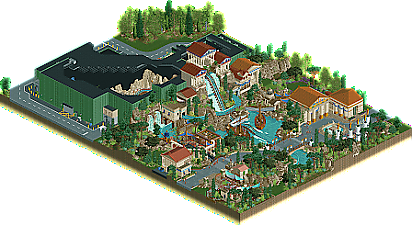
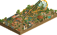
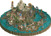
This is fantastic, possibly some of your best work. It feels like a very well developed segment of a larger park. I love that you included indoor details where appropriate, turning this from an average supporting ride into a well made and highly thought out set-piece. Really well done, I don't really have anything negative to say about this.
Legitimately one of my favorite designs in a while. The level of detail throughout is just incredible and shows you're just as adept at CSO as NCSO and an overall fantastic builder.
- The crunch and detailing in the path is so subtle. It's ghost note crunch; you can hardly see it but you can feel it. Honestly, I love it.
- The mixed rockwork works surprisingly well. The Krypton rocks add a nice roundness the Fisch rocks lack.
- The plaza might be my favorite part. Love the juxtaposition between the market tents and the huge statues above and the pavillions for the queue on the other side. Imagine standing in the middle of that plaza; everything around you must feel so imposing.
- And of course the ride. Love how the cutaways represent each book, and all of them are detailed so intricately. That cutaway with the red and blue buildings is just insane; looks like your own take on Rajasthan.
- Imagine the view from that bridge! Has to be awe-inspiring. Most splashdowns I've seen IRL have a bridge as part of the exit rather than the main path so this is a really nice twist on that.
- I think Pants has definitely had a big effect on us in terms of designing backstages just as interesting as the park itself. The tanks and boxes and cars add so much life to an area some would see as an afterthought.
75% from me. While I think it'll take a bigger scale for you to finally earn that green name, I think you're well on your way.
EDIT- You got me dude. Just bumped it up to an 80% because I don't think size should undermine a design this detailed and immersive. PLEASE get that green name
If I can win a design / parkmaker with a meme MS paint park, surely great, well thought-out designs like this one are more than worthy of breaking the 80% mark.
Beautiful work Otter - you continue to impress with each thing you touch, yet still somehow "fly under the radar".
You're mad productive, and consistently great. Keep showing them how it's done!
Love the choice of a water coaster for a design, with dark ride elements too. I especially like the front of the map, the main drop, interaction and the way everything fits together is just about perfect, and the architecture is fantastic too.
Love it! Your stuff is always such a delight, so well composed and vibrant. It somehow manages to feel cozy but grand and very, very "theme park-y". This type of design is obviously right up my alley and I'm sure I'll be coming back to this for inspiration (especially those interiors, yowza!). The rockwork's great, that library tableau with the spinning globe is so fun, love the way those statues balance out the entrance plaza and the way that final drop is layered (although the airtime hill feels a bit small coming after a drop that big).
I only wish that the facade was carried all the way up to the top of the show building. I don't know that I believe the trees would do enough to obscure that green wall from the guest perspective. You put so much care into making everything immersive that it's a shame the rockwork doesn't reach a few tiles higher to hide it.
I gave it an 85%. Really hoping this gets you that green name (though if it were up to me, you would have already gotten it for Marblehead!)
This is really a nice and lovely piece of rct. The beige buildings are beautiful and surrounded by amazing landscaping and foliage. I love how the ride turns around the big drop and than those ships next to the little airtime hill... great composition!
Def 80% work to me!
Now that you mention it, this is a pretty damn big issue IMO. The facade work is fantastic on the front, but it really should've covered the entire show building to really give it away. Make it feel like you're in another world!
OddmentsAlchemyLab Offline
This is really fantastic. It felt educational in the way that it split the dark ride from the park to the infrastructure and utility behind and throughout. I see what they are saying about the height of cover and how it breaks immersion somewhat. But that is pro-level stuff. I'm no pro and would not catch a lot of the detail those artists do. So for me, I enjoyed seeing the "4th wall" work you put in. I have an affinity for mechanical and utility - probably a holdover from s career of designing fire protection systems. I enjoyed flipping back and forth, finding the spots where fantasy and HVAC meet. Small and digestible, this is one of my personal favorites.
this is so clean. if there were a larger release at the same quality and thoughtfulness and cleanness as this it would be a 100 from me. it strikes the perfect balance between detail and clarity.
This is marvelous on all accounts. Your NCSO work has helped you break away from the grid and allow your resourcefulness to shine, and this has in turn allowed you to reenter the CS medium with a sense of natural placement unhindered by gridlines and right angles. Everything on this map exists so harmoniously with everything else, and that air of "RCT compromise" that exists in the development phase of a budding Parkmaker has disappeared. Regardless of where this scores (and what some would say are holding this particular Design back), what you've created here shouts at the top of its lungs that you the builder have crossed the green threshold.
Yes, the indoor parts are lovely and the concept is very well executed, but...
That right there is top-tier ride design + fakerockscaping. So crunchy, so curvy, and yet, so very clean. It is the purest Fisch-Krypton union of rockery I've seen yet, and each plant and water feature fits in right as it should. Truly inspiring landscaping.
I shall echo what has been said by others already... build something full-size of this quality, and it shall be an era-defining Spotlight.
Congrats on the design Otter! Shame it didn't clear 80% but to come so close on such a small map speaks to the high quality you've managed here.
+ love the little vignettes you've made visible, they each feel distinct and nicely detailed without ever being too much
+ adore the pillars with Athens tents and the walkway bridge
+ that drop is an absolute showstopper, it would stand on its own as the highlight of a much larger park. Really outstanding stuff
+ this to me almost looks like a combination of 7 Liberal Arts and Lemuria, I appreciate the commitment to realism to include backstage sections and give context to the dark ride sections
[] That decision to include realistic details kind of leaves me wanting more to see how this all fits into a larger park, pure theming may have mitigated that some but I recognize then that indoor sections wouldn't make much sense
+/- the only real "negative" is that it's small, that explains the score but honestly this will carry influence on similarly-themed parks for quite a while
Really strong work, love to see your continued development as a CSO player, you've got a really natural classic style
Time for a review for one of my favourite builders. First impression: smaller than I thought it would be. Loving the vibe though.
+The way the pillars frame the square/fountain is gorgeous.
+Landscaping in general is really good
+colours work really well together. Good use of contrasting green and red.
+Ride design. The drop is wonderful and the way it dives under the other section of the ride is great.
+Indoor sections are great. The scenes are wonderful but at the same time the small area in which they are present make them feel messy.
-Station looks a little messy. Lots of different blocks in such a small area.
-I dont think the diagonal roof and the blacktile is doing you much favour, gives the entire thing a bit of a messy look.
The storytelling here really drives me to explore every little detail. Although it's a small park, it carries lots of content. Your submissions never disappoint.
i imagine you're disappointed for missing 80, but I think its a testament to the quality here that such a small ride got such a high score. its a really wonderfully constructed slice of a park, and i'm left wanting a full size one from you. i feel like i just ate one little taco or something. the parts of the ride which dip out from the building and go around the main drop are the clear highlight from me. great work