Park / Snake City Mall
-
 10-June 22
- Views 2,017
- Downloads 341
- Fans 1
- Comments 9
-
 67.00%(required: 60%)
 Silver

G Force 75% SSSammy 75% Jaguar 70% Terry Inferno 70% Xtreme97 70% bigshootergill 65% CoasterCreator9 65% ottersalad 65% saxman1089 65% Scoop 65% posix 60% RWE 55% 67.00% -
 Description
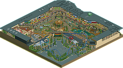
This park was a mad dash built in a month! Indoor mall type park for the DKMP transport ride contest. Pretty self explanatory park full of fun details and references.
-
1 fan
 Fans of this park
-
 Full-Size Map
-
 Download Park
341
-
 Objects
1
-
 Tags
Tags

![park_3324 [H2H7 R1] Circus Circus & Adventuredome Atlantic City](https://www.nedesigns.com/uploads/parks/3324/aerialt2970.png)


![park_3198 [MM2014 R2] Hathor's Realm](https://www.nedesigns.com/uploads/parks/3198/aerialt2802.png)

![park_4134 [H2H8 R5] Romon U Park](https://www.nedesigns.com/uploads/parks/4134/aerialt3926.png)
Amazing that this was built in a month, love all the little shopping mall details and the storefronts. Overall It's well laid out and a lot of fun to explore.
Really cool. Having grown up with a large mall amusement park not far from my home, this was fun to see. I really enjoyed the main jungle themed section; there was a lot to see and a lot of fun interaction between the rides.
I thought the NASA coaster was a bit strangely bare by comparison. The same could be said for some of the shopping areas, but it's pretty clear where the focus was.
Very nice work, and something I wouldn't mind seeing more of in the future.
Lovely work. Really impressed on how lively it all felt. Lot of attention to detail on the parking lot, which was a pleasant surprise. I think maybe a tad more detail with the shops would've been fun, but I understand the limitations of ncso.
American Thunder! Was great, and was definitely a highlight for me, as well as the spinner coaster that went through some cute little themed areas. The ride design (minus NASA) was great overall.
The Bimbo Bar facade was neat, as was the lower level kiosks.
Really fun to look through and explore.. great work guys!
There is something very realistic and I really like the architecture as a whole, especially La Vibora, I find the station building excellent in its simplicity and execution. On the negative side, it lacks vitality and activity, especially in the area around the carousel.
But overall it's a nice map, congratulations!
AJ you've quickly become one of the best NCSO players on the site, this is quite nice! Doing detailed work like this in NCSO is no small feat and you've accomplished it very well, two things that stand out to me:
Amount of greenery in side the interiors... I feel it might have been a little too much, sorta blurs the line a bit too far on what is inside and outside the mall. If it was more clear it probably would have been even stronger (think Gee's Lenox)
Second is the amount of tan, it appears you really just swapped grey for tans as your base colors here. Perhaps smart but I wish you would of varied it up a little more between the two just to improve readability. Some grey isn't always a bad thing!
Overall a ton of creativity and very impressive, and one of the more memorable DKMP/NCSO releases in a while I reckon!
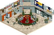
Great map AJ and Mama, not sure what extent of it is meant to be indoors but I think that's ok, got a very charming atmosphere throughout. A lot of great little kiosks and details that add a lot of character and charm to the park, and skilfully made. Things like the cactus and snake floor murals, also loved the escalators and the Dillard's signage, great work on the shop floor. The rides are very nicely integrated and well themed too.
This is the style of NCSO at which I can marvel for hours... realistic shapes, resourceful object use, and maximum detail without sacrificing aesthetics. It breaks free from the boxiness of traditional, "safe" NCSO and embraces every curve, diagonal and fractional aspect of Sawyer's original vision. So many wonderful techniques have been harnessed here, and your artistic eye(s) really shine with this glorious piece of construction.
You also convincingly made it multi-level, which satisfies my thirst for isometric verticality in a way that I should not discuss with anyone other than my therapist.
Absolutely loving the curvy steel roofs and the thatch all around the central courtyard. Every track roof here is beautiful, and it serves as a reminder that those who do not find track roofs aesthetically pleasing in general simply do not know what they're talking about. Trackitecture here is top notch, and nothing seems forced or out of place.
With all the architectural innovation here, the one portion that did not match the quality of the rest of the map was the Dillard's exterior wall portion, which seems as though it may have been rushed since this was a contest map. Dillard'ses (?) are quite tan, but this one would have benefited from a few more deliberate aesthetic choices, such as some tan glass walls in some areas to give it a more "the mall is a sophisticated place" look.
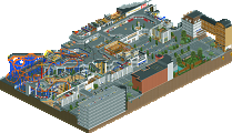
I've got no complaints about the ride design... it is clearly very well thought out and never seems cramped even though it is meant to exist in a small, enclosed space. American Thunder is certainly a lovely "Gatekeeper" for the establishment (and my god, that parking lot is hotter than most CS lots), but the real charm is the chemistry between the Anaconda and the Orangutan. Let your mind do with that what it will. The trains will occasionally traverse the curves in sync with one another, and that's one of those little miracles that you just don't see on the Discovery Channel.
I want to see full-scale, deadline-free NCSO maps from both of you, and I will not take no for an answer.
I quite liked this and thought it was closer to 80% than 60%. Can't believe you managed to pump this out in just one month
+ Dillard's section was a highlight for me, loved the custom elevator (super clever!) and I thought some of the shop racks were really effective
+ carousel section was another: loved the busy-ness of the scene with two levels, multiple ride snippets visible at once. All the different storefronts and path details were great (those bobsled kiosks ++)
+ macro is really successful, I love the immediate contrast between indoor and outdoor that you achieved by associating brown and gray almost exclusively to their specific parts of the map
+ there are times when the interior almost feels like a sea of brown but I really admire the different ways you've broken up the path, the German flags and green path sections are great additions
- I didn't like the big blue coaster very much, it made the map feel a bit claustrophobic to me, I actually deleted it as a test and it gave a lot more breathing room. That's probably specific to me because I try to delete main coasters on every map I work on
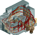
+ Anaconda was great, I love the track sections that emerge above the roof and the whole area comes together really well. It's all very busy but clear
Very very cool, stuff like this makes me appreciate the ingenuity required to be successful with NCSO
this is really fun, glad i didnt overlook it. a really charming and cozy atmosphere with some fun ride design to go along... this park has a better lineup than a small market cedar fair park! I especially loved the spinner darkride/coaster---that would be really fun irl