Park / Mario Kart 7 - Neo Bowser City
-
 02-May 22
- Views 3,064
- Downloads 344
- Fans 0
- Comments 4
-
 56.00%(required: 65%)
 Design Submission

Terry Inferno 65% bigshootergill 60% G Force 60% In:Cities 60% Xtreme97 60% Cocoa 55% Liampie 55% ottersalad 55% Scoop 55% posix 50% RWE 50% saxman1089 50% 56.00% -
 Description
No, I'm not back.
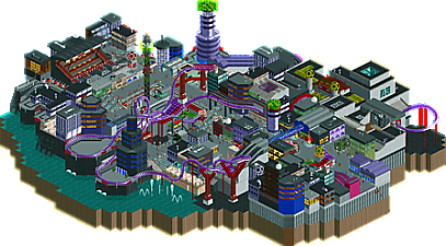
Welcome to Neo Bowser City, a small build heavily inspired by the Mario Kart 7 track of the same name!
NCSO Design built for the RE 1UP contest. Has WW/TT objects and custom music. -
 No fans of this park
-
 Download Park
344
-
 Objects
1
-
 Tags
Tags

I haven't played Mario Kart, but this map definitely seems to capture the video game feel better. The music helps obviously, but still. Liking how every building and thing is unique, but comes together as a whole well. If I may make one suggestion, I thought the viewing angles weren't the best. There was no good angle for the go karts for example, some random shacks were blocking the view on the track behind where the seatings are.
Looks like a ton of fun to have built.
NCSO lends itself quite well to cyberpunk, and this map successfully captures the colorful, futuristic aesthetic even for viewers who may not be entirely familiar with the Mario Kart track that inspired it. While the WW/TT objects do receive a bad rap in this community for being jarring, you've managed to blend them in seamlessly here; not one of them detracts from the viewing experience (including the New York flat roof pieces, which I usually advise against). This coaster would have been a hit in RCTgo's Build It competition back in the day, and seeing maps like these cause me to wish it were still going.
this is quite a good attempt at a future theme in ncso, i find they often come out a bit square and samey, but you did a good job. ride is a bit hard to follow, but i quite like the waterfront construction. nice work
I like the interaction moment in the outdoor sections of the coaster. The barrel rolls and the tunnel launch in particular. The indoor sections are too hidden to add much.
I think you have a good thing going with the black-grey-purple color scheme. The soft greens and yellows clash a bit. This may be application to use the brightest green and yellows for a cyberpunk look. Maybe even hot pink.