Park / The Silverhand Block
-
 10-June 22
- Views 1,573
- Downloads 367
- Fans 0
- Comments 6
-

-
 56.50%(required: 65%)
 Design Submission

CoasterCreator9 65% ottersalad 65% Terry Inferno 65% Liampie 60% chorkiel 55% In:Cities 55% Scoop 55% wheres_walto 55% Xtreme97 55% Magnus 50% RWE 50% posix 40% 56.50% -
 Description
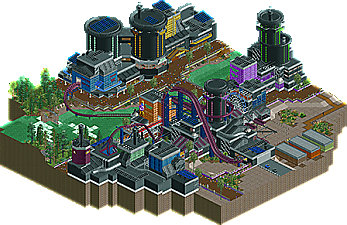
Welcome to the Silverhand Block, the more infamous section of Night City. It is home of some of the biggest MegaCorps to exist.
This is my first pure NCSO build, but with a custom palette put in. I have been very busy this last year but I put this together over the last couple months when I find time to build. Though it would be fun to experiment with a different theme that I don't see super often in RCT2.
Built on the new save format for OpenRCT2. -
 No fans of this park
-
 Download Park
367
-
 Objects
1
-
 Tags
Tags
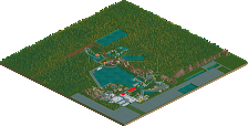
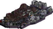
Fun interpretation of the theme, and a solid layout that interacts well with said theme. There's a lot of cool little stuff too, I like the atmosphere quite a bit, and I'm glad you didn't go for the default "make everything darker" technique with the palette.
Wow, really enjoyed this. The main coaster, I assume Assault on Arasaka, was nice.. really well supported and polished. The supporting rides were great as well. Archy felt a bit simple at times, but it didn't need to be super detailed. Look forward to seeing what you make next.
Don't quite know what this is referencing but it's a nice map regardless. The colour choices stand out well I think, good contrasts and blocking. The coaster is fairly standard dive coaster elements but there's some nice interaction with the rest of the map.
A lot of real NCSO skill on display here. The building shapes are complex enough to be interesting. The layout and interaction are solid.
The theme is well established in the vicinity of the coaster but really drops off in the outskirts. The shipping containers and (nice) foliage seem to fill space more than fit the theme. I'm not familiar with Cyberpunk 2077 so I could be missing the references.
this is a pretty solid piece of ncso scifi. the layout is a quality diver layout and I like the trick of putting glass over the skyscraper walls. palette is good and vibe is good!
This little NCSO gem deserves more attention. Strong theme commitment executed cleanly with no WW/TT objects... I don't know how this took five months just to make it to the panel.
The architectural shaping is the high point of this map, and not just at the individual level; all of the buildings come together to create a scene that is as pleasing to view from a distance as it is up close. The palette takes a bit of acclimating, but your use of color gives the scene a nice sense of depth. It is alive, just as a city should be.
It is also impressive that you created something highly detailed while also managing to avoid most of the NCSO pitfalls. Trackitecture is clean, and it melds seamlessly with the scenery pieces for the most part. There are some patches that clip that could have been cleaned up with a final pass through, and the steel latticework walls could have been dialed down about 20%, but it doesn't ring of compromise the way many smaller NCSO maps have lately. You've brought your vision to life with the Sawyer objects alone, and anyone who can do that shall go far if they so choose.
Deserts are one of the trickiest landscapes to build with this approach, however, as there are very few vanilla objects that lend themselves well to the textural nuances that encourage sand to sing. The deserty portion is the one area of the map I truly believe you could have taken further; your foliage patches in the sand are lovely, and they would have been even more powerful had you used them as a liaison to shape the sand in areas such as the transfer track and the paths near the Silverhand Ghost sign. A bit of darker sand and a few more ruins would have further eased some of these more abrupt transitions.
I do hope you continue building lively NCSO pieces like this one, as is it something of a niche style these days, and it is becoming rarer to see this branch of NCSO without the looming presence of the WW/TT objects and overuse of the raptor track, two more pitfalls you successfully avoided here. Those of us who love to play with the tile inspector but have much less time or inspiration to do so must build vicariously through maps like these, so we are always grateful to those of you who take the time to finish projects like these! I'm looking forward to the next thing you create, even if I have to wait a little longer for it.
(I don't know what an "NC Officer" is, but seeing as you have three of them, you missed the opportunity of a lifetime to replace the space in one of their names with an "S")