Park / Stream of Conscious
-
 02-May 22
- Views 2,413
- Downloads 396
- Fans 0
- Comments 9
-
 50.50%(required: 50%)
 Bronze

Jaguar 65% Xtreme97 60% bigshootergill 55% Cocoa 55% posix 55% CoasterCreator9 50% In:Cities 50% saxman1089 50% Terry Inferno 50% Liampie 40% RWE 40% Scoop 30% 50.50% -
 Description
A park that was just made on a whim with whatever came to mind. Its cramped and a bit all over the place but I like it! For openrct2
Its mostly NCSO with a tiny sprinkling of custom scenery, but it uses the expansion packs too. -
 No fans of this park
-
 Full-Size Map
-
 Download Park
396
-
 Objects
1
-
 Tags
Tags
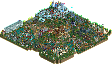
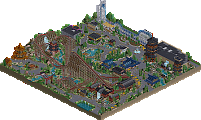
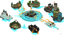
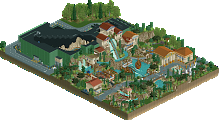
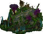
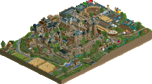
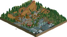
A lot of fun stuff in this park, and a lot of experimenting. My favorite thing is the cable coaster, that's such an obscure ride to build.
there is certainly a lot going on here. and so many rides with music that i can't even hear myself think over the din.
favorite bits- tesla coil ride, center castle, big christmas tree, and the scifi bit in the corner with the rusty factory out front.
this was is such a cute and fun park to look through, it looks like you had a ton of fun making it! I love all the crazy coasters, i like the tiny green coaster called gravity the most! looks painful haha. This park is really packed with a ton of great stuff and is a great showcase of what you can do with the game. Super fun park !
Stargates, turbine-powered cable coaster, pyramids. This place is a trip, and I'm on for the ride. A lot of really cool moments in here. You can improve the jumble in whatever you do next, while still keeping & refining your own funky style.
Imo this is a pretty underrated park... it's like the RCT equivalent of a sketchbook... just different patches of very different styles that could've been made years apart. Certain areas (the boardwalk) have a very LL feel to them; others (the castle behind it) have that style a lot of Youtube builders like Royr's old parks had, and then there's places like the snow or haunted mansion section that are obviously DKMP inspired.
Collectively, it looks like a mess, and some of the sections (that glass building with the heartline coaster) are of questionable quality. However, others are honestly very well done... that turbine powered coaster for instance is awesome
Thanks for sharing this; while it's far from the most cohesive park, it's very reminiscent of those sprawling megaparks of old, and it was a lot of fun to view.
This was a difficult one to score, as it does not possess the same level of structure as would most accolade-winning parks, which the title suggests, and thus can come off as relatively chaotic. However, much of what is there displays a winning combination of artistic sense and technical proficiency; the borderline Bronze score speaks more to the difference between the best and worst areas of this park than it does in regards to the highest quality visible here. The Tesla coil-complex is certainly the high point, but the North Pole with the reindeer scene and Egypt with the Eye of Horus and your take on a functioning stargate also display your creative potential. For every one of these cleverly themed areas that thrives within this park, however, there also exists an area that's just sort of... there. Curldive and the alliterative water coaster near it seem to both seem to exist in a sort of architectural limbo consisting of object, shape and color choices that do not really fit together. As these rides are relatively close to the entrance, it's possible that this was just built earlier than everything else with your own abilities improving significantly over the course of this park.
A few notes for your next big park, which I hope to see sometime soon:
- Buildings appear more chaotic when too many different wall textures are mixed in a single structure. Architecture will appear much cleaner when the wall choices deliberately fit the building rather than to fulfill some sort of textural requirement.
- Underground sections of rides are best used sparingly, as most of the value a viewer receives from a ride is from what we can see. Most of The Aqueduct seems to be straight track traveling through a black void, and I almost missed Barnyard Bale Bash entirely. When building a ride that is mostly underground, cutaway view can be used to build a scene so that we may see what the riders experience.
- Foliage is more powerful when it takes more deliberate shapes. Even though Chris Sawyer's own builds often use a more randomized approach (usually just to fill in gaps), trees and grass can be harnessed to create shapes and set scenes.
I am pleased that this won an accolade even if it just squeaked through into Bronze territory ("Squeaky Bronze" as I think of it), and with some technical refinements, I am certain you will hear the harmonious sounds of more precious metals.
I had the same thought as Jaguar. Opening the park is like looking at a page full of doodles you made while on the phone. Picking your best ideas to refine and give prominence would yield a more compete picture.
Congratulations on filling such a large park which is no small feat on its own.
Wow this was a trip, it's very much the type of park I would have made when I was younger without access to much custom scenery. Massive, sprawling, dense, clearly the product of years and years (I hope) of buildup.
I don't really think it's something that's meant to be judged by NE standards, there's a much higher emphasis on experimentation with more willing disregard for composition and cohesion. And that's okay, this is a fascinating way to play the game that I hope hasn't been completely lost in me.
The tips given above are valid if you want to pursue the "NE style", but I get the sense that you had a blast building this in a very casual way so don't feel pressured to change
thank you! yeah they're great tips but dooont think i'm gonna follow that tbh. its an all over the place design with a buncha hyperfocus details and i'd like to equate this game still to fun vs approval from a website. plus tbh i prefer semi-realistic approaches with parks anywho!