Park / The Duck Festival of Trifouilly-les-Oies
-
 02-May 22
- Views 3,559
- Downloads 498
- Fans 1
- Comments 13
-
-
 74.50%(required: 70%)
 Gold
Gold

SSSammy 90% Jappy 80% RWE 80% Cocoa 75% In:Cities 75% inthemanual 75% posix 75% Xtreme97 75% G Force 70% Scoop 70% Terry Inferno 70% ottersalad 65% 74.50% -
 Description
The Duck Festival is a medieval celebration of the famous Duke of Brittany Riwallon Ier, better know as Riwallon the duck. This festival takes place during the last weekend of August at the castle of Trifouilly-les-Oies, next to Rennes. It was an important fortress which protected the duchy of Brittany against the kingdom of France. The site has been fitted out with 2 museums: the medieval history museum to the north and the Benedictine convent inside the castle. This last project has been a source of much controversy for its audacious architectural project. The site is operated by the DreamLand Company which would like to eventually make it a tourist site of primary importance, with the risk of degrading a thousand-year-old place which was once occupied by the Romans.
This map is inspired by the castles and landscapes of the Dordogne, I was also very inspired by 2 towns in my region: Dinan and Vitré. I took a lot of pleasure in the realization of this map, trying to give a great place to the landscapes and the general atmosphere. Hope you hear the sound of lute and crickets while viewing this map! -
1 fan
 Fans of this park
-
 Full-Size Map
-
 Download Park
498
-
 Objects
1
-
 Tags
Tags
![park_3338 [H2H7 R2] World's Fair](https://www.nedesigns.com/uploads/parks/3338/aerialt3037.png)
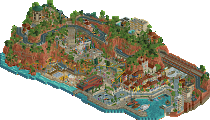
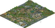
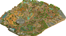
This is a pretty cool project! I am a fan of most of what is included on the map and I think overall this is very solid work. architecturally, its a mix of really good and lackluster for me. I really love a lot of what is here but there are also a few areas that could definitely use refinement. I wasn't really a fan of the half diagonal buildings you included. It seemed to me that they were placed to create an off grid illusion but the city is very much composed to be on grid so they ended up looking forced and under detailed compared to everything else IMO. On the other hand, a lot of the other buildings included were awesome and the fort/castle itself was pretty good also.
This is my favorite area of the whole park I think
The landscaping was also really cool throughout the whole park, I like the color details you added to make the rockwork really come to life. The foliage was kind of hit or miss for me. Some areas were great and others missed the mark.
For example, this area looks very spammy and unnatural compared to some of the other great foliage moments in this park.
As for the festival itself, I was really impressed with a lot of the cool details such as the knights head and the fake water on the boat ride. The custom vehicles were also really well done, although it is a little disorienting scale-wise to have a huge custom firetruck placed right next to the custom car objects. I was also a huge fan of the fallen leaves placed under trees throughout the park. The curved river also turned out great as well as the fun little miniature show scene.
Overall, I really enjoyed looking through this project! You are clearly a skilled player and the result is something to be proud of.
If I were on the panel I think I would rate this park 65%-70%. A very solid silver
This map is amazing. Parkmaker quality in my opinion in some corners. You are developing a very nice style with a good mixture of macro and micro skills. I can definitely see you took some inspiration from some H2H parks looking at this, would have made a great park in H2H9!
Reminding me of your first very busy parks i expected to see more stuff happening in the castle, but that shouldnt be a negative point, since its definitely working like this too and youve proved over here that you can create something great also when being more focused on the architecture than on the little things. But this also still has a lot of little things tho elsewhere, i will definitely come back to try to find all.
I agree with BarnNID about the scaling issue here and there, i also think some landscaping and foliage edges were a bit rough. But these are relatively small points for me since the overall feeling of the park still worked.
Overall congrats to another amazing release. I wish i would have your talent and speed. Keep it up!
Great stuff Babar. Really great architecture on display here. The main castle was quite impressive and one of the best castles I can recall in RCT.
I think I agree with Barnid as well that some of the scaling between buildings was off. You seem to fluctuate between how many units you use per floor of a building. But, I think in most cases it seemed appropriate with window/shutter/door object usage.
The carnival was cute and simple with some great set pieces that we've come to expect from you! I think what was missing was some hacked flats and more movement. You have a lot of rides/vehicles that are stopped or closed. Hope you figure out how to get more stuff peepable in the future.
Overall though this was quite a showing. I know I'll come back to this frequently for inspiration.
A very fun to explore map, and your style is very apparent. Lively, lots of small details and scenes.
Babar Tapie, keep up the fantastic work. This reminds me of some of my visions, but never had the skill to execute them as you have. Perhaps consider collaborating with players who are good at ride design - with some great rides, there is absolutely no reason why you couldn't bag a spotlight.
Beautiful atmosphere here. The architectural work and the small details are certainly the highlights of the map as they are on your others, but your abilities in natural elements are also improving noticeably. Farm scenes have been popping up more frequently in recent years, and you've incorporated them well here as a tool to contrast the greener surroundings. Every little scene here tells part of the story, and this is a quality that is strongly prized especially in H2H maps and the like. I agree with others that the map would benefit from more interactive elements, especially towards the center where it is not always clear what purpose something serves (e.g., the modern-looking glass structure in the middle of the castle looks like it could be a Metro station, but a clickable element would confirm it), though the worldbuilding here is still very strong even without that layer.
The knight helmet, the archery sign, and the Gene Shalit kiosk are creations that would not be out of place at Cook County Fair, one of the strongest micro-oriented maps we've seen.
There is still work to be done in the landscaping department, and this is the area that is holding this map back from being top-tier quality for me. The cliffs seem somewhat manufactured, as though they were built to fit the castle rather than the other way around. Fisch rocks are notoriously difficult to get right, and only a few parks so far have managed to use them in a way that appears natural--I strongly recommend looking at Villerouge, Madinat and Gladsheim for natural shape inspiration). The grass clusters around the edges are nice, but they too could use a bit more focus.
Here the grass is growing in perfectly-spaced square patches, when it would benefit from a more natural shape.
Still, your landscaping is kilometers ahead of your first park, so with the speed at which you're learning these techniques, I have no doubt your next release will include Spotlight-quality foliage work. In the meantime, keep exploring high-scoring parks that emphasize foliage and landscaping; when your abilities in these realms are as strong as those you already possess in architecture and micro-detailing, I am certain we shall be reading your name in a different color. And with your astronomical progress, it will likely not be too long before you accomplish this!
This was so fun to look through. Quite a unique piece of RCT- love that there's no big ride! The castle is so good, the tour stuff is so good. My absolute favorite is the little ghost moment in the corner. The farm stuff at the bottom is so good. Love farms!! The wheat field is great. I really like the juxtaposition of modern facades and the old castle stuff. The little fair at the top is adorable. The swinging ship is fantastic!
This is such a cute release. greatttttt stuff!
Another really impressive release from you. So much content, so many ideas, so much flesh. A pretty maximalist style, but infused with love and passion for the source material. It's amazing to see what comes out of a player with such positive circumstances.
To move to the next level, I challenge you to experiment aesthetically. I want to see darker colours instead of only bright ones, some parts that aren't micro-detailed but still work in the overall picture, some negative space, something ambiguous or slightly dreamy. I know this isn't your approach, but that's perhaps why it's missing a bit.
you again? how are you this prolific??
this is so fun, again. A really great castle at the centrepiece---feels super realistic, especially with the modern additions. the whole setting is full of atmosphere and charm, and the old-fashioned fairground is great. really takes me back to renfests I used to go to as a kid. there is once again an abundance of little details, sculptures, and silly bits all over. Love the energy and enthusiasm here
congratulation on the gold - keep up the great work
Everything you build is full of atmosphere and enjoyable details. You already excel at presenting a cohesive vision and filling your parks with fun details.
I agree with Terry that the rockwork and landscaping could be improved. They are both a good opportunity to break the grid.
Keep building what you enjoy! I didn't expect it, but these parks with little to no rides are still very pleasant to look over.