Park / The Child's Dream
-
 27-March 22
- Views 3,101
- Downloads 553
- Fans 5
- Comments 18
-

-
5 fans
 Fans of this park
-
 Full-Size Map
-
 Download Park
553
-
 Objects
1
-
 Tags
Tags

![park_3338 [H2H7 R2] World's Fair](https://www.nedesigns.com/uploads/parks/3338/aerialt3037.png)

It's so cool to see this finished and released! And considering the core of the park is six years old, this holds up really well. Says a lot about how it could've fared in the H2H7 final.
Is this what you had in mind six years ago? The landscaping is quite different!
Congrats on finishing
Awesome to see this released. It has been so many years since ive seen the beginning of this. All the unusual objects, the colors and the architecture are very awesome. Im not missing a coaster or something in here, there is so much movement already in here!
Might sound funny but the only complaint i might have about this is the narrative. I mean i get the story, but i would love some more explanation here and there. Would love to hear more about what your thoughts on some stuff was.
All in all a lovely submission and a great start to get ready for the birthday celebration!
In the end the park itself carries the narrative in a way. It began when I was a college student and in many ways still a kid, it ended up being more than I could handle at the tail end of H2H7 and it went painfully unfinished. It was only after the innovations of OpenRCT and a long skill buildup period that I was able to revive and complete the park in a new vision, with greater patience as I've gotten older. So for me the park represents redemption and perseverance combined with stylistic themes of imagination and experimentation
Pretty wild to see this finished. It's very beautiful, almost more of a work of art than an RCT park. As Liam said, this holds up incredibly well - though I do think there's a ton of new objects and techniques made possible over the past few years that helped out a lot. I do appreciate that it's not trying to be something it isn't; good on you for not shoehorning in a roller coaster or something like that. It does make it a bit hard for me to pin down a score I'd choose for it, but I can't emphasize enough how much I think it's fitting that it's so nontraditional.
I do really hate to be the first to comment on it; but the palette is a bit hard on the eyes for my personal tastes. It isn't unfitting or anything, but a lot of the bright colors are just uncomfortable for me to look at. Almost certainly a personal taste type deal. It was also a little strange that the park was just so...quiet. I appreciated the inclusion of a music file within the zip, but for such an atmospheric entry there was just so much silence in-game.
It's good to see this finally finished. I think the point of the park as it is now is that the park itself is the narrative. I'd love to see something in this style as a full-size park with rides planned out from the beginning - I think that would be pretty fantastic. A complex high fantasy theme park would be really fun to see.
733737 Fan Offline
this is a really great park, I think it's one of my favorites
Great concept.
This park was really interesting and certainly fits the theme. It's nice to see a park so outside of the norm. I hope to see more stuff like this in the future on the site!
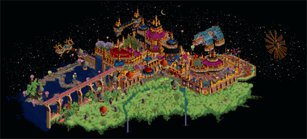
I was a big fan of the foliage, I've always loved the look of that tall grass and depot water brush spam. The low grass object also worked really well the way you used it to kind of trail off into the void. The whole grassy scene looked very serene. There was also a lot of really clever object use (Sinking the trees into the ground to add texture for example) in there which I appreciated.
The blue grid area (I'm not sure what to call it haha) was also great. I loved the sprawling flowers and all the little particle effects to add that extra bit of detail.
The structure itself was also super dreamy and well put together. I loved all the balloons and entertainers walking around. The whole scene was kind of hauntingly beautiful to me as there was no one there to enjoy the party.
Speaking of no one being there, I was impressed with the amount of movement you achieved with no peeps in the park at all. I loved all of the balloons floating around and the little rainbow particle custom train zooming around the park. Seriously good stuff.
I don't really have any complaints about the park but it does feel like its missing something else, maybe a coaster to kind of tie everything together. I would probably rate this park a 70%-75% if I were on the panel.
A design submission? What??
I'm just gonna cut to the chase right now; this is one of my favorite RCT2 releases in a good long while. I adore this level of fantasy and the way we can use a 20 year old theme park management game to create this level of art and the evocative atmospheres that come with it. It's not often that I've seen this achieved, and only a select few users here have really hit that spot. It's safe to say that with this release, you join them.
What surprised me about this release was how much motion there was. Everything felt so vibrant and alive, even outside of the crazy amount of vehicles flying overhead. The use of effects was astounding, but I think my favorite one you implemented is the Gladsheim blizzard effect painted green over the meadow. It does the job of a windswept plain really well, although I think the object comes off a bit too dark. The snow/rain effects on the water, the waterfalls falling into the mist, and the leaves falling everywhere really upped the atmosphere too. And of course nothing would sell the Ghibli-esque atmosphere like some Joe Hisaishi. Perfect music choice.
Outside of that, this is just really well built. The meadow is perhaps the best executed I've seen in RCT2, and it really reminds me a lot of Hoobaroo's work (if the whole thing doesn't already, let's be real). I also love the way it drifts off into space using the 1K nets; a classic fantasy trick. The main city is gorgeous, and I'm a big fan of the use of the Argonath objects for a surreal effect. There's this strange quality to those objects which works perfectly for this setting. I'm also a big fan of how you used the Madinat carpets on the sides of the bridge for a painted look. The garden is a real highlight for me, and I love the mandalas and how the flowers frame them. I have been dying to figure out how to get those big glass arches to look good for a while, so thanks for indirectly showing me how! In fact, I'm probably stealing half of this for reference in my own work. They're gonna ask where Walto is while Gustav's in prison for grand theft.
The one flaw about this park is one that comes with any densely-packed fantasy work; readability. The area near the windmill still feels a bit awkward to get my eyes around with all the purple worked into the path. Taking away the purple snow/leaf covering objects and throwing in some Liampie rock blocks colored purple and tan amidst the LotR paths could achieve the same effect while not feeling as cluttered. Some complimented the restraint to not shoehorn in a coaster, and this park does feel very natural without one. However, I am missing Dragon from the original Fantasy Park With Strong Narrative a bit, and I feel this could have had the potential for a coaster that subtly works its way into its surrounding and swoops all around without intruding. A hard feat to pull off, but I believe it could be done.
On the topic of Fantasy Park With Strong Narrative, I find it funny that there really is no narrative this time around. There isn't a single name more than a letter long to even hint at what anything in this dream is called and there isn't a readme to go along with it. It actually works; dreams often come with no context or explanation leaving you to connect the dots when you wake up. With all that said, is the strong narrative of this park the one we create ourselves? Whoooooaaaaa.
Fantasy Park With Strong Narrative has always been intriguing to me, with so much potential that couldn't be achieved. I never thought you'd come to finish it and instead just leave it as a relic of H2H7. Even if it's not how you originally perceived it, this is legitimately some of the most beautiful and spellbinding RCT I have ever seen. It takes a real creative mind to be able to craft worlds like this, and the last person I would expect to pull this off would be the dude who just released Ohio Stadium earlier. You've mastered realism and fantasy and made one of the best comebacks of anyone on this site. Solid 85% from me, fantastic work.
Personally, I think you're too hung up on the label. It's just a park, evaluate it by how much you like it, they're all made up categories anyways
this feels very magical and pleasant, especially with that music.
the flowing grass is genious.
I immediately started wondering if it's based on some movie/game/book, because it feels like it's own universe
Really lovely stuff. I enjoyed exploring the architecture here. Very joyful and dreamy of an experience. Foliage was really nice on the lower level, and it contrasted the gold everywhere in the buildings. It was very simple, but the floating blue glass arch thing was nice. Love all the balloons everywhere.
Lots of movement which helped add life, especially considering there were no peeps. Not a complaint, I just enjoyed all the action!
Congrats on this release Walto! I know how rewarding it can be to get something incomplete across the finish line, and from what we started I think you've made a far better end product that what I had ever envisioned. The artistic and surrealistic direction you've pushed this in and the way you've experimented with shape / color / form is incredible. As someone who has always loved artsy rct, this hits the sweet spot for me.
I'm sure some people will complain things are busy, but I disagree. The maximalism of how you've stylized this creation has created dozens of really beautiful, interesting compositions. It makes the park a joy to explore and find new and interesting things, not just in what you've made but how it interacts with the things around it. I think the two landscapes you've made (the grasses and the flowers over the water) are particularly successful, and how they interact with the built forms is beautiful. The grasses in particular and how you've created waves of glittering across the top is fantastic and definitely could have a ton of cool other applications. I think you've also been really successful in how you've created so many different gradients throughout the map. That's something I've become obsessed with in rct, so it was a joy to see so many gradients here. I also adore the red gothic structure detail, can't get enough of that against the black background.
I do think the park could use some ride to act as a thru line. There's plenty of movement, but something less textured and a bit more track might help guide the viewer thru the spaces. Even just turning the existing aurora ride's track into single rail might help provide that visually. I can't say for sure, the style and aesthetic of this park is so unique it is hard to critique without a lot of experimenting, but just a thought I had.
Overall, a really gorgeous and stimulating creation, something that forced me to spend more time with it and really consider how things came together. I'm so excited to see it finished and to see you continuing to step into new territory with such success. Sorry I wasn't able to help out more with this, but hopefully we'll get a chance team up on something again soon!
Great architecture, colors and use of effects. The meadow is fantastically done as well. Great stuff.
And going from a recreation of a real life stadium to this in back to back releases shows amazing talent and ability to change styles.
You've made some bold choices with this submission and I think they've paid off. The decisions to omit a ride and to keep peeps out really go against the grain, but absolutely fit the style of your creation here. In fact, I really disagree with the comments that say a ride would add anything to the map. It helps that you properly compensated by creating movement with other means.
Calling this a dream is an apt description. Each area is vivid and immersive, while also being surreal and disjointed from one another. Fortunately, it differs from a dream in that the memory sticks with me once I move on.
Interesting that neither of your last two releases contain actual theme park rides. It's funny that RCT is the medium being used to produce these things, but I'm glad to get to see it.
This was quite wonderful. Looks like an AVC micro from the last MicroMadness, but larger, and with H2H9 objects. Many beautiful ideas everywhere, and so impressive how you made such a style swap from to fantasy this time. My main criticism would be the undiscernible parts of the main architecture, where you have more of one big mass than identifiable features. The glaring palette doesn't help this very much either.
this is really incredible. I know fantasy park with strong narrative is a well-trodden meme, but I used to look at the little bits there and think 'damn, this could have been something great'. and now, it is something great. you deserve major kudos just for revisiting something.
maybe of all the players building cool shit right now, you (walto) seem to be the one to which I keep saying 'damn, i wish i had built that' the most. and thats really the highest praise I can give
elite soundtrack notwithstanding, this is just so cozy and bittersweet and pretty. it actually is painful, in a weird way. i don't really know what much of it is, but I know I'm not supposed to. its just a feeling, and I love it.
btw, the rustling wind on the grass is so close to being a perfect detail, it kills me. I feel like if it was a lighter shade instead of darker it would sell the idea better