Park / The Sapphire
-
 25-March 22
-
 The Sapphire
- Views 2,330
- Downloads 314
- Fans 1
- Comments 13
-

-
 78.13%(required: 65%)
 Design

chorkiel 80% CoasterCreator9 80% Liampie 80% Milo 80% Scoop 80% Terry Inferno 80% bigshootergill 75% G Force 75% RWE 75% posix 70% 78.13% -
 Description
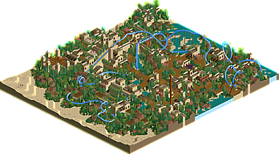
A quick design I've been working on the past few months here and there. Mostly just an attempt at emulating classic LL. Enjoy :)
-
1 fan
 Fans of this park
-
 Full-Size Map
-
 Download Park
314
-
 Tags
Tags
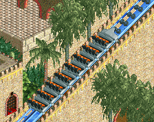
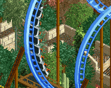
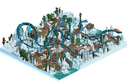
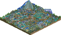
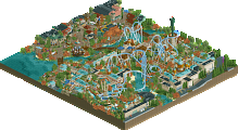
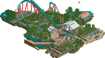
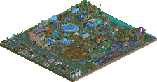
This was great, love how your really spent the time to make this in LL these days. You really have a knack for this style too, archy, coaster framing of the ride, themeing was all very fun. Not overly complex for LL but just right in my opinion where it felt very throwback in style but also fresh with how you handled some of the landscaping.
Great work
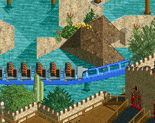
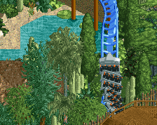
What stands out to me is the landscaping and foliage. I really like the land shapes in the lagoon area. The sandy outskirts are also effective. The foliage placement throughout is deliberate and perfect to my eyes.
As far as the architecture, the spring gardens area is the most interesting to me. Almost makes me want to try out LL.
Almost.
Lovely classic work. Feels very nostalgic. You managed to make a relatively boring general theme interesting and fun. I really hope this will get the attention it deserves.
This does a great job of being classic and nostalgic, with some nice use of terrain textures and a couple newer touches. Also love how the coaster's colors stand out from the map without clashing.
Really superb, lovely feel to it. One of those things that makes me want to break out LL again!
I really like some of the subtle details like the path as sand texture in places. Classic feel of LL with a few little modern tricks mixed in. Coaster is very nice.
Sweet thing this. Very interesting foliage which was great to see. Stylistically quite far, telling of your strong routine with the game. Nice layout too. Really missed a ride music though to complete the oldschool feeling. Nitpick.
The park macro was a bit weak perhaps if I had to criticise. Was hard to tell where ride entrances were, and with the overpowering foliage things seemed to go under a bit.
Thanks all for the comments! I had a pretty smooth time building this, was fairly spontaneous without a great deal of planning which perhaps shows in the macro but I think it was quite liberating. Glad to know I've captured a classic vibe. And if this spurs anyone to pick up LL I'd be very happy!
Oops, thought I had added that in. I could update the save but not sure it's worth it now.
If you want you can change it after the panel vote.
Lovely work, Xtreme, and congratulations on the design and its (in my eyes accurate) score! It's a very nice continuation of The Hidden Kingdom, which was already solid LL from you. Great coaster, maximum interaction, and an overall aesthetic that is satisfyingly classic, and very very easy on the eyes. The colours are just beautiful. What the map is lacking is some space to breathe, I found it rather labyrinthine and sometimes hard to read; the whole cluster of stuff behind the MCBR and lifthill is just a soup of walls, rocks and trees. I like soup, so don't get me wrong. Also could've been stronger with more ideas, as I'm not sure what I'm looking at here. The Spring Gardens were an exception here. More stuff like that, and ideally embedded in the overall concept! Nitpicking. It's a great design, love it.
What I like about this is not that it is emulative of classic LL but rather that it combines older styles with modern techniques, particularly in the landscaping. The use of the "wall of green" foliage technique to frame the non-desert portion works extremely well here, and it gives the overall shape of the scene a much more deliberate look, which was often not considered in high-quality older LL works to the same extent as it is in the current era. A bit of negative space in the middle--possibly some open grass patches--would have helped frame the interior even further. If I had to change one thing about this map, it would be to introduce some variety in the wall color, as it blends a bit too well with the sand terrain when zoomed out. Regardless, nothing seems out of place here, and the custom flats give it that extra breath of life.
It is time for you to take on the 126x126. At this level of quality, we may just see the next LL Spotlight from you.
this is really excellent. just oozing confidence and charisma, very impressive.
you know, every time I think I'm finally done with LL, something like this draws me back in. I'm not sure why, I just never get sick of it. It's so appealing
lovely work xtreme
For those without LL: the full aerial is now available.
Really nice neo-classical stuff in your usual style! I love how lush it feels and the way there's vertical layers - having the path a little elevated over the central waterway gives really nice opportunities to have the coaster dive down to eye-level.
Really nice use of the minimal custom trackitecture supports to convey the idea and a nice fun re-imagining of the Hulk archetype.