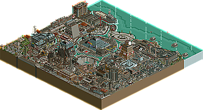
Park / Orwell's Modern Hell
-
 27-February 22
- Views 1,650
- Downloads 441
- Fans 1
- Comments 5

-
 Description
It was a bright cold day in April and the clocks were striking thirteen. Looking up at the propaganda screaming from every corner and crevice, he sternly read "WAR IS PEACE. FREEDOM IS SLAVERY. IGNORANCE IS STRENGTH."
The year... 1984.
(Authors note: Read all signs and banners for Easter egg treats!) -
1 fan
 Fans of this park
-
 Download Park
441
-
 Objects
616
-
 Tags
Tags
This has a really interesting old school aesthetic to it. I think you're making huge strides - would love to see this style you're developing continue to grow, I think we'll see some stuff reminiscent of parks like mala's if you keep this up. Great work.
Love the concept, a lot of nice scenes throughout. A nice job of taking a difficult dystopian theme and making interesting and fun to explore in RCT.
Really interesting park. Odd viewing experience for me.. so dystopian, but also a theme park? It's dark and dingy full of movement and things to watch. You have a lot of bold shapes and buildings which I enjoy, but then your ride design is a major drawback. I really appreciate though your architecture here and definitely reminds me of Mala too. Doesn't fit the current meta, and it's refreshing.
I just wish your coasters were a bit more, realistic? Some of the layouts are quite jarring. Namely the immediate neck breaking turn after the launch on "where there is no darkness" and the tight turn at the bottom of the first drop on the side friction coaster. Just painful! What's interesting though is the rest of the that particular ride is great. Love the heartline tunnels. Love the old school side friction layout.
Sorry to dwell on the layouts. Just think it is something that would really elevate your work. As always, keep it up. Look forward to what's next.
this looks way too fun for 1984 haha
really cool work. vibrant and dense, kinda hard to follow, but in a fun way. Some good spots of archy all over. love seeing some wild, novel rct out there
This is so oppressive in-game, I love it.
+ V is for victory statue
+ the area around Fall of the Capital was so great: trash everywhere, dirty factory buildings, relentlessly gray and brutal colors, busy but cohesive all the same
+ the stair fountain is so disorienting, every time I rotate my brain is playing tricks on me. Simple but awesome
- the giant letter sculptures didn't really work for me, I don't think they were necessary and seem pretty out of place and blocky
+ your use of more conventional signs to convey authoritarian messages, however, was really effective to sell the concept
Very unique and very cool, not surprised to see the community score bordering on gold level