Park / The Great Lake
-
 27-February 22
- Views 2,543
- Downloads 396
- Fans 1
- Comments 6
-
-
 49.50%(required: 50%)
 Spotlight Submission

Cocoa 60% In:Cities 55% Jaguar 55% posix 50% RWE 50% saxman1089 50% Terry Inferno 50% Xtreme97 50% bigshootergill 45% chorkiel 45% Scoop 45% ottersalad 40% 49.50% -
 Description
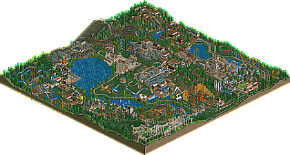
For this park I really wanted to challenge myself with working around terrain. I used the Leafy Lake map for this. My sincerest gratitude for the people that make the awesome CSO! I built this on an iPad. Please enjoy my first upload!
-
1 fan
 Fans of this park
-
 Download Park
396
-
 Objects
346
-
 Tags
Tags
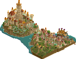
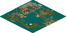
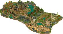
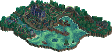
The few times I've tried to make a decent park on a mobile device were painful and unproductive, so I'm always impressed when someone manages a full park build like that. A couple of my favorite areas were the castle and the town round the river rapids. I also liked where the rides used the terrain and interacted with the paths.
A couple things I'd suggest for future builds, the trees were so dense in places that it caused a repeating pattern that looked unnatural, having them in small clumps would work better, and naming the rides. It's weird to have a park that has this much effort with coaster just called "Splash Boats 1" or whatever.
Overall I like this as a first submission, especially considering it was built on an iPad and with no or minimal cheats. And I like the "Classic RCT" feel this has, especially with it being built off of a scenario map.
Kind of charming in an interesting way. Some/most of the architecture feels a bit beginner-ish, but honestly the use of some difficult to use CSO is rather impressive - sort of balances out in places.
I actually kinda like the dense carpet of bushes making for a bit of a longer grass feel in places, somewhat unique idea there and must have taken awhile on an iPad.
Not a bad first release! I think there's certainly room for improvement, but impressive none the less.
Nice seeing this here! I've been following your posts in the r/rct subreddit and they impressed me. I had no idea this was made on an iPad with minimal hacking though; that just takes it up a notch. The highlight for me is the castle with the mine train and the splash boats weaving through. It has such a huge and lively atmosphere to it and the splash boats add a perfect splash (pun absolutely intentional) of color. Most of the coasters were solid, albeit some like the invert drag a little bit in places. While intentionally creating that kind of suspense can work, such as extra hang time on a loop, it's also important to keep track of your pace and make sure your coaster train doesn't reluctantly trudge through a curve. Single-tile paths are an interesting choice; reminds me of old RCT1 parks. Honestly, the combination of the old Harry Potter scenery and the dark blue water reminds me of the multiplayer servers I used to frequent about five or so years ago. It's pretty nostalgic to be honest.
My biggest gripe is with the names. Yes, your rides are nice, but please name them! It's a big pet peeve of mine to see such lovingly constructed rides called Roller Coaster 1. There are also points where the foliage looks repetitive to the point of resembling a pattern, especially with the bush spam near the water. I also feel like most of the tracked rides are boxed off from the path instead of freely flowing and interacting with the path and creating interest for the peeps. This is a beginner's trap and definitely one I'm still trying to get over myself. The Gatekeeper-style zero G roll over the entrance is a great example of path-ride interaction.
Regardless of all the flaws I mentioned, this is a really nice first release. Take what I and (especially) the others have said to mind for your next one; you've got a bunch of potential and I can't wait to see what you do next. 60% from me; I think you can crack Silver with this.
hey, I think i remember this from reddit. very happy to see it here.
there's actually a lot to love here. you clearly have an eye for themeing, landscaping, and atmosphere. so many great spots, like the huge castle with the water ride, the covered bridge, and just generally throughout the park theres a lot of great looking buildings.
the ride design and park flow ranges from passable to awkward, but whatever. its a really lovely piece of work for a first release, and also impressive for an ipad haha.
Congrats on your first release here. Impressive considering this was from an ipad.
I think Wooden Roller Coaster 1 was great, minus the name.
The big castle with the splash boat ride was really nice, cool structure. I think this area is indicative of some solid planning and shape.
Would like to see a bigger focus on ride design and a bit more realistic layouts. I was a bit let down by none of the rides/shops being named.
There is some strong work in this park, and I believe with technical improvements--particularly in landscaping and area design--you would have no trouble cracking an accolade. The coaster layouts are hit-and-miss, but I consider most of them to be a more of a hit than a miss. Covering such a large percentage of the terrain with the same shrub object detracted from the presentation, as negative space is your friend, and the gray rocks could appear considerably more natural and less random. The strongest element here is the architecture, and I particularly like the castle you've built for the 4D max ride. The scenery pieces used throughout the park seem a bit homogeneous, but you use them well in most instances, and it is rare that we see a park that utilizes almost the entire HP scenery collection.
Now that you're here, I recommend studying the foliage and landscaping in large, high-scoring parks. Such parks are typically magical, so when you can harness these aesthetic techniques to create the magical worlds you envision, we may have to start calling you Wizardwayne...