- Views 6,139
- Downloads 638
- Fans 6
- Comments 20
-

-
 78.00%(required: 70%)
 Gold
Gold

In:Cities 85% RWE 85% saxman1089 85% SSSammy 85% Terry Inferno 80% bigshootergill 75% CoasterCreator9 75% G Force 75% robbie92 75% Scoop 75% ottersalad 70% WhosLeon 70% 78.00% -
6 fans
 Fans of this park
-
 Full-Size Map
-
 Download Park
638
-
 Objects
606
-
 Tags
Tags
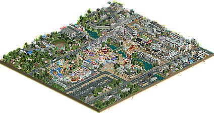
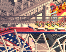
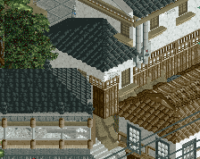
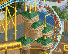
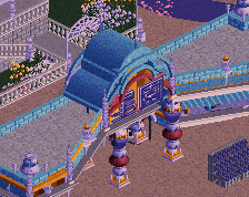
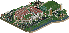
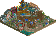
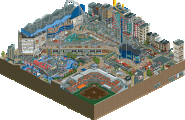
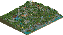
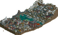
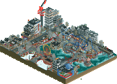
Very well built park. This is in the same league as other city parks from long-time players like Nippon, Washuzan, and Tubiao. The park was quite vibrant and lively, and I feel like you captured the feeling of a somewhat upscale Japanese park (insofar as the ones I know about). The outskirts had the opposite feeling, a feeling of melancholy which was accentuated by the music.
This park is quite incredible, I enjoyed it a lot.
I'm a big fan of this park. A very Impressive first release. I'm amazed at the sheer effort you put into the outskirts of the park, really building a nice atmosphere for the park to sit in. The architecture was pretty solid overall, with some buildings looking a bit nicer than others.
This area in particular was very well built
The foliage seemed really well done to me, I appreciated that you gave some areas some space to breath rather than just spamming trees everywhere. the landscaping was really good in some spaces and a little lackluster in other areas.
The rockwork in this spot seemed a bit unnatural to me compared to a lot of other places in the map
The park itself was great, I loved all the little details you put in throughout. The theme park architecture was pretty on point, and some of the scenes you created were gorgeous.
This was my favorite screen from the entire park
There were a bunch of other really cool spots in this map like the sweet tunnel effects you came up with. I was a little sad that you didn't include any movement in some of the suburby sections. It looked a little bit weird that those areas were just dead in comparison to the rest of the map. Although I guess it's hard with the half diagonals.
Anyway, overall this park absolutely slapped and it was very enjoyable to look at. I'm very excited to see what you do next. If I were a panelist I would give this a 75%, a very solid gold:)
This is an amazing debut park Ethan, congratulations!
I really like the park. The architecture is very detailed, especially for a first release. I don't know what's based on reality and what's invented, but I like the blend of white and gray architecture and the particular color palette you used. Astroturd is right that the surroundings outshine the park but I like them both so it doesn't bother me. And I really like one detail especially, the Catbus driving around.
Love the colorful, lively architecture in the park. And the town around it is a nice contrast, especially with the theme. I also liked the half diagonals here, they seemed to fit well and didn't seem forced to me.
Overall a fantastic first release on NE.
Like others have said this is a very good debut release, you certainly have a lot of skill and ability with the game along with high aspirations.
I think the park does come off a little sloppy perhaps, like many newer members first releases do. Some of the object and texture choices are a bit odd for the situation and there's a few things that could have been improved with a second or third pass. Learning to balance out details is something you'll learn over time, no doubt.
Definitely is impressive though, I appreciate the amount of ambition you showed with the crunchiness and amount of half diagonals, you've brought a new aesthetic with you that is quite appealing and shows much potential.
Overall I went with a 75% on this but I think you're going to get much higher scores that in the near future.
G's comment sums my thoughts up nicely. Having been to Japan, I do really appreciate this style of park and city combination as always. Very ambitious, a remarkable first release, and all in all very nice.
I don't think I've been more excited for a release in a long time than I have for this. Seeing you hop into the NE Discord with a crazy DKSO-style recreation of Lightning Rod sparked off all the lights and alarms for me; this kid is a future parkmaker. I've been impressed by your screenshots of this park, but seeing it all together is simply wonderful.
The park itself nails the Japanese feel with the swooping painted paths and gaudy colors, and the fallen cherry blossom leaves just take that up to 11. I loved the consistency with the shoestringed rides where possible; we're at the point now where shoestringed flat rides are almost a must for a convincing realistic release and you delivered. And of course the names; from the energy behind Go! Go! Mini Coaster to the bordering-on-funny Wonder Car and Rodeo Bull Inside Arcade, they're spot on for an Asian park. It wouldn't be an Ethan release without a Togo, which you've executed wonderfully with smooth hills and sweeping curves. Considering you've experienced these parks in person, it's not surprising to see you take the experience straight to RCT2.
The outskirts play just as much of a part in this release as the park. It's a bold move making them such a stark contrast to the park; you go from flashy colors and rides to a quiet, somber, and almost eerie town surrounding them. The level of execution isn't diminished, however; you've grown to the H2H9 meta with half diagonals and Fisch rocks very quickly and did them great justice. And holy crunch, Batman! The textural variations in the roads alone is astounding, and I'm definitely going to have to steal some of these tricks. There are times there it feels like there's too much variation in one spot, but that's a minor issue.
The parks and open spaces add a perfect contrast to the gritty urban scenes with gorgeous foliage, landscaping (did I mention Fisch rocks yet?), and color variation. The baseball field and park are simply beautiful, and going from a vibrant theme park to a cemetery with a funeral in progress highlights the duality in this release. I'm also really digging the frozen peeps with the custom names; they bring an esoteric vibe to the outskirts which almost remind me of Hoobaroo's work in some areas.
I honestly wasn't sure where to stand on the lack of action in the town at first. I was set on my stance that some of them felt too still, but after finding out it's deliberately set up to feel like a ghost town I think you succeeded in the vibe you wanted to capture. Every time I tell myself "this area needs this to make it pop" or "there should be some trains or cars to give it motion", I have to swallow my words because that would detract from what your vision. It's a very bold move in a game that thrives on action to give us something completely different, and at the end of the day I think it works very well for this release.
As excited as I was for this release, I've waited so long to give it a proper review simply because it needed time to sit with me. I could have just looked at it for five minutes the moment it came out and spilled my first impressions, but that wouldn't have been right for a release like this. What seemed like simple oversights in the street scenes are now evocative and contemplative in a way many RCT2 releases haven't matched. The details show more and more as you really become part of Hoshi En. What really blows my mind is how you were inspired by the Set Design building challenge. That wasn't even a year ago! To produce a release of this quality in that timeframe says a lot about your prowess as a parkmaker. While some areas suggest some refinement is needed, that just shows you have room to go up.
Overall, artistic and adventurous with a sharp sense of detail, an evocative atmosphere, and a reverence for Japan in all its grace and glory. This is up there with Tubiao and Washuzan as one of the best Asian parks on the site. I always knew you'd come in swinging with your first release, and if this doesn't turn you green at least then we're out of our minds. 80% and an easy Gold from me. Fantastic work.
bumping so more people can share their thoughts on this park
Really cool debut park. A lot of what I would've said has been pointed out by other comments above.
There are some spots that could've used a second pass.. namely the park entrance/plaza around the merry go round. Felt very sloppy to me with a lot of objects that perhaps were floating or not really aligned properly. Noticed a few spots where roof pieces/trims/walls were missing and you could see inside the building. Biggest offender to me was the swinging ship station.. just too much going on there. One thing that also sorta bothered me was inconsistencies with first story heights. In some places you had 3 units, 4 units, and then 8?
It seems as you kept building on this park, the quality went up. The outskirts are phenomenal and very detailed. The baseball field was a neat little addition. Yurameki was a super well detailed attraction. Wonder Car was a cute ride too. Outside of the grit and grime of the surroundings, you balanced it well with the color and brightness of the park itself.
Sorry if my criticisms were a tad harsh. I guess I'm just a stickler in regards to consistency. Anywho, still a great park. Look forward to what's next for ya.
I agree with you about some of the inconsistencies in qualities, but with a debut park I don't necessarily agree about spending time rebuilding older stuff. Or at least I think there's a limit to how much effort should go into that when your skill level is developing at such a pace. Better to get a park finished then move onto a new project where you're building at a higher level from the beginning.
That said, I actually think this is very good quality, regardless of whether it's a debut or not. Looking forward to what you do next Ethan.
Fair points Alex! I agree with the idea that it's best to continue to develop your skill level thru moving on to new projects. I guess it was just distracting to me when viewing the park.
But, I think it also shows there's already been a huge amount of growth and makes me, and I assume others, anxious to see what's next!
As I've already mentioned to you many times Ethan, I'm absolutely astounded that your very first NE park is of this quality. I'm hoping for it to score an 80 or higher gold, because I think it deserves it. The real aspect that stands out is the incredible quality on both a macro and micro level, it's just spectactular. That is where the main points are scored in a big way I think, and your skill level is very clearly on display here.
The only aspect which wasn't jawdropping was probably the park idea itself. I think the fact that Washuzan was released pretty recently impacted the impact of this park, so to speak - on the other hand, it also clearly provided a good source of inspiration, as well as a measuring stick which clearly shows that this is not far away at all from the very best rendition of this kind of idea.
So, while I think a "good park set in Japan" is one of the best ideas to pick "off the shelf", I'd be very curious to see if you can also bring out some entirely new ideas and concepts for coming projects and pair those with this parkmaker-level building skill and attention to details. If you do that I have no doubt you could produce a spotlight.
its crazy to me that such a new member can integrate such new concepts such as half diags holistically into a project, but also novel ride ideas and executions.
the varying quality across the map shows your improvement and is definitely not a mark against you as a builder.
733737 Offline
love the half diagonals, but not a fan of the mild coaster designs
yoooo congrats on the amazing score. Well deserved papa
First park or not, this is a very strong example of worldbuilding, and the grace with which you've created life and movement all over the map really sells the urban atmosphere. Some areas could be a bit over-detailed, but for the most part, the crunch factor is realistic and lifelike; others can hear me chewing the park from the next room as I take it all in.
Strangely, the macro aspect has not been touched on much, but one of my favorite things about this map is that even from far away, you can tell where the park ends by the color scheme alone. The contrast between the bright and sunny park with the dismally industrial surroundings beautifully illustrate the attraction of an amusement park even in a place where you might not necessarily expect to see one.
I've become a bit of a rock stickler, and I've found the rockwork to be the weakest aspect on this map overall. In some cases here, it looks somewhat natural, but in most cases, it's the same three jagged straight Fisch rocks and for some reason a 90-degree corner piece. This scenery set allows for considerable variation in shape and texture, and only using the same shapes and textures will give it an unnaturally homogeneous look. There are a few parks that have used these pieces masterfully (Villerouge, Madinat, Gladsheim) and many that have used them clunkily, but this is because they're easily accessible and extremely difficult to master.
A few miscellaneous choices stick out as odd, such as the floating bridge over the river and the Wile E. Coyote tunnels that "open" with a vertical wall of black, but your deliberate use of objects and focus on even the minutest of details to convey the setting already display tremendous strengths that many builders take years to achieve. You've made the most out of the .sv6 selection limits while managing to keep it comfortably under the map object limit, and though this skill may seem largely obsolete to many, those of us who still use old versions of Open find little things like this just as impressive as we did five years ago.
Looking forward to the Spotlight, whenever it may come!
Been meaning to circle back on this. As a first major offering on the site, this is an incredible release. It is filled with atmosphere, gorgeous little details and quirks that make it feel like a real place, and tons of character. Your influences are pretty apparent, but not in a way that detracts from the overall product. Probably the only thing missing is consistency in your execution. When it's on, the results in near flawless, but there are definitely rougher edges in places. But I chalk that up to your relative youth as a builder. And honestly, I think it's better to put the finishing touches on a project like this and move on to the next where you'll undoubtedly continue to improve rather than toil over your first major release. It's also really interesting to see a newer builder using half diagonals and other modern aesthetics in their first release, considering those have developed for others over so many years. Like many others, really excited to see where you go next with rct. Congrats on the gold!