Park / Serenity Hills Fun World
-
 27-February 22
- Views 2,888
- Downloads 487
- Fans 1
- Comments 9

-
 68.00%(required: 60%)
 Silver

In:Cities 80% Scoop 75% Xtreme97 75% CoasterCreator9 70% ottersalad 70% G Force 65% Jaguar 65% Liampie 65% posix 65% RWE 65% Terry Inferno 65% chorkiel 60% 68.00% -
 Description
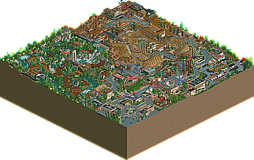
First place entry in the January DKMP Ride Creation Contest. The contest was for a transport ride that travels through at least 2 different themed areas. Our focus was to build a train ride that manages to witness all of the major elements of the park. We also had a focus on having two-way track with some elements shared but timing setup such that there are no collisions. Enjoy!
-
1 fan
 Fans of this park
-
 Download Park
487
-
 Objects
1
-
 Tags
Tags

Wow what a surprise! I didn't see this park mentioned in the announcements, so it flew a little under the radar.
Two of my favorite builders - and this definitely didn't disappoint! I love the clean style you two achieved, and the different themed areas are very distinct and well thought out. Great interactions overall. My favorite is how the Serenity Express mine train winds through the entire map. Very cool.
There's just a ton to see here and really sucks you in the more you look at it and start to notice.
NE tends to overlook DKMP contest parks, which is a shame. I can definitely see why this park won first place, as it is truly a great map.
This reminds me a lot of Terry's work.
I think what's sort of impressive about this is that it feels like you took a normal size park, took out any open space, and ended up with this. It sort of works, it sort of doesn't. As usual with these parks, I think it'd have benefitted from room to breathe.
Otherwise, the ride design is great, the theming is nice, and it certainly has a lot to look at.
bumping this so more people actually look at it. 25 downloads is pathetic for a park this nice
I appreciate your encouragement. I'm never too eager to check out parks with this style of pseudo-ncso, but I'm glad that I did because the park has a lot of great shit alongside stuff I don't care for. Contender for best DKSO park.
Some highlights:
- Synchronised miniature railway thingy/opposite circuits
- Bandit is stellar work
- Not a fan of giant props and exaggerated entrance signs but the Falcon sculpture is excellently done
- Good use of 4d lift awnings! Not sure I've seen it before.
- Good details like the rodeo ride, the smoking go kart, and the film clapper. Is that a gas tank behind Falcon's station? Vines aren't subtle (meaning it's not a detail) but it's a good touch well done.
- Train Heist ride has a great interior, the saloon scene would not look out of place in Storybrook Glen which is the gold standard for this sort of stuff in my eyes. Also love the archy for this ride.
Pretty impressive park layout too. Only gets messy around the canyon (can't figure out what's going on with the train and paths here) but overall great use of the available space and breaking it up into smaller spaces.
Loved the train in this park, how it's timed to use the same track in both directions. Also liked the ride design overall, two nice coasters, one of them even shoestrung with a downhill brake run, and the different themed areas were nice.
Awesome job!!! I really like so many elements of this park. Is this possibly an entry for the DKMP contest?
EDIT: This was the transport contest lol, I thought it was for the dive coaster this month.
There is a lot to like here, good job. Really enjoying the coasters and a lot of the general ideas and little things. Only area i think lacks behind a bit is the western area. The red rock area looks a bit out of place. I also do agree with CC9 that some room to breathe would have helped here and there; i think you showed at the entrance area what amazing stuff you could do when you have the space to build on. Would love to see you tackle a bigger map.
All in all thank you for showing this. Keep it up!
I really enjoyed this park. It was very well put together and I think it needs a lot more attention. First of all, the archy in this park was very solid for the most part. I'm by no means an expert on NCSO building but there were some areas that seemed better put together than others.
This scene in particular was amazing
The coasters themselves all seemed really strong. I was a huge fan of the interaction you were able to achieve throughout the park. I'm very impressed with how the wooden coaster seamlessly interacts with the path but also doesn't come off as messy. It is really hard to pull off interaction like that without the area looking crowded.
Probably my favorite scene in the park
The flats were also super strong and I noticed a lot of really interesting ideas on display. I thought this park was a good example of how trackitecture should be used. It added a lot to the park such as the bridge but didn't seem spammed like it commonly does in modern NCSO parks.
The used of the enterprise here is great
The only thing I wasn't a huge fan of was the landscaping. The different rocks in different areas made the park feel a little bit disconnected. Like it almost looks like the wild west area and the jungle area are from 2 separate park from the overview. I think if you guys made the rockwork a bit more consistent the park would have benefited from it. But thats just my opinion!
Overall I really enjoyed looking through this project, it was great. If I were on the panel I would rate this park somewhere between 65% and 70%. A very high silver or low gold.
The more I look at this park, the more I agree with this assessment. Finding creative uses for every available object, track and ride is the principal reason why half of my projects are still full NCSO, and this park illustrates that same approach very nicely. Serenity Hills further proves that both of its builders are as creative as they are resourceful!
Both of the coasters here are both realistic and aesthetically pleasing. Bandit especially is a Spotlight-grade woodie that I hope sees recognition in the 2022 awards, and its Hybrid supports complete it as a veritable work of art. Falcon's shoestring is also excellent, and it explains why the park itself sits at such a high altitude. That lift hill boasts some of my favorite trackitecture supports ever!
The foliage could use some work, particularly with the quarter-tile pieces. Flowers, rocks and bushes work best when you create larger shapes with them, as it is more reminiscent of natural plant growth than a few isolated pieces here and there. On its own, a flowerbed or a ruined statue rock is square, but group a few together, and they begin to look more natural in the context of a landscape. Grouping some of the leafy bushes together--such as a few light green ones and then a few medium ones--rather than alternating 1/4-tiles each time will give your next jungle setting a more cohesive and deliberate appearance.
I don't believe the size of this park is holding it back, but like many of these contest parks, it does fall victim to some questionable object choices. You have your standard base game objects, but then you have a bunch of awkward expansion objects thrown in that throw off the texture of the base game objects. The red rocks are just an overbearing object in general--even when composed nicely, as they are here--and the prehistoric bushes stick out like the Jurassic predecessors of sore thumbs. Replacing these with either more base game objects (full NCSO) or some versatile CS pieces (nincso) would have given this a cleaner, more readable look overall. Still, given the strange object selection here, you did very well with that which you were provided!
For me, a little over half of this park is over the gold threshold--namely every section that uses predominantly gray path--but a few large areas (the jungle and the red rock conglomeration, mainly) are still not there. Even if my 65 is a lower vote for this lovely square of high-altitude goodness (I'd give it 67 if I could), it is easily one of my favorite DKMP contest entries and one which I will be returning to for inspiration in the future.