Park / Lenroth Enclave
-
 07-February 22
- Views 2,480
- Downloads 463
- Fans 0
- Comments 9
-
 65.00%(required: 65%)
 Design

In:Cities 70% Jaguar 70% saxman1089 70% Terry Inferno 70% CoasterCreator9 65% ottersalad 65% Scoop 65% Xtreme97 65% Cocoa 60% posix 60% RWE 60% Liampie 55% 65.00% -
 Description
DKMP Entry and winner in month of October 2021
--
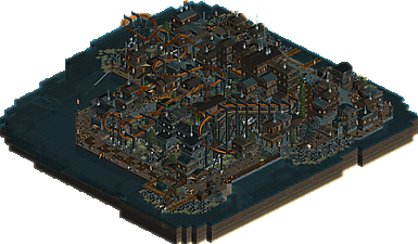
Welcome to the Lenroth Enclave, an island full of people wearing dark clothes and brown hats. And believe it or not it; is not a western! They're seen in this park strollin' about in their shantytown preparing to fight the ghoul that flies through the skies! Even Mr.Sorrento is thought to have something to do with this creature flying overhead.
There was to be two shipments arriving taking a few people off the island, but the harbor is eerie with no buzz or reinforcement. Maybe it'll arrive later?
--
Upload is as last seen. Additions made after the new save-format somehow did not stay / got corrupted. -
 No fans of this park
-
 Download Park
463
-
 Objects
196
-
 Tags
Tags
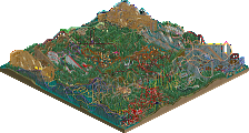

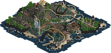
I liked the dark and gloomy atmosphere in this park, a lot of gritty textures as well. Also, the coaster supports, I don't think I've seen those objects used before, interesting. Overall, Definitely one of my favorites from that contest.
Thank you!
I found this pretty enjoyable. Super atmospheric, aided by the palette, which I think works with the colours and textures well in a way some palettes don't. The coaster is pretty nicely made, with cool supports. Don't really love the weird s-shaped curve after the zero-g roll, nor the placement of the loop being hidden between two buildings, but the rest flows pretty well between the elements. The recolourable ncso thing kind of bothers me because it holds the park back in some places, such as the use of the grey bullrushes where a smoke object would have worked much better. Guess that's down to the contest restrictions. The archi overall is pretty great however, good variety of textures but still feels cohesive.
Aye, the loop was not as hidden early on building this, and is something I do regret sticking through with.
And wholeheartedly agree that the smoke i this case, could have been replaced. Either with crashed vechicle trickery or me being able to locate an object in time.
I appreciate that you like the textures!
Thanks man =)
Really great atmosphere, I pretty much agree with Xtreme in that there are a few weird quirks here and there which are noticeable, but don't overly detract from the park as a whole. Love these kind of spooky parks, so I'm happy to see this!
Building shantytowns in RCT requires finding a difficult balance between cohesive and ramshackle, and you've pulled it off quite nicely here. Occasionally there is one wooden post or steel fence too many, but overall, the use of textures is thoughtful and helps sell the theme; even if you did not tell us which time period this is meant to represent, we would be able to figure it out largely based on your architectural choices, many of which are subtle but still distinctly late 1700s.
Most of the questionable object choices are a result of a restrictive bench, but you've managed to make it work well enough despite the limitations. I particularly enjoy the shapes you create with flowers and rocks on water. Keep doing that!
The coaster itself pops better when painted one shade lighter; it blends in a bit too well with the dark surroundings currently. S-curve notwithstanding, it's a very nice layout, and the scene as a whole becomes more readable when the coaster and the buildings are more distinguishable. The loop may be hidden, but in a spooky scene such as this one, a secret loop is not necessarily out of place.
You're developing a style that is instantly recognizable as your own. Looking forward to seeing more distinctly Wacked parks!
Thank you kindly! It'd be cool to know which choices I could have done differently with what was given =)
Shantyyyyy! And yessir, late 1700's towards 1800's was a goal, but forgot to look up historical buildings early on xD
Aye, I do like lots of macro layers. But It was toned down from what I practiced building before this. Also having fewer trackitecture-roofs helped this park.
I do like placing the flowers to become beds of vegitation so glad it is appreciated ^^
Damn! Really sorry I didn't check this out sooner. Really love the vibe here. Very ramshackle and detailed village. The coaster weaves through it beautifully. I agree with Terry that it could've been a bit brighter as it would stand out spectacularly. Oh well! Either way, I love everything from the map edges, to the archy around Bodyscrambler, and the rocky waters edge. Great stuff as always. I really enjoy your style.
grats on the design.
I like this, it actually reminds me in a weird way of fisch's old invert design... thats a deep cut lol.
the station is excellent and the gloomy harbour shores are great too. the layout kind of gets awkward from the zero-g onwards, but mostly works in the environment. cool stuff, very lively