Park / Adventure Time
-
 05-January 22
- Views 14,758
- Downloads 442
- Fans 2
- Comments 20
-
-
 75.00%(required: 70%)
 Gold
Gold

G Force 80% saxman1089 80% Scoop 80% Xtreme97 80% bigshootergill 75% chorkiel 75% Jaguar 75% Terry Inferno 75% CoasterCreator9 70% Liampie 70% RWE 70% posix 60% 75.00% -
2 fans
 Fans of this park
-
 Full-Size Map
-
 Download Park
442
-
 Tags
Tags
![park_3152 [MM2014 R1] New Society](https://www.nedesigns.com/uploads/parks/3152/aerialt2774.png)
Voting has begun !
Dear all, we have now entered the voting stage. In the poll you will find two questions; one for choosing the entry with the highest quality of RCT, and one for choosing who had the best interpretation of the keyword 'transition'. What that means, is up to you. You may vote for as many entries as you like in either category. The winner of the contest is determined using the following formula:
Question 1 votes + ½ × Question 2 votes
Like this, there is a reward for best interpretation of the keyword. Should we see two or more entries with similar vote counts on top after counting Question 1, this will likely decide who wins. The poll will stay open for 72 hours, meaning we will know the winner in 3 days from now. Your choices will be public, but will remain hidden for the duration of the voting stage.
As always, please make sure you give all entries a fair chance and look at them all before picking your favourites.
AJ- (100%)
RWE (65%)
Gustav Goblin (35%)
RobDedede (50%)
Lurker (50%)
In:Cities (25%)
WhosLeon (25%)
AvanineCommuter (25%)
hydroportal (25%)
Liampie (90%)
Scoop (10%)
With that, we'll leave it to your hands to choose who may call themself the winner of the second New Element Flash Challenge.
You already know what time it is.
Transition of Stolen Artifacts (AJ): Classic AJ! Your style really reminds me of a NCSO FK. While the surrealist spin does mean it takes some time getting used to the theme, the two sections depicting ancient artifacts being looted and put on display is pretty damn cool and hits the theme right on the head. The blue swoopy lines also transition from one area to the next beautifully, another great take on the theme. Disapora is a minty fresh layout, although I feel like the lack of a brake run before the second lift makes for some awkward pacing at that point. There are also some names I don't exactly understand, and the specks of blue the palette causes is a minor complaint as well. Overall, though, it always makes my heart happy seeing how these themes can be interpreted in a more artistic and surreal way, and this entry does just that.
Millford (RobDedede and Lurker): Five entries and someone still managed to yoink my theme. I'm only a little bit mad. This is so so so cute though. Love the idea of a smaller town slowly being taken over by industrialization as opposed to the biggest city in the entire United Kingdom that I decided to represent. The NCSO archi is really nice, especially the white building near the northwest corner. The quarry is a great take on industrialization. The rope carts are especially unique, and the way the crates swing makes it look so believable. Harvester is such a nice centerpiece; I love the horse and chariot train, and the the vertical spike going over the sign is just MMMPPHH. I feel like this could have been pure NCSO, but then you wouldn't have the ropes for the ropeway. It's tough for (mostly in this case) NCSO parks to compete with parks using more intricate CSO, but this is still a very nice submission.
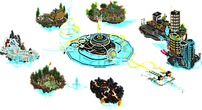
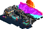
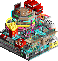
Adventure Time (The 1992 U.S. Men's Olympic Basketball Team): I looked at the monster lineup behind this one and immediately accepted defeat. And just as I feared, this is stunning. Let's talk about the coaster and the time machine first, holy moly. The interactions between both tracks are beautiful, and I love how they lead your eye to the little fragments of time. That huge spire with all the little details the coasters reverse on is just bonkers. The time machine itself is mind-blowing; SpaceK's custom letters are already putting in work, and how you planned out all the inner workings is beyond me. The floating islands are beautifully composed and their shapes feel very organic. I also love the little flashy bits connecting them all; it gives you something to follow. The dinosaur, caveman, and cyberpunk islands are highlights. Overall it's awesome seeing this standard of parkmaking sticking around after H2H. Can't believe you all did this in a week!
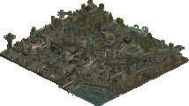
Metamorphosis (Liampie and Scoop): Duuuuuuuuuuuude. This was my thought process navigating through this beauty. It's very artistic but in a different way than AJ's. That opening shot of the Escher-esque town is one of the highlights of the entire contest for me. It has this almost '90s CGI liminal space feel and it actually made me feel some weird indescribable feeling upon first viewing. I also love how following the rapids times with the flying coaster reversing which takes you through the rest of the map. This does the transition theme better than most of the other parks, with every section blending into each other. The diagonal perspective helps a lot too; almost feels like it's being shown in a cinema in ultra-wide screen. The problem with this one is my favorite part was at the very beginning, so it felt harder for the rest of the park to keep up. Also as pointed out in the Discord, there is some Julowing with the one-view perspective and the rest clouded by black walls which takes away from this one. Love the concept though, and it has some real stunning scenes.
The Big Smoke (RWE and I): 35% self review time! The Industrial Revolution theme came to me within an hour of this contest being announced, although my original idea was less London and more Pittsburgh (complete with a paddle wheel steamer like in Rob and Lurker's). I also intended to do it in the style of NE's awkward transition period circa H2H6 to both fulfill multiple transitions and make it easier on myself, but then I realized going for gimmicks always costs me and I wanted to keep up with the current meta. By the end of the first day, I had basic macro planned out as well as building the underground portion of the Metropolitan Railway and a steam-powered ferris wheel. The ferris wheel was a revelation that came from thinking about how I could translate Heron of Alexandria's aeliopile into a ride, and I knew I wanted to lean into the more fantastical steam-powered side. However, doing pretty much nothing the second day was a clear indicator I needed a partner if I wanted to finish, and the next morning I conveniently found RWE asking if he could team up with someone. He jived with what I had in mind and immediately drafted up some flats to copy into the save. Working with someone from Germany was actually a lot more convenient than you'd expect, and we essentially had a three-block process. We'd bounce ideas off each other in the mornings, I'd plop like two pieces of scenery down in the afternoon while he was asleep, and then he'd build about half the map when he woke up. It definitely felt that way; RWE is a ludicrously fast builder and I was in a mental slump which my godawful pace didn't help with. However, he was a super supportive partner in both keeping my spirits up and giving advice as we went along, and later in the week I finally began to get my mojo up. Being faced with deadline pressure and attempting to imitate the aesthetic he set for the park was a hell of a learning experience, and all in all I think it turned out amazing. Just my promenade walls alone look better than anything I've done before, and I honestly think what RWE built is better than Tomatina and Parque Monteril. It was a pleasure collaborating with RWE, and even if we don't win I'm coming out of this a much more experienced parkmaker. Builder map coming once the poll wraps up.
Not sure whether to null vote or just exclude my own park, but here's my standings for NEFC2! Great work everyone!
Which entry is your favourite?
1. Adventure Time
2. Metamorphosis
3. Transition of Stolen Artifacts
4. Millford
Which entry had the best interpretation of the keyword 'transition'?
1. Metamorphosis
2. Transition of Stolen Artifacts
3. Adventure Time
4. Millford
Gustav, I loved yours and RWE's representation of transition with an Industrial Revolution theme - great stuff.
Transition of Stolen Artifacts
This artsy entry is gorgeous. An impressive composition with the Diaspora coaster curling through it. I also love the use of the single rail coaster. I probably don’t get the subtle nuances of all the names, but the larger theme is very clear. Amazing work given the short time period it is build in. My only constructive criticism is that I missed something on the inside of the museum.
The Big Smoke
I like the Revolution lay-out. Shame it’s glitching over the water. This probably has to do with the support plug-in you’ve used. I like the idea of the Switchyard Shuffle, but I think I would like it a lot more if it would’ve had a little longer layout. I like most of the archy, only the big towers don’t work for me. Funny how you introduce new rides from the future at the start. Such a great entry as well.
Millford
Harvester is just such a fun ride. I love how the horse pops up just over the sign. Lovely stuff. I liked it even though the old school look isn’t my preferred style.
Adventure Time
Wow this entry really tingles my happy place. Such a beautifully arranged composition and executed perfectly. I love it all: the intertwined coasters, the vignettes from different time-periods and the use of rock in this beautiful pallet. Only nit-pick is that you didn’t call yourselves the Tile Club.
Metamorphosis
This entry is just such a tastefully done artsy take on RCT. I think I’m now on my tenth time going slowly from left to right. Every time I enjoy the simplicity of it and the way it transformes even more.
thats what our little mini-discord was called while we built it lol
downloads: 2
I thought the glitches were with my graphics card or the new build. IDK exactly what plugin is causing that but it's a shame regardless. Glad you appreciate my layout though. I had plans for a longer layout for Switchyard Shuffle with the lift coming out of an engine shed and over the walkway, but I thought RWE's layout for it worked really well especially with the big curve around the obelisk. It would've also been hell on earth to rework since he built the buildings before the coaster and we would've likely had to start from scratch if we wanted to redo it. That whole factory area is some of his best work ever IMO. Glad you liked it!
Going to write some short comments on the other parks.
Transition of Stolen Artifacts:
A interesting one to look through, I enjoy these wild abstract style parks. My favorite part is the single rail track river in the center, it makes a nice centerpiece and I like how it splits the map. Also impressive that this was a solo park.
The Big Smoke:
This does a nice job with the gritty industrial city look. Revolution has a nice interaction moment with the bridge, the classic carousel is well done and Switchyard Shuffle is nicely themed and fits well into the surroundings, a nice job of making a simple shuttle coaster interesting and fun. And I loved the railyard, it adds motion and the switch going in and out of sidings was well done.
Adventure Time:
Amazing that this was built in only a week. Great details in all of the little scenes/areas and way the whole thing is tied together with the time machine in the center. The coasters were really fun to watch, great timing the whole way.
Metamorphosis:
Love this take on the keyword, the way it goes from abstract to realistic and back, I also like the right-to-left progression of looking through it. My favorite part is the town on the left, great style with just the right amount of detail.
Congrats to everyone on some lovely entries. The differences in approach and styles is so fun to see. I couldn't do the turnaround on this contest, but I'm glad it exists cause I love opportunities for less conventional approaches to rct and I think that showed up big here.
Transition of Stolen Artifacts: Loved this entry, definitely felt like something I would make. The mix of conventional real-world things with more abstract concepts was great, it feels at times both fully solid and tangible yet also artistic and stylized. I tried to be more discerning in my picks with this contest as I usually end up giving out too many votes I feel, and this just missed on getting a nod in each category. I thought it was lovely, just amongst some tough competition.
Millford: A more conventional approach, but some lovely rct. The overall composition, both macro and micro, was great. I particularly liked the bit of path directly behind the first drop on the coaster with the little horse pen. It also has hallmark innovative NCSO that makes it fun to explore and see how ya'll did different things. The one drawback is that your theme was similar to Big Smoke, and I felt that map managed to convey it just a bit more clearly.
The Big Smoke: Really loved this entry, it felt very well executed for the time given, and the theme was very apparent. The details that you managed to bring in, as well as some of the smart macro and micro elements, was really well done. I particularly loved the carousel and the balance of details in the architecture. Ultimately, I felt two other parks had better concepts so I didn't give a vote in that category, but it selected it as my second favorite entry.
Metamorphosis: Conceptually, I think this was the most artistic and thus something I definitely go for. I love the forced perspective and the simplicity of seeing how different elements of rct can evolve across a diagonal space. The execution, while solid, was a little lacking compared to others, but the stylization one me over. I didn't vote for this was a favorite entry, but did vote for it as one of my favorite interpretations of the concept.
Adventure Time: This felt 100% like what I would have done, and then I remembered I've done a very similar concept on a smaller scale in the past. I won't lie that I thought all the big names on this might give it more hype then it deserved, but then I dived in and it's exactly what you'd expect these names could do. Each little vignette is incredible well made and designed, the artistic elements of neon blue time wound throughout are beautiful, the futuristic stuff is so cool. It was hard to fault this as a piece of execution, and the fact that this was so clearly how i'd approach the prompt from a non-realism perspective, I had to give it votes in both categories. Congrats, this is an amazing product for only a few weeks, and the fact that found contributed just means some great teamwork from a bunch of people known for great teamwork.
Again, congrats to all on the level of quality and execution and concept achieved in such a short turnaround. Also, I feel like we saw some glowups from the participants here, so I'm excited to see what else all of you will do (except on Adventure Time, ya'll can calm down...)
Transition of stolen artifacts:
Fun idea if you'd ask me. The colors are a bit of an hit or miss for me, but I like how you just went for me. The coaster flows really nice and it all fits pretty well together. I like the details that have been paced out over a very good macro setting. That really keeps my attention.
The Big Smoke:
My vote for the best looking entry. I think you put a lot of energy getting all those elements together. The bloons, the archy, the water, it just works. Never understimate a good palette too. At some point it even feels H2H-ish to me.
Millford:
I like this take of (almost)NCSO. It feels very classic - in a good way. The farmlands work very well as surroundings for the coaster. The ropeway felt kinda forced though. I think it's the way how it's layed out - meandering inbetween the buildings. But still nice to see this take on a new ride.
Adventure time:
This entry really could keep my attention the longest. So much different stuff to see and it all looks very enjoyable. I'm usually not a fan of a park that consists of all small islands but this one could actually entertain me. Good use of half diagonals too, which I always can appreciate.
Metamorphosis:
Certainly the most interesting one. I really enjoyed the abstract visuals from this entry. Awesome mix between realism and fantasy. Sad to see you Julowed it, however that's the only possible way to do it I guess. Still one of the best entries.
Transition of Stolen Artifacts (AJ)
Lovely entry AJ, strongly stylized and full of your psychedelic colour and design choices. Love the choice of theme as well, fits the brief very well and got my vote in the second category for that reason. The invert layout is pretty interesting with the way it spans both "islands" of the map, with some nice interaction. I would have liked to see something within the museum perhaps, or otherwise references to the specific pieces like there are in the ride names.
Adventure Time (tile club boys)
Love that you four joined forces, bridging the two teams. Really solid piece of work, lots that kept me interested and I like how you made each island distinct in its design and style. Excellent work on the detailing and environment of each, I especially loved the mammoth and dino sculptures, the cityscapes and the huge symbol in the center. I can spot some of your different styles and trademarks in various places, and it's cool how well they mesh together. The only issue was some islands not looking too pretty from the back. Other than that, great entry!
Metamorphosis (Liam & Scoop)
Really enjoyed this despite how simple it appears at first glance. At a conceptual level it's really fun, the highlight being the way the void becomes the shaped blocked which morph into buildings as the level of "grain" and detail and colour get added until it becomes a fully fledged little theme and ride setting. I think some parts of the map lack that kind of detail, though it still feels quite instinctive. The other end is pretty great too with the queue awnings morphing into the cubes.
Millford (RobDedede & Lurker)
I definitely expected at least one industrial revolution themed entries, so to get two is great! I liked this one, and how it tackles the theme by showing the contrast of the traditional agriculture and horse-driven harvest with the industrial production areas and railway yard. The agriculture area is super cute, nice swoopy layout for the rmc and pretty good landscaping here too. Cool use of the rope vehicle for the ropeway as well. Overall a pleasant map, good job!
The Big Smoke (RWE & Gustav)
I think it's interesting that the other entries largely deal with the "transition" key-word directly in their content, whereas to me, the theme in this park feels more present in its setting. And this isn't a criticism by the way, I love the difference in approach! The park itself is excellent, really impressive that you were able to take this from concept to completion on a H2H-sized map within a single week, and at the detail level you've built. Lots of great things to explore here: the carousel and small park vibes in that area are excellent, the balloons are super cool and feel unique in their design, and I really enjoyed the atmosphere of the map. Lovely work overall, and showing a great step forward for both of your RCT skills.
lol in classic AC fashion, we waited until 6 minutes before the deadline to start that part
We congratulate In:Cities, WhosLeon, AvanineCommuter and hydroportal on winning the second New Element Flash Challenge with their wild entry 'Adventure Time'. Frankly, with that manpower behind an entry, not winning would be embarrassing. Regardless, great work, and the people of NE have comfortably voted for you to be the winner!
NEFC2 Overall Standings / Question 1 votes + ½ × Question 2 votes
Like with the first edition of the NEFC, the two poll questions diverged significantly. Liampie and Scoop beat the eventual winners on interpretation of the keyword Transition with their 'Metamorphosis', as is evident in the table for Question 2 votes below, with enough votes to overtake RWE and Gustav Goblin for second place, even though the latter's park 'The Big Smoke' was elected to be the higher rated piece of RCT in general, according to Question 1.
This was arguably the smallest official contest we've ever held, but it doesn't matter! We had fun, and we hope you did too. Thanks for your participation, and see you next time!
was hoping for a few more power combos so we didnt feel like such dicks
very happy to see liam and scop working together, and gustave / rwe made an excellent pair.
rob and lurker meshed so great together and created a very underrated entry
AJ created my favorite map of them all
I think even like only two more entries on the level of The Big Smoke would be nice for sure, I agree. Do note that you guys did not win the second criterium.
It's been a very nice little contest regardless of the number of submissions, with good variety and some cool new ideas. Each map had stuff going for it. I voted for Millford for question 2, because exluding our entry I think it did the best job at showing a transition itself. Adventure Time did not really do that well honestly, although that depends on your interpretation of the concept. It shows the world in different stages. Progress, yes, but the actual transition? Technically and aesthetically the best work of the contest though, no doubt. Fantastic work.
Our entry was obviously rushed. Sadly Scoop couldn't put in as much time as we hoped, and I just did whatever near the end. The parking lot to rooftop transition is so shitty, I kinda like how shitty it is. The idea for parking lot light poles morphing into trees came to me spontaneously last minute and it's one of the things I like best here, glad that came to me to give the map some more conceptual mass. Despite the rushed state and some weak ideas, I'm happy we managed to get the idea to work and release it on a map. Thanks for the reviews and kind words.
Not bad! Congrats to the strongest team I've ever seen put out a park since Madinat Al-Hareer for winning the best park and to Liam and Scoop for an artistic and beautiful entry which fit the requirements perfectly. And of course, huge thanks to RWE for being willing to partner with me and making The Big Smoke look top-notch. Here's a behind the scenes look!
Interesting result. My favourite entry was Big Smoke, but I did vote for Metamorphosis on question 2, so it makes sense to see this result. Still very impressive RWE and Gustav to do so much in so little time. I loved the composition and how it highlighted the architectural features. It also looked like you two had good chemistry.
Thanks a lot, it's honestly shocking to hear that some actually preferred Big Smoke over Adventure Time overall. As I mentioned before, RWE was unbelievably fast and was conscious to use small flat sections which he could spam with the scenery manager. I also tried to follow his aesthetic style, specifically how he spammed the Tols snow object on the path (even in different color variations for both full-tile and diagonal) and used brown grass trims to capture bits of dirt below foliage. Those times I tried to copy his style honestly taught me a lot more than I expected.
This was certainly a fun contest. I'm glad Lurker was willing to build with me. I'm proud of our entry.
I decided not to vote as I participated, but if I had to choose a favorite in terms of quality it would be The Big Smoke. In terms of who executed the prompt the best, that would have to be Metamorphosis. I did like all the entries, though. It makes me wish there were more of them!
Some humble feedback: I do also wish that the contest stuck to the original NCSO no hacks requirement. Lurker and I tried to emulate that style somewhat in our entry because we both felt that way. I think it would have given players like him and I a time to shine, and the style would probably have allowed for more entries as it allows faster builds that are still high quality. It's just my opinion, but maybe something to consider going forward.
elon cyber town is dope