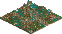
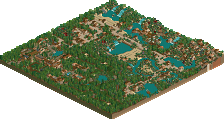
There really is no one else like RCTNW out there. Who else can capture real world looks and structures like him? I really can't think of anyone offhand. He is really in his element when it comes to creating things on a huge scale like bridges, resorts, themeparks and now with "Marriott's Discovery Bay Golf Resort" he gives us RCT's first ever full PGA style golf course!
It was nice and all. But each and every hole had sand bunkers. A lot of the holes were dull and just the same as everything else. There were far too many sand bunkers on the holes, there was no potholes or rocky areas or anything. Also the fact that it was ALL fairway would make the course very dull, you should have had rough... Basically, Your holes just lacked a lot of fun, originality of design and the fact they weren't entirely realistic, which i know is what you strive for.
The rest was nice. Everything else was very well done, loved the parking area, that was amazing, really cool.
Discovery Bay Golf Resort is, IMHO, the first project deserving the title "Concept Creation" that has been released. The others (Mainly Magic World - Indoor Paradise because I can't view Pleasure Point) just seemed to be, "Oh, this isn't good enough for RU, let's make it a CC." A pity.
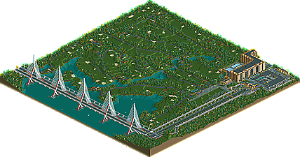
Some of you may recognize the Discovery Bay Bridge from the PT2 preliminary round. That entry was a 255x255 map size that had most of it blacked out. I’ve always wanted to do something with it and use it in future projects (even had it part of an entrance map to another park that was never released). The problem I had was that the main roads didn’t line up to work on the Marriott project. After thinking it over, I was able to shrink it down to 200x200 and make some changes to so that the road drops in elevation by going into a hill. This will then line up with the current resort map (with some modifications). Once that hurdle was overcome, the actual construction on the map took less than 2 weeks to complete. I’ve done the golf course before in two other projects however I was really pressed for space. Since this map was dedicated to it, It allowed me to really focus on the layout. I have three holes on the map that I would really like to play. Hole #3 is perhaps my favorite as it has a great view of the bridge and can be a great challenge. Number 14 is a short par 3 that plays right up to the hotel and would be a blast to watch from the balconies. Finally the 18th with the restaurant and water fountain around the green.
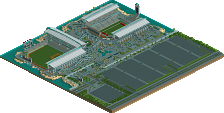
There was a few challenges though that developed during the construction. The biggest was the driving range and putting green. After the course was laid out and the hotel construction had started, I realized that I had forgotten these two elements. The problem was there was no place for them. The end result was that the hotel grew taller and the foot print was reduced. This caused a problem for the monorail station not being attached to the hotel like the original plans called for. Although the hotel is not ground breaking, I’m still happy with it.
Some of the highlights that I enjoyed about the map
Main Monorail Station – Perhaps my favorite one to date!
Parking Structure – My first real attempt at showing the different levels and the ramps that connect them
Tee boxes for each hole – Went through many different variations
The little bridges on the golf course – the small 1/8 building blocks are now a must in all my benches!
All in all, I had a real blast making this and I have two other “CCs” that are in the planning stages although nothing started as I want to get back to MMW and MUS. The next release will be the MMW map in a couple of months.
I want to thank geewhzz and CP6 for testing it at the last minute and also to Kumba (and cork) for starting the CC’s. It’s nice to see things outside the norm get some recognition.
JJ – Thanks for the feedback and I do agree with you on some points, mainly the rough. I struggled with this aspect of the course in that how do I make rough? I had tall grass but it looked like crap in comparison and I was not happy with it. The dirt/grass land type didn’t look right to me either. With that said, this was all I could do with what I had. As for the bunkers, I’ve played courses with bunkers at every hole so I’m not sure what the problem is although I could see how it looks like there is too many. I guess we will chalk that up to personal preference. As for the holes all being the same, I feel there are very few holes that have the same layout, again, we will agree to disagree. All that said, I do appreciate your info and If I ever do another golf course, I’ll keep that in mind
disneylhand – Thanks glad you liked it
Geoff – I’ll be posting some SS on my site shortly.
Well I think the way you could have done rough would have been to set the handyman to mow on just the tiles for the fairway and then let the otherstuff grow? Although that would allow only certain widths.
Or you could have used a mown grass scenery piece, mm but that would mean lots of pieces for the angles.
I did try the handyman suggestion however the assigned patrol areas did work like you said. I have seen the grass land tiles and the thought crossed my mind however, those really only work on flat land. I wanted to have some elevation changes and again I was not real happy with it. What would be cool is if the tall grass ¼ tile object was just a bit shorter and a bit darker. I could them place it to represent the rough. Perhaps one day I’ll go back and do that however for now, the course will remain the same.
Wow, very nice!
I looked about it more then 45 minutes and I can't stop looking at it .. last time I've got this feeling .. don't know anymore, when it was ^^
I thought the course was nice as is. It would have been nice to be able to have the greens and rough be distinguishable, but alas you did your best with what the game provides. As for the course, I've played plenty where there are that many bunkers and very little else for hazards. It seems like a classic early 20th century design in terms of layout, and there are plenty of classic courses that follow this prototype. No need for the Pete Dye target golf concept that dominates todays designs.
In general great work...the only thing i would have like to have seen is the occasional stray golf ball over the nets of the driving range. =)
Thanks Toon, glad you liked it Funny you should mention the stray golf balls as I did have a few during construction however it wouldn’t let me place any tree’s because of them. Yes I could have Zero Clearance them on but I was too lazy. Besides, you would not have seen them anyways.
Also, I almost forgot. I big thanks to hpg once again for the logo. Fits perfectly with the Marriott resort concept!
i liked it very much. i think golf courses are hard to do well. they need precise arrangements, otherwise they just look wrong. i somewhat felt you ran into some problems exactly with that, so it was a little hard to organise the courses well, but in the end you succeeded. again the monorail, parking lot, hotel interactions where just so wonderful. no one can do it like you. and i agree that monorail station is very elegant.
i especially loved the little terrasse café with something that i understood as a pergola near the beginning of the golf course. the waterfall in front of it was pretty and atmospheric. and that huge bridge! wow.
i can only hope you keep up delighting us with your rct creations. well done.
by the way, no idea who made it, but that logo is beautiful.
For now I can only comment on the overview but it's really looking nice. A neat concept too... actually the only other memorable golf courses in rct I can remember is on in Troy's Sunken Retreat and TPM's resort map for the burning secret. Yours looks pretty solid but I'll reserve comment on the layout until I can look at it closely. Otherwise nice job on putting some nice structures and realistic details together. I always liked the bridge and the hotel looks up to your usual standard.
Discovery Bay Golf Resort is, IMHO, the first project deserving the title "Concept Creation" that has been released. The others (Mainly Magic World - Indoor Paradise because I can't view Pleasure Point) just seemed to be, "Oh, this isn't good enough for RU, let's make it a CC." A pity.
-disneylhand
True words have rarely been spoken.
They are just garbage, they just needed some models for the new thing, pity, because they are no good at all. I can see CC becoming awesome, though.
Anyways, congratulations, RCTNW, you really outdid yourself this time. Keep it up, and now get back to work on MMW.
EDIT: And this is not the first golf course in RCT2. In the Station Park they had one as a Bonus Map.
13 Comments
Kumba Offline
There really is no one else like RCTNW out there. Who else can capture real world looks and structures like him? I really can't think of anyone offhand. He is really in his element when it comes to creating things on a huge scale like bridges, resorts, themeparks and now with "Marriott's Discovery Bay Golf Resort" he gives us RCT's first ever full PGA style golf course!
Please post comments below.
JJ Offline
The rest was nice. Everything else was very well done, loved the parking area, that was amazing, really cool.
Edited by JJ, 23 September 2007 - 06:07 PM.
disneylhand Offline
-disneylhand
Geoff Offline
RCTNW Offline
There was a few challenges though that developed during the construction. The biggest was the driving range and putting green. After the course was laid out and the hotel construction had started, I realized that I had forgotten these two elements. The problem was there was no place for them. The end result was that the hotel grew taller and the foot print was reduced. This caused a problem for the monorail station not being attached to the hotel like the original plans called for. Although the hotel is not ground breaking, I’m still happy with it.
Some of the highlights that I enjoyed about the map
Main Monorail Station – Perhaps my favorite one to date!
Parking Structure – My first real attempt at showing the different levels and the ramps that connect them
Tee boxes for each hole – Went through many different variations
The little bridges on the golf course – the small 1/8 building blocks are now a must in all my benches!
All in all, I had a real blast making this and I have two other “CCs” that are in the planning stages although nothing started as I want to get back to MMW and MUS. The next release will be the MMW map in a couple of months.
I want to thank geewhzz and CP6 for testing it at the last minute and also to Kumba (and cork) for starting the CC’s. It’s nice to see things outside the norm get some recognition.
JJ – Thanks for the feedback and I do agree with you on some points, mainly the rough. I struggled with this aspect of the course in that how do I make rough? I had tall grass but it looked like crap in comparison and I was not happy with it. The dirt/grass land type didn’t look right to me either. With that said, this was all I could do with what I had. As for the bunkers, I’ve played courses with bunkers at every hole so I’m not sure what the problem is although I could see how it looks like there is too many. I guess we will chalk that up to personal preference. As for the holes all being the same, I feel there are very few holes that have the same layout, again, we will agree to disagree. All that said, I do appreciate your info and If I ever do another golf course, I’ll keep that in mind
disneylhand – Thanks glad you liked it
Geoff – I’ll be posting some SS on my site shortly.
Thanks everyone!
James - rctnw
JJ Offline
Or you could have used a mown grass scenery piece, mm but that would mean lots of pieces for the angles.
I'm not sure, but I'd think there was a way.
RCTNW Offline
Again, thanks for the feedback
James - rctnw
Fr3ak Offline
I looked about it more then 45 minutes and I can't stop looking at it .. last time I've got this feeling .. don't know anymore, when it was ^^
So one word is the right one:
ReallyniceCCandthebuildingswowloveit
=)
JJ Offline
Toon Offline
In general great work...the only thing i would have like to have seen is the occasional stray golf ball over the nets of the driving range. =)
RCTNW Offline
Also, I almost forgot. I big thanks to hpg once again for the logo. Fits perfectly with the Marriott resort concept!
James - rctnw
posix Online
i especially loved the little terrasse café with something that i understood as a pergola near the beginning of the golf course. the waterfall in front of it was pretty and atmospheric. and that huge bridge! wow.
i can only hope you keep up delighting us with your rct creations. well done.
by the way, no idea who made it, but that logo is beautiful.
Milo Offline
Nice work and can't wait to see more.
Kevin Enns Offline
True words have rarely been spoken.
They are just garbage, they just needed some models for the new thing, pity, because they are no good at all. I can see CC becoming awesome, though.
Anyways, congratulations, RCTNW, you really outdid yourself this time. Keep it up, and now get back to work on MMW.
EDIT: And this is not the first golf course in RCT2. In the Station Park they had one as a Bonus Map.
Edited by Kevin_Enns, 16 October 2007 - 07:51 PM.