Park / Ohio Stadium
-
 31-December 21
- Views 6,588
- Downloads 428
- Fans 8
- Comments 13
-

-
 84.00%(required: 70%)
 Gold
Gold

Terry Inferno 90% no bigshootergill 85% no CoasterCreator9 85% no In:Cities 85% no ottersalad 85% no posix 85% no saxman1089 85% no WhosLeon 85% no Xtreme97 85% no G Force 80% no RWE 80% no SSSammy 75% no 84.00% 0.00% -
8 fans
 Fans of this park
-
 Full-Size Map
-
 Download Park
428
-
 Objects
488
-
 Tags
Tags

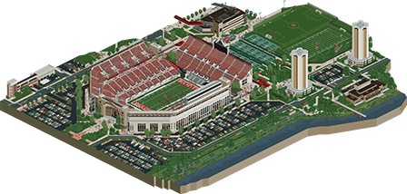
![park_3122 [MM2014 R1] Weise Stadium](https://www.nedesigns.com/uploads/parks/3122/aerialt2773.png)

Looks epic from the overview Walto, love the expansions you'd made to the map, really sets the scene super well. Can't wait to check this out.
Dang, so cool to see this in RCT.. well done sir. I think this is a great recreation of Ohio Stadium and in terms of realism, I have a hard time finding any fault in it. If you wanted, you could've included all the insanely long lines for getting a beer between quarters! I enjoyed the attention to detail with the retired numbers, signage, the tennis courts, soccer being played, bikers on the Olentangy.. really lively all around. I was afraid the surroundings would be a bit dead, but you captured gameday quite well.. it's a sea of people!
Having been in the stadium before it was fun finding the section I sat in last time... and having run around the stadium before in the Columbus Marathon, it was also fun to reminisce that... especially the red road here:
Things like the tailgates also greatly added to the atmosphere
Again, well done and congrats on making this!
Just got a chance to take a look and wow, just super impressive. The atmosphere and little peep details is really what has made your work special and its no different here. So many little things that do a great job of capturing the atmosphere of the game.
Super glad you expanded the map a bit too to include more of the campus, all of it was great. Lot of this style of architecture is hard to capture well in RCT but you did a fantastic job here. Just wonderful work Walto.
It's wonderful to see a solo release from you after so many H2H contributions, Walto. This is definitely up there with your best work, brilliant to see a non-park project of this size and detail being made. The stadium itself is excellent, the scale doesn't hit me in the screens but viewing it in game is different. It feels very personal and well researched too, so many minor details and quirks that sell the authenticity perfectly, and the attention to detail in every corner of the map is incredible.
Love all the extra pieces on the map, adds a lot to the life of the stadium by showing how active and busy the area is on game day. Things like the jumping peeps in the stands, the band music and the tailgaters are also a great addition to the atmosphere.
The main downside of the park for me is in the palette. It seems like every colour has been changed, with the saturation being pumped up on a lot of them and as a result it feels a bit alien. The grass in particular suffers from looking quite plasticy and loses texture. My only other nitpick would be the road cracks looking too dark and out of place on the lighter roads. Other than that this is a stellar map, congrats on finishing it!
I have zero clue about the source material, but I can tell a lot of care was taken towards every detail and the dedication to a consistent take on the architecture involved. This does make me long for Concept Creations - but I think this easily stands up to RCTNW's Hyatt/Marriott hotels and infrastructure in terms of detail and content, proving again that this type of work certainly holds significant value.
This makes me excited to see people attempt some larger cities and landscapes with the expanded limits with .park.
When I watched you make this, I had no idea it would feel as alive as it does ingame. Zooming out and seeing how huge and animated the crowd in the stadium was shocked me. The little details like the streaker, the anti-vaxx rally, the tailgaters, and the cornhole tournament really brought a lot of life and enjoyability to what could have easily been dead still surroundings made to serve as context for the stadium itself. Excellent release!
The hallmark of my favorite RCT pieces is the lifelike level of detail in the presentation. The ability to take scenery built for general RCT use and transform it into something that looks nothing like RCT as I know it is the skill I prize most in a RCT builder, and this is the best non-H2H example of this talent at work I've seen in quite some time.
Even the state of Ohio couldn't make Ohio look this good.
One aspect that has not been praised enough here is the immaculate object usage. The DP Frontierland windows are almost unrecognizable if you aren't looking for them, and the suspended coaster supports blend in so well as regular building supports, it's a wonder how rarely we've ever seen them used that way. You've taken objects that have been available to the entire community for years and strung them together in fresh new ways. Even that weird old info kiosk matches its surroundings perfectly, and I don't believe that object has ever been used well before.
It's unfortunate that, as one of the most immersive non-parks ever, this will not score even higher, but it's abundantly clear that your macro abilities, attention to detail and object mastery are all at a level that encroaches dangerously close to the blue territory at the very least. Regardless of which tier this park scores within, this release should comfortably answer the question your username asks: "somewhere on the Parkmaker page".
The palette is certainly unorthodox, but I did visit Wooster once as a child, and I remember purple being swapped out for beige then as well, so I suppose other parts of the state would naturally follow the same pattern.
(would have been a perfect 100 from me if not for its ardent support of the Stardust Sportsbook since, as we all know, it's a direct competitor to the Yerkalmanac)
jesus christ walt, I dont even like Ohio State and I love this.
Such perfect execution and attention to detail throughout. Palette looks great.
I just wish you would have made the map shape a perfect rectangle and set the entire map upon a solid black base with an extruded edge - almost like its a scale model of a stadium. Simply for overview/macro sake haha.
That said, this makes for an incredible overview. Post this on reddit, those nerds will go nuts for it.
What a fantastic recreation of that stadium. And I love all of the work put into the surroundings, for the whole game day atmosphere.
As a Michigan Alum, this makes me sick.
Well done.
Go Blue!
damn, this is just epic. and, may I say, such a welcome palette cleanser after so many goddam ncso releases back to back. so juicy.
anyway, excellent atmosphere, and the music obviously adds a lot. so alive and frantic, and the archy is beautiful. the trampoline peeps in the building is a clever trick. I also loved those awful student dorm towers. what a vibe