Park / Sugarland
-
 31-December 21
- Views 1,970
- Downloads 446
- Fans 0
- Comments 8

-
 49.50%(required: 50%)
 Spotlight Submission

CoasterCreator9 65% In:Cities 60% saxman1089 55% Jaguar 50% ottersalad 50% RWE 50% Terry Inferno 50% Xtreme97 50% G Force 45% Scoop 45% Liampie 40% posix 35% 49.50% -
 Description
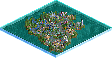
This was a challenge build, NCSO, No cheats, and it was mostly built in a few hours. I also wanted it to
look like something from the early days of RCT2, a retro park of sorts. Because of the no hacks it also works in Vanilla and Classic, another part of my challenge.
For the theme it's meant to be a children's park, somewhat inspired by the old children's parks of the 50's. -
 No fans of this park
-
 Download Park
446
-
 Objects
146
-
 Tags
Tags


![park_4796 [NEFC] Pineapple Road](https://www.nedesigns.com/uploads/parks/4796/aerialt4695.png)
![park_4799 [NEFC] New Element Kingdom](https://www.nedesigns.com/uploads/parks/4799/aerialt5004.png)

![park_4800 [NEFC] Ghost TowNE](https://www.nedesigns.com/uploads/parks/4800/aerialt5001.png)
Man, this is a lot of fun! Reminds me of Chocotopian's work, as well as savoytruffle's. Classic simplicity, quite beautiful. I think you can get more out of your parks if you make it less generic. There seems to be a candy theme, but it's only in the park name and the candy objects themselves. The ride names are generic. say not to genericness!
Also think your work would benefit from some custom scenery. 2004-era custom scenery.
What’s here was small, but I like some of your ideas. The mini suspended coaster was probably my highlight. A pro tour 2 bench park would be a cool project for you.
I wish you didn’t limit yourself to no hacks. I just am not a fan of the park border fences. I look forward to seeing what you have up your sleeve next. You’re quite productive
Cute - feels very retro indeed. I'd love to see you expand on this and make a larger park in this 2004-2007 era style - I really enjoy those "fully immersive resort style parks" and would love to see a fresh take on the idea.
Neat little park you've built. Despite the variety of colours and textures it's still quite charming and has a very playful atmosphere.
This is very cute. Reminds me of old times.
Damn, was the final vote here, missed out on an accolade by 0.5%. Feel kind bad as I debated for a while on my vote but from your recent screens I'm sure you'll be back with something better in the near future!
What was here is pretty nice though, just wish there was more content, if the park was 50% bigger I might have voted a little higher and I think a few others would aswell. Considering you did this as a challenge though it's a pretty nice piece of work!
This is a really pleasant piece of no-hacks work. I do agree a little bit with Liam in the sense that some more unique themes would help elevate your work - though I know you can do this. Keep at it. A full-scale NCSO no-hacks park from you (bigger than the ones you've already done) would be wonderful. I do agree that this park might be a little too small to win the accolade, but I could see either side.
I see how this missed Bronze by a hair, as it is very small and on the simpler side in terms of ride layouts, but I consider this to be a major improvement over your previous park in almost every other way. The shape of the island is very natural, and your commitment to using just one or two wall textures per building (and eliminating that striping habit from before) has allowed each of your buildings to develop its own identity. Not a single color or texture seems out of place, and you've harnessed giant candy and wonderland objects pretty much exactly as Chris Sawyer intended them to be used.
Something about this release evokes a level of "universal" RCT nostalgia; rather than calling back to an era of RCT's history in online communities, it instead brings back a time in all of our own histories when RCT was pure joy. This is a rare gem of a quality that I hope you retain as a builder, as most of us have unfortunately lost it over the years.
I gave this park the same score as I did Terror Bay, but considering that this one is about one-tenth of the size of that one, it should reflect that Sugarland's quality is a step higher. Had you executed this theme at this quality on a larger map (hopefully with a few more coasters), I could see it eyeing the Silver mark.