Park / Wings n Things Fun Fair
-
 31-December 21
- Views 4,006
- Downloads 482
- Fans 10
- Comments 11
-
 77.50%(required: 70%)
 Gold
Gold

CedarPoint6 85% In:Cities 85% bigshootergill 80% G Force 80% ottersalad 80% Terry Inferno 80% chorkiel 75% CoasterCreator9 75% Scoop 75% Xtreme97 75% posix 70% RWE 70% 77.50% -
 Description
Timeline Contest from DKMP.
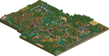
Wings n Things Fun Fair started as a back lot side show, but it grew beyond Swaggert Titterton's wildest dreams. Come enjoy the thrills and embrace your new adventure! -
10 fans
 Fans of this park
-
 Full-Size Map
-
 Download Park
482
-
 Objects
1
-
 Tags
Tags
![park_3211 [MM2014 R3] Heart of Darkness](https://www.nedesigns.com/uploads/parks/3211/aerialt2825.png)
So glad to see this up here.
It was so much fun watching the park progress
#TimelineGang
Eeeek! Super glad to see this out. I loved watching this grow over the year. The entrance buildings are HOT. I love the welcome banners. The opening generic section of the park is legit. The merry go round is gorge! That kids section is too die for! The Kings Horses ride is adorable.
The adventure section with the river rapids looks like the most fun, especially the rapids themselves. I love how much interaction there is here. The roman area is nice, i think the purple accel is my favorite coaster! The area is a bit small but oh well.
The western section has the best theming, the log flume and wild mouse are to DIE for. Such a cool release to see out! Congrats tits (.)(.) !
I've watched this park grow from a young lad into a sophisticated Chad.
Seriously, it's parks like this that make me truly appreciate realism, and park-making in general. The game is called RollerCoaster Tycoon, and I've always seen this game as such - but parks like this make me truly appreciate the minute details: back lots, nearby infrastructure, the story telling between each months, etc. Watching the original map get - not erased, but redone - gives it an extra boost of believability.
I believe the macro and micro are truly strong in their own ways. The balance of color is there, but not blinding, despite having two coasters with intensely bright hues. Each area feels well thought out, and not forced; not every area needs to have a standout thrill ride. Family rides are cool too!
Swag, congratulations on this entry. This was a great way to end 2021 and begin 2022. Hoping this gets a well-deserved high score!
I am head over heels in love. I will always be a fan of timeline parks; watching a tiny little funfair slowly develop into a full-fledged theme park is so much more immersive than having the final product presented to you. On top of that, all the love and care that went into making this as realistic yet charming and enjoyable as possible is commendable. The use of NCSO is also fantastic; on top of the detailed yet readable theming throughout the park, you somehow achieved NCSO crunch with the intersections! All of this combined makes this the kind of park I would die a thousand deaths to make myself. I was actually a little sad when I got to the last save. Legitimately one of my favorite releases in the last few years. Congrats on making NCSO Riverland.
Timeline parks always have a certain charm to them; it's fun for me to go through the saves in order and see how things change over time. The log flume is probably my personal highlight in this park. The roads also deserve praise; I don't think I've seen it done quite this well before - similar, but this is polished.
Nice work. I personally think this is low-mid Gold level; some of the coaster layouts have awkward quirks to them, but I enjoy the detail put into the supports and little features of the park.
Glad you've graduated from the smaller maps to something on a larger scale, even if it's still within the confines of a contest. The timeline aspect is interesting too, I think it sometimes shows that the restrictions of the contest dictated the park content, but I liked how some things were manoeuvred such as the fun fair at the start being moved to a different area to make the proper entrance better laid out.
As for the content there's some really lovely parts here. The entrance stands out as one of your best works, love the colour layering and form. Also enjoyed a few of the coaster layouts and supporting rides like the rapids and the go karts, which was a really clean execution. The foliage was another thing I noted felt quite refined, same with a lot of the path and road work, and I loved the bridge over the rapids.
One of the main issues I had with the park was that the longer I looked at it the more I noticed bits of work that I'd seen before in your other parks. The haunted manor and some of the wooden huts in Destiny of Kalfou, and the train station from sarajevo bobsleds stood out to me. Not to say they aren't good pieces of work, but they're so similar that it became noticeable.
First off, congrats on finishing this park. It was fun to follow along with the timeline saves.
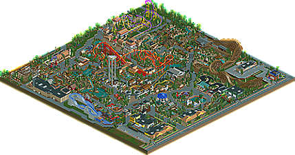
I think the park was quite dense and you were able to pack in a lot of really awesome details and themes given the constraints of DKMP map sizes. Only area that felt cramped was by Woodchuck Express.
Big highlights for me include the log flume.. dang. Great layering to the track textures and the mountain is very well done. I think you probably make the best/most realistic log flumes in the community currently. And I'd include river rapids in that category as well. Speaking of which, the mountain that housed the entrance to the queues for both the rapids and The Peak was excellent.. really great use of space and those queues are immaculate. Odd, but it feels "Disney" to me here.
Elsewhere, the invert was great.. well supported. Great backstage stuff there too. I have a hunch the area for Icarus was inspired ever so slightly by Caer Hywel, Antiquita, and Storybrook Glen which is cool.
Here's a few spots I enjoyed:
This use of coaster supports for the corners of this building was unique. Neat and simple.
Lovely and quiant car ride.. cool fountain too!
This queue complex is so cool. Will definitely be seen as inspiration in other parks
Cool fountain
Kudos and well done sir. Always a huge fan of your work. Some of the cleanest NCSO we've seen.
Really fun park, and awesome to see it grow with all the saves. Shows how much you've improved with every save. That building just before the entrance has changed so many times Great quality too in the latest save, my only little gripe was that the entrance area could've maybe be expanded/rebuild too a bit with the years, instead of just the road in front of it.. Nevertheless a great piece of work. I'm usually not that into NCSO, but you've made it look great here, good job!
Good park. The many tricks you found to create something with NCSO are very nice. You sacrifice aesthetics way too much along the way though. For a potential area of improvement, I would give more importance to creating something that's visually pleasing. It feels secondary for you right now.
More NCSO American realism? Don't mind if I do...
Much like Marblehead, this is the approach to NCSO I could stare at all day. It may not be up there with Storybook Glen or Blue Oak as far as clean NCSO realism goes, but your innovative approaches to various details really shine through here; you continue to stretch the limits of the Sawyer objects that convey your points and look nice in the process.
If I had to choose a favorite ride in this park, it would be the river rapids. The beige railings matching the rocks and ruins is among the most practical uses for a palette I've seen on an otherwise NCSO map, and the ride itself interacts extremely well with its surroundings without sacrificing its theme or identity. The bridge above it is a Spotlight-quality compositional moment. The go karts are a close second with those immaculate curves and 1-unit raised grass patches, something I have not yet seen often.
Speaking of beige, you've managed to work it in very naturally without it jumping out and screaming "Hey! This is a custom palette!" Since it appears already in unpaintable Sawyer items, it makes sense to include it for colorable pieces as well. The entrance area has a great shape and color scheme; modern architectural styles are underrepresented in parks, particularly when it comes to NCSO, and you've pulled it off quite well. Yellow was a bold choice for the buildings up front, but it too works well on a macro level with the Icarus supports on the opposite side of the map when zoomed out, and it might actually be my favorite artistic choice on this map.
And I must say, that railroad station is looking mighty fine!
I'm not 100% sold on the trees, and while I cannot quite pinpoint what it is, my best guess is that it's because you have large sections with tall pointy trees mixed with short, roundish ones, but these areas are missing the medium-height bushy ones that create the most effective lateral tree cover. A few more of those Monterey Cypresses, European Larches and green swamp trees (preferably those with the shorter trunk) would allow it all to blend together more naturally. Also, if you commit to about 10-15 trees throughout the forested areas (disregarding specific themed areas, of course), it will be noticeably more cohesive.
I believe the biggest thing working against this park was the map size, only because it did not allow for as much negative space, and this lack of breathing room within the park may have caused it to look more cluttered than it is. You do have some nice patches of mowed grass (my favorite kind), but in some instances (such as behind Icarus), you've planted sparse shrubs and bushes somewhat randomly across it. Let that grass pop!
I'm very much looking forward to seeing what you come up with next. Your NCSO work has consistently been some of the most fresh and exciting since you appeared on the scene, and your creativity easily rivals that of some of our most innovative builders. Clean up the foliage, keep executing your style with pinpoint accuracy, and you'll have a Spotlight on your hands before you know it.
this is a charming release that totally flew under my radar. timeline parks are always a joy...it would be really neat if somehow openrct2 could implement some kind of native park-switching mechanic for these kind of things. but anyway-
very dense, lush, and lively, a solid example of modern quality ncso parkmaking. the entrance was very warm and exciting, and I love that little castle area with the vekoma junior boomerang. maybe the best bit otherwise was the log flume, just a perfect little flowing layout.
oh, and i forgot to say- add music to your parks!! lazy bums