Park / Volcania
-
 21-January 22
- Views 1,916
- Downloads 374
- Fans 5
- Comments 8
-
 65.50%(required: 60%)
 Silver

CedarPoint6 75% bigshootergill 70% G Force 70% Terry Inferno 70% CoasterCreator9 65% In:Cities 65% RWE 65% saxman1089 65% Scoop 65% Liampie 60% ottersalad 60% posix 50% 65.50% -
 Description
Volcania was made for the DKMP timeline contest. So if you want more details about the story and each round check on the DKMP server.
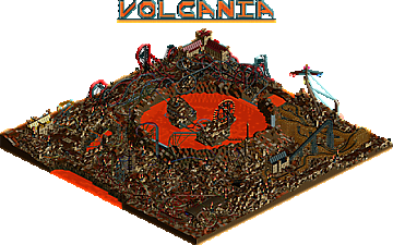
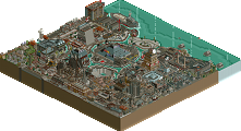
It is a post-apocalyptic park built around an active volcano, it features lots of cobbled together rides and buildings. In a hellscape like environment.
I had a lot of fun building this park over the year and I hope that shows. Enjoy :) -
5 fans
 Fans of this park
-
 Full-Size Map
-
 Download Park
374
-
 Objects
1
-
 Tags
Tags
This is absolutely overflowing with creativity. I love how the park tells a story. You went big and I think it paid off. My favorite was the inverted coaster section. It feels natural and very well-thought out. What an awesome debut!
I like post-apocalyptic stuff in RCT so this was a lot of fun to look through. Great atmosphere, a lot of fun and creative rides (Never though I'd see a post-apocalyptic Toboggan) and a lot of pieced-together wasteland buildings. Another thing I like is how massive this whole thing looks, with the huge volcano in the middle of things, it makes a 100x100 look even bigger than it is.
It also also fun to read through the story and check the previous stages out to see how it developed over the year.
Its a mess, sometimes its a very beautiful mess like in the area with the grey and red coaster, sometimes it doesnt work that well to my eye. All in all this is a great park and i think possibly one of the best creations weve seen over here coming from the DKMP community yet.
Finishing this is quite an achievement. A lot of my criticisms you already know, so I'll keep it short: ugly palette, spammy theming (instead of idea-driven theming), and the park being hard to read as a result of both of these things. Ignoring all that, there is a park that I definitely like! Great dedication to your concept, in things like the coaster trains, which mirrors the architecture nicely. The burning views crane thing, the lava dam and flows, tornado of souls... That's good stuff. The coasters are nice, but a bit over the top. Less is more. Fire Storm is probably the my favourite!
Curious to see where you're going next. I hope you can apply some of the feedback you've had, but I'm glad you saw this project through to the end in your own way. That's not easy! Well done.
yoooo congrats on the silver! I thoroughly enjoyed this park. While a little rough around the edges, it worked thematically. The areas where I thought it fell a bit short were the composition and readability. I understand the theme, but a little more care taken to make sure that things are a little easier to view would have really helped to elevate this. Lots of clutter, which looked cool. But just a biiiit too much in some spots.
Really cool park regardless. Congrats on the great achievement
733737 Fan Offline
I haven't had the time to read your story or look at all the stages, but I will try to make an effort to read and look at all of them by next year. I am so happy you made this park and I love the post apocalyptic theming and the great coasters! keep it up
I liked seeing constant progress pictures in Discord but never got around to commenting on the finished product, so here it goes:
+ the macro is really dramatic, I didn't realize your logo actually appeared in-game until I opened the park
+ your support work is absolutely mental, love what you've done with the single rail tracks. I'd be very interested what you could come up with in a different context. Supporting those duelers is a true achievement
+ love the patchwork construction feel, the coaster with multiple colors/track sections is a neat idea
+ Your building construction reminds me a lot of the slums of Haven City from Jak 2 or even Spargus in Jak 3. The constantly varying heights, textures, and rooves do well to sell chaos
- I know it's very much by design but the palette gets old after a while, it makes it tough to decipher at times when combined with..
- the overwhelming sea of browns. Most every building texture is some shade of brown and there's a lot of base land to define the map (which is also almost all shades of brown). Aside from the lava, there's not much on the map that pops
[] this might be personal preference, but orange water never really feels like lava to me, especially when it's visibly transparent and still (shouldn't an active volcano be violent?)
Anyways, I came away extremely impressed with your track structuring ability and would love to see you tackle something that explores it more. Congrats on the silver, can't wait to see what you're working on next!