Park / Gathar's Greenhouse
-
 21-January 22
- Views 3,289
- Downloads 473
- Fans 0
- Comments 11
-
 69.00%(required: 65%)
 Design

Jaguar 75% ottersalad 75% Terry Inferno 75% Xtreme97 75% bigshootergill 70% In:Cities 70% Scoop 70% G Force 65% posix 65% RWE 65% CoasterCreator9 60% chorkiel 55% 69.00% -
 Description
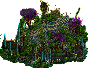
"After years of failure, the potion finally worked.... A little bit too well..."
-
 No fans of this park
-
 Download Park
473
-
 Objects
1
-
 Tags
Tags

![park_2403 [H2H6] R3 - RevoLLutionists - Concrete Jungle](https://www.nedesigns.com/uploads/parks/2403/aerialt2138.png)
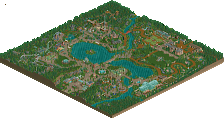
Not much to see here, but what i do see is amazing. Very cool atmosphere and world building. Makes me wanna see you do more in this style.
It's stupid how good this is
this was super gorgeous, i love the interaction and with the greenery and plants and structure!
Leon and overgrown foliage is the best combination. Absolutely terrified stuff like this is what I'll have to go up against next Micro Madness.
Really good work. It will be interesting to see if this wins design! The quality is exceptional, but it is very small! On the other hand, the coaster does have an excellent layout. It's also very unique and has good interaction too. Very intriguing entry.
This was lovely, but so small that it didn't warrant the high score it would have if three times as big. It's almost like a micro. I'm impressed by the amount of layout you were able to fit on the map though, and the many theming elements. Quite a unique and interesting theme also. Well done.
This is like looking at a painting, but it moves occasionally. Your use of color here is immaculate, and while moss green dominates the scene, you manage to contrast it perfectly with both bright colors and light earthy browns.
However, I do not think green as a whole suits you anymore. It is long past time for you to turn red, or perhaps even blue, so finish something large-scale with this magnitude of Leon magnificence!
This is incredible stuff. Just gorgeous. Only you can use blue trees and make them look great.
Designs should not be scored based on size.
Size matters debate no thanks.
Congrats Leon. Perhaps the smallest design win ever.
Reminded a lot of Cappadocia. You've got a great skill for making tight and flowy layouts. I think the lush foliage vibes and watching the train sneak through it was quite fun to watch. I guess size of the park is important here, but I think you packed a lot of detail in to this. No need for extra filler imo.
Agree with Terry that this felt very much like a painting.. but with movement.