Park / Knots Bessen Boerderij
-
 25-December 21
-
 Knots Bessen Boerderij
- Views 2,844
- Downloads 462
- Fans 3
- Comments 9
-

-
 76.50%(required: 70%)
 Gold
Gold

Liampie 80% RWE 80% Terry Inferno 80% WhosLeon 80% CoasterCreator9 75% G Force 75% In:Cities 75% Jappy 75% ottersalad 75% posix 75% Xtreme97 75% chorkiel 65% 76.50% -
 Description
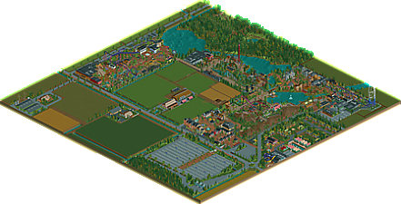
The story of this timeline park started in the 80's with a farmer's son that decided to start a small local amusement park after he got a piece of land from his father. Being angry of his son not continuing the family's farming business, the father refused to pass the rest of his farmland to his son, resulting in the park growing around the old family farm. Despite this issue the park eventually grew out to be a large thriving themepark.
I started this park in 2014 with the idea to build it in the old-dutch parkmaking style. However in the following years more and more modern NE influences found their way into the park giving it a modern feel in the end. -
3 fans
 Fans of this park
-
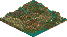
 Full-Size Map
-
 Download Park
462
-
 Objects
525
-
 Tags
Tags
![park_4086 [H2H8 R1] Tahendo Zoo](https://www.nedesigns.com/uploads/parks/4086/aerialt3817.png)
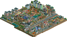
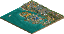
Super glad you finished and released this Rene, really enjoyed following this back in the day when you we're posting the timeline updates. I think the recent additions and stylistic improvements are great too, definitely feels like a natural progression of the classic dutch style and shows your ability as a parkmaker and detailer.
Combining some Herschend elements with the more European feeling theming and coasters really lead to a unique park.
While some aspects and objects do feel a little dated I don't really mind it, sorta a nice change from the hyper crunchy and micro style we're seeing with RCT currently. Thinking this is going to be something I'll come back to often to just enjoy some solid parkmaking and fun theming.
Hope we see more solo work from you in the future!
Pure nostalgia! Amazing park, Rene.
Congrats on the release, Rene. Really lovely park. Very unique to me, since I am not an expert on Dutch parkmaking. The layout of the park I think is different and the storytelling definitely helps sell it.
The theming here is super well done and elevates this quite a bit. Doesn't feel generic to me at all. Size-wise, there is a lot to explore which I enjoyed. Some areas you could tell were a bit dated, namely the entrance plaza. But, as you get deeper into the park, the area surrounding Tucano is very refined. It also seems that peep interaction is a major focus in this park with every ride going over or under paths. Really well done to avoid the dreading path islands!
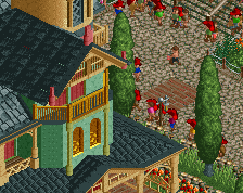
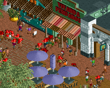
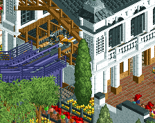
Figured I'd share a few screens of bits I enjoyed:
Wooden coaster turnaround was very nice. Looks fun as hell.
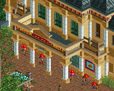
Queue entrance here was great. Good example of how nice a lot of your queues were themed.
As was the rapids. Very atmospheric and great interaction between all the rides here.
just snooping around the park and i gotta say i truly love the vibe this has, only weird thing about this macro wise is how the tucano area is a pretty big dead end without any transport ride in or out of it, pretty big macro "flaw" but i can see that work irl if need be. some small things to note, like the woodie switch track not having the slider to actually make it work is kinda sad to see after seeing how much detail is already put into it
Really enjoyed looking through this. I like the odd layout and the story to go with it, and the whole park has a nice atmosphere. A lot of highlights with the architecture, Mystic Manor being one of my personal favorites.
This is the sort of classical park making I aspire to. Pretty modern object usage, mixed in with classic RCT rides and keeping that quintessential look of RCT without too much fuss and weird non fitting textures.
When we were still doing De Concurrenten, I remember being disappointed that oyu abandoned the 2007-look and went for something more modern, but now I can only commend you for doing that as it has worked out in the parks favour. I agree with BG that there are a few oddities macro wise, but to me that only heightens the realism as now it feels like a real park that has to work with the land its got.
I hope we can see more of your work soon!
This is pretty charming. I appreciate the classic parkmaking and lovely atmosphere. Feels like a mix between Riverland and Paul's parks. The turnaround on the wooden coaster is fantastic looking.
All in all - really solid work. Enjoyed this a lot.
This was a fun park to explore, sort of been under my radar until quite recently so it's great to see it released. The object selection somewhat ages it but it's a charming park regardless and shows a lot of good parkmaking skills. On top of that it feels like a clean evolution from classic dutch timeline parks towards something more modern, especially towards the back.
The timeline aspect certainly shows in how "sectioned" the park is, the big farm area dividing off the back section of the park is a neat quirk despite how awkward it makes the park layout. Highlights of the map for me would be the Bolivia/Amazon area, the Norse area and the Mystic Manor ride. The coasters throughout were rather nice, some clunky parts like the flat section on the wing rider hill, but a solid lineup. All in all a great park with some dated sections that are more than made up for with charm and atmosphere.
this is a really lovely little park. on the surface I was expecting a somewhat typical 'dutch' park, but actually I found the construction and detailing to be quite modern and fleshed-out. there's a lot of lovely architecture, and I love the way its crammed into its surroundings, making the evolution of the park very apparent. highlight is probably the turnaround on the woodie, what an excellent element. love the entrance plaza with the hotel too