Park / Marblehead
-
 25-December 21
-
 Marblehead
- Views 5,477
- Downloads 717
- Fans 6
- Comments 19
-

-
 79.50%(required: 70%)
 Gold
Gold

In:Cities 85% Terry Inferno 85% bigshootergill 80% CoasterCreator9 80% G Force 80% saxman1089 80% Scoop 80% SSSammy 80% Xtreme97 80% Jappy 75% posix 75% RWE 70% 79.50% -
 Description
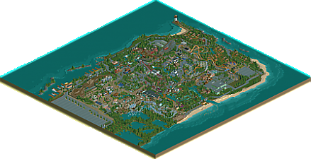
Welcome to Marblehead! This quaint park is situated along the Lake Erie shores and was created in the early 1900s to compete against the giants of the time period, Euclid Beach Park and Cedar Point. While it was difficult competing with other parks all offering the same picturesque views of the best body of water in the world, Marblehead was able to stand the test of time. Over the decades, the park operators slowly added and expanded the park thanks to partnerships with companies like HUSS and Arrows.
In 2018, the park was purchased by Cedar Fair who quickly added Endorphin, a new centerpiece coaster to Marblehead. In continuing the theme of their expansions at other properties, Cedar Fair also added the two cabin areas to the end of the peninsula.
Whether you relax on the beach, fly through the air like a fighter pilot on Mustang, or just enjoy eating funnel cakes and watching coasters zoom by, we sincerely hope you enjoy your stay along the beautiful coast of Lake Erie.
Huge thank you to Zarathustra for his hacking expertise on Boulderdash and the Christmas Curve. Also, as always thank you to everyone from Strangelove for helping me along the way with advice and tips. And thank you to everyone at New Element who inspire me to keep playing this game. -
6 fans
 Fans of this park
-
 Full-Size Map
-
 Download Park
717
-
 Objects
1
-
 Tags
Tags
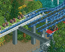
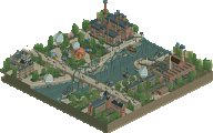
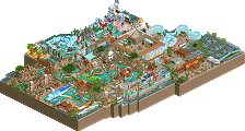
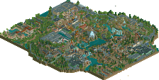
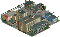
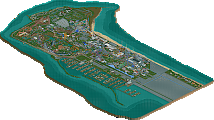
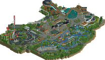
Wow this is a huge map. Congratulations Otter!
how do I view this? I only see a Park file?
openrct2 in the develop version.
.park is the new save file format.
I think the completeness is what really impresses me most here, not often we see all these side details done to such a high level in NCSO. For the most part some of my complaints with your path layouts and planning have been resolved here, despite there still being a bit of awkwardness and dead ends. Other than that really hard for me to not like everything here.
All the coasters really felt unique and had their own identity which adds a lot to the depth of the park, as do a lot of the buildings and areas. The CF and Cedar Point influences do show here which is fun and sorta a different vibe in NCSO than we've seen recently.
Definitely want to mention how clean this feels too, really impressive for ncso. No awkward objects or angles that sometimes happen with this style. Pretty much everything feels like it belongs and that is impressive.
Still debating a bit on the score but currently leaning 80%.
love you otter man.
remind me to do a proper review when I have the time. I was blessed to be able to view this in game for testing, and it's by far your best work yet. so great.
Candymonium is a smaller scale hyper that has an off-axis bank that's similar to what Otter used, and that opened in 2020, so I don't think this its all that crazy.
Otter, great work here. Really enjoyed looking through this park, and really got the Cedar Fair vibe, even with the limitations of NCSO.
I personnaly love this park. This is the sort of NCSO I like to see. A nice simple theme, an American realism park, executed brilliantly without overuse of trackitecture and with some great creativity. I don't really have that much to say about it.
The Christmas area was novel and not something you see that often in RCT so I can commend you for doing that. I also really like you made a few rides that are not that standard and are pretty creative like the aptly named Innovations and the beautifully integrated Boulderdash.
Well done Otter, keep 'em coming!
Congrats on this release! Super nice park with lots of great bits and pieces.
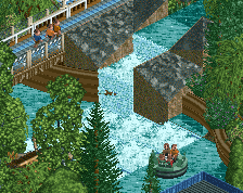
The area around zara's switchback is top tier! the river rapids, flat ride and station all look incredible. The density and excellent macro of the section really makes it pop, if that kinda planning made it through the whole park it would be fantastic. Some things feel like filler- the lovely retro building near the corck screw is great but feels outta place, some more neagtive space to appreciate the great foliage and landscaping you do would be very much loved!
The coaster layouts in this park are really well done! I love the interaction with the arrow and hyper! The two woodie look great and the sus and invert too! The supports look great on all of them too. The logflume drop operator booth is one of my fav details.
Love seein your stuff otter! cognrats agaon!
Really enjoyable. Sort of a mixture of alex and G Force/pac in my mind - which is a great thing. Feels a lot like a reimagined Cedar Point, which is one of my favorite parks of all time - hard not to love this. Great coasters, lovely atmosphere, some unique themes. It's no secret I'm a fan of not-so-cluttered NCSO; and this achieves excellent detail through creative use of both track and objects without going overboard.
Really great work. You've evolved significantly, and I'm looking forward to what you have in the works next.
Great piece of work, Otter, I've enjoyed seeing this progress in the screens over the past few months. The overall map shape is cool, like a condensed cedar point. Great peripheral details like the cabins, boat dock and swampy/pond area. Only complaint is that the park layout is a bit confusing/directionless around the entrance, but I think it clears up towards the back of the park. Some really strong layouts throughout, the way the B&M hyper interlocks with the arrow feels quite realistic with how limited the space is and how it has to weave through the existing layout.
The architecture is quite nice. It's lovely to see how it varies throughout but still feels like a family of styles and doesn't rely so heavily on track roof. It's taken inspiration from a few modern NCSO styles but also builds on them in its own right and has your own personality.
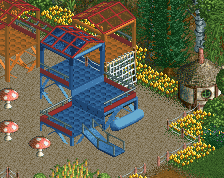
Standout parts of the park for me would be the Gravity Group coaster with its own little themed enclave and the christmas themed area which feels like a playful idea for a park like this. Lots of really cute little ideas too like the guess your weight stand, the boat ride rails on the art deco looking restaurant, the basketball hoops! All in all the park feels fun throughout and makes me want to fire up my own projects which is an excellent quality to have I think. From a technical perspective it's definitely a step up from Caer Hywel, but I don't know if the atmosphere is quite as strong. Loved the park regardless.
Painful to see this score.
Let me try to feedback why I didn't vote higher. I must say the park felt too repetitive and uneventful for me to warrant an 80%. Whilst you have a very good level to articulate your content, it was artistically "boring" (for lack of a better word), and although I know that RCT2 NCSO look is to blame to certain extent, it cannot be the only reason. You do get parks like Ancient Worlds (sadly due to the shortage of NCSO I don't have much else to compare to) ..that are beautiful and NCSO, still. I cannot say about this park that I thought it was beautiful. And that's where higher scores are coming from in my votes. Your foliage is still the best aspect of your game in this regard, but aesthetically I was longing for a further development of that charme and warm atmosphere Antiquita had. This felt cold and serving the clichés of dirty american realism.
I would recommend you try a smaller project next, like a design perhaps, to experiment more boldly with artistic expression, through extreme colours and shapes, to see what you have in yourself here.
axolotl Fan Offline
I wanted to say that I love this park so much. It doesn't feel super busy, and its a really good looking park.
I think my favorite rides are the Intamin Hyper and the Arrow Looper. I really like how they look and just flow in general. Also love the Arrow color scheme. I'm also a big fan of the Arrow suspended coasters layout.
If I could give some criticism, though, I feel that the Arrow Looper's trains feel unrealistically short, and they crawl through the last corkscrew.
But overall an amazing park, and one of my favorites. I just love how it doesn't feel too cluttered, while still being packed in a bit tight. Great work, and hope to see more from you in the future.
Great park! I hoped you would top 80 with it, but it's still a respectable score and you did a very nice job with it.
Here's a video review of the park with Otter providing guest commentary:
https://youtu.be/VVT1S3WtHX0
NCSO + dirty American realism = one of my favorite RCT2 aesthetics.
The technical proficiency you've shown with this release is miles ahead of where you were just two years ago, and your eye for composition and attention to detail really shine through here. Every flaw I saw in Antiquita has been completely ironed out, and you've allowed your foliage and terrain to take natural shapes while using cohesive building techniques that deliver the right amount of detail without overtexturing.
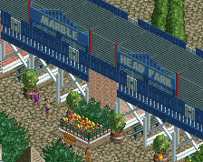
And speaking of the architecture, this park features a handful of some of my favorite NCSO buildings ever...
Despite an existing bias in parts of the community against certain forms of trackitecture (especially in roofs for some reason), I am fully supportive of using tracks to their full potential, and you've done just that in the structures above.
I'm on the fence when it comes to English Palette in NCSO. On one hand, I appreciate the mixture of different browns, beiges and rusty red to augment the uncolorable walls that fall within that general color scheme. On the other hand, the palette itself has a flatness to it that causes the map to blend together a bit too well on the macro scale, which is something with which NCSO parks often struggle even with the Sawyer scheme. I see what posix means about parts of it being artistically repetitive, but I attribute that more to color than style in this case. Each area does have its own distinct personality, and I enjoy the thematic subtleties that separate each area without deviating from the overall Cedar Fair look (which you absolutely nailed, by the way).
While the layouts may have ultimately been the deciding factor when it came to Marblehead crossing the 80 threshold, I believe that the majority of the architecture, landscaping and detail work is up there with Storybook Glen and Blue Oak as some of the best we've seen in NCSODAR yet. You should be extremely proud of what you've built here, and though it may not have been scored as high as expected (if anyone knows what it's like to miss it by a fraction...), I'm certain that your next park of this magnitude will have a certain green effect on your name.
Get this man a clickable aerial!
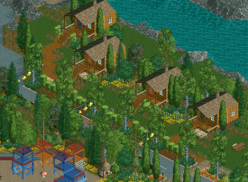
Not sure where to start with this so I’ll begin with the surroundings, which after a few viewings I think might be my favourite part of the map. As others have said, your landscaping and foliage skills are already excellent, and I think with this release you brought it one step further with a level of ambient storytelling in all the outskirt and infrastructural details:
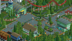
In terms of the park itself, my feeling is that it’s full of moments of brilliance - especially individual structures and rides - but I found it was sometimes lacking cohesion in a way that you would have a quite heavily themed building (or one with a standout architectural character such as the art-deco diner), but then no other similar styled buildings around it. I’m not saying it needed themed areas, since I get that you’re going for a kind of amusement park realism rather than fully immersive theming. Rather I think the park could’ve benefited from a more consistent house-style through the generic structures.
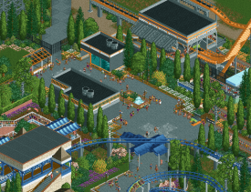
That said, there was still some beautiful placemaking to be found. In particular I loved the aviation theming for Mustang and the plaza underneath the helicopter ride. The checkerboard flowers work brilliantly and the greens as a base-tone work really well:
I thought the generic but subtle high-tech/industrial feeling in this area was really well executed too:
Love the warning stripe signs! (and will most likely steal at some point)
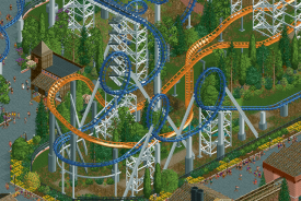
Another high point was these two coasters interacting with each other:
Ride spaghetti still has such a nostalgic RCT charm to me, and if you can execute it well in a realistic way, then to me there is nothing better. Fantastic colours here too.
Anyway, congratulations on the gold and hope my comments are helpful - really looking forward to whatever you’re working on next.
I love this park. Basically every layout is excellent and the atmosphere is great. It feels incredibly clean but also highly-detailed.
Great work.
Circling back; congrats on the gold Otter! This park just oozed classic atmosphere and charm. Similar to a lot of the great NCSO we've seen in the past few years (and from you), something about removing the CSO brings an instant, almost effortless charm to the park. I think that is well balanced with some great details, particularly unique ways of using the basic tools of the game to craft a realism aesthetic. Personally, I found the coasters to all be pleasant but felt the park could have used one or two flashier wow coasters, not so much for the peeps but for the viewers.
This park is also deceptive, it's massive and yet feels smaller than it is. I wonder if that is because NCSO, I remember thinking similarly about SG maybe because of the jump from itty bitty CSO to primarily full tile structures.
I'm honestly bummed you didn't get over the 80% benchmark for this, I think the work shows a sense of planning, composition, and detailing that should be at least at or above 80%. This combined with your previous NCSO releases really shows a clear parkmaker-level approach to the game that I think would be more quickly rewarded if parlmaker wasn't tied to accolade scores. Alas, congrats on the gold and epic release. As always, excited to see what you do next!
of all my backlog, this was one of the ones I was most hyped for, and I have to say it does not let down. actually, I found it even more impressive than I was expecting. I think you totally nailed the ideal american cedar-fair style park, with a kind of blend of theme and not-theme. Sometimes people undersell the themed areas, but I found this reminded me a lot of parks like worlds of fun, where its evident that they at least tried. I particularly adored the christmas theme---snowy areas are really difficult to pull off well and this nails it. feels exactly like what I would expect out of this kind of park, very holiday world vibes. there's a lot to love in this park, heaps of pretty corners and cute buildings and landscaping, all in nostalgic lake erie surroundings. but maybe my highlight is boulder dash, with the wonderful red station and bridge over the track. excellent composition.
apologies for taking so long for feedback...really a wonderful release