Park / DreamLand
-
 27-November 21
- Views 4,837
- Downloads 518
- Fans 3
- Comments 12
-
-
 74.50%(required: 70%)
 Gold
Gold

bigshootergill 80% CedarPoint6 80% RWE 80% G Force 75% In:Cities 75% ottersalad 75% posix 75% Terry Inferno 75% saxman1089 70% Scoop 70% Xtreme97 70% CoasterCreator9 65% 74.50% -
 Description
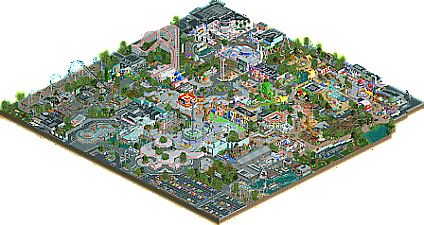
Dreamland is the most famous park in France (after Disneyland!) located in Rennes, Brittany. This park is known for its magical side, loved by children and parents alike. Reviewers say the attractions are bad but recognize the unique atmosphere of the park. Many people were outraged by the high ticket prices, the owners replied that it was the price to pay to get the use of the many commercial licenses present in the park.
More seriously, this park is a tribute to my childhood and my adolescence. I'm a 90's kid and always tried to keep my childish side in this weird world. So this park is dedicated to all these heroes.
PS : I have never posted on NE, however I took a lot of inspiration from all of you guys
PS 2 : I suck in English (it’s my french side), so I use google translate -
3 fans
 Fans of this park
-
 Full-Size Map
-
 Download Park
518
-
 Objects
576
-
 Tags
Tags
![park_2387 [H2H6] R2 - Reservoir Dogs - Pixar Animation Studios](https://www.nedesigns.com/uploads/parks/2387/aerialt2130.png)
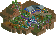
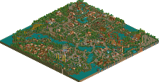
This is a great debut park! What really shines about this release is how recognizable all of the themes are, whether through sculpture work or color palettes. This looks like a park you had a ton of fun with, and that enjoyment is palpable as I look through it. My one gripe is that some of the ride layouts feel a bit awkward, but the surroundings definitely make up for it. You might be able to crack a gold accolade with this one!
Now for some highlights.
- Those curves in the entrance building are gorgeous.
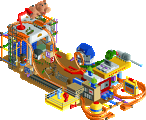
- In love with the Toy Story section. Best example of the sculptures and colors I mentioned earlier.
- Love the Ratatouille-themed street. It's a lot more subtle than the rest of the park, but it looks amazing.
- The Ninja Turtles facade.
- The Mario World facade looks like something I would've tried to make ten years ago if I were proficient with custom scenery (hell, if I even knew what it was).
- The Kamehameha sculpture on the Dragon Ball Coaster station.
Hi Babar Tapie! This is such a cool release, congrats!
This entrance is wild, I love the color and shape of this curvy sexy building. The tree openings are cool af. The opening ride, the water ride is neat- that turtle nemo statue is bonkers. The two big coasters are interesting at least. The architecture and details are what makes them pop! I wish the layouts matched the amazing quality around. The south park suspended monorail indoor ride is great! Love the building. The 2001 Rabbit Odyssey is cute af, i love the carrot worship thing. So silly, we stan. I like the beep beep road runner, and family rides are some of my favorites. The water coaster is pleasant. The indoor splash is odd but oh well.
Some of the architecture and detail highlights for me are the angry birds guys, one of my fav apps as a kid. The burger bar is super cute. The speedy Gonzales ride and Mexican archy is super sexy. The pizza box is funny af.
Congrats on such a cool release! Cant wait to see more from you.
What an impressive first release on NE. Great sculpture work and setpieces all around, was easy to tell what they show or game they were from, even the ones from stuff I haven't watched or played. A lot of creativity too, some of my favorite parts are the miniature city/town dioramas around the park.
Wow, honestly I was pretty amazed with how many IPs you managed to include here, only a few I didn't really recognize but my gosh basically a snapshot of cartoon/animation pop culture for the last 60 years. Super impressive stuff for a first NE release, kudos to you.
Only real complaints where it felt a bit dated stylistically, not sure how long you've been working on this but it gives the impression a lot of this might have been build a few years ago. Not that that is a problem but I think it hurt the overall feel of the park for me a bit.
Would like to see a bit more time spend on your ride layouts and maybe thought put into the whole macro of the park, big concept planning and such.
Overall fantastic stuff, hope this isn't the only park we see from you!
Thanks a lot for your feedback! I fully agree with the negative reviews about the coasters. To be honest it's really not my favorite thing to do, you can feel it in my park but it's something that I plan to work on. For sculptures, I’m passionate about art in general (and Lego !) and I had the chance to study in a fine arts school, so I use the same gestures and process as a sculptor / designer to construct them.
First off, welcome to the community, I hope you stick around.. your style is unique and it is obvious you cared alot about the shows/themes in this park.
I think the sculpture work here is some of the best we've seen.. and that includes the greats like FK and Mamarillas. So many were like "a-ha!" moments throughout the park.. as a viewer it was so cool to see themes and references of shows I grew up on as well. Really got me on the nostalgia. The Toy Story stuff and Spongebob stuff were highlights perhaps. Your park just screams fun, and I really enjoyed combing through it.
In terms of the park itself, it was quite dense, but in a good way. But I agree with others that coasters and rides were a bit of a let down. The splash boats and the Jaws rides were the worst offenders. The Rick and Morty ride might be painful to ride as well! I agree with G_Force that park layout and macro planning would be something to work on in the future if you choose to keep playing RCT. For example, why are Rick and Morty with TMNT? And why do I have to walk through Disney World Light upon entering the park? Honestly those are just some thoughts, not major complaints. I think overall the park flowed well, but just some food for thought.
Again, congrats on the park. Hope to see more from you.
I will write more later, but for now, thank you for this park. The structures and commitment to emulating the various IP (intellectual properties aka the different cartoon characters) is fantastic. Also love the pastels and overall arrangement.
Will get to reviewing a bit more of this, so happy it exists.
This park was so much fun to look through, I had a grin plastered on my face the whole time! I'm a sucker for colorful sculptures so there was a lot to appreciate, but my favorite bits are when you go to a really fine/small scale. Like the miniature Springfield, recognizable but scaled down so carefully and meticulously. Congrats on the gold!
Such a well-themed park, and a well-deserved medal for this lovely slice of France.
Between this and the recently-released LEGO park, there was lots of nostalgia here, reminiscent of my favorite childhood cartoons and other characters.
A cool hodge-podge of various brands and companies' creative properties that could never occur in real life due to copyright B.S., but all fitting so nicely into the realm of RCT.
Welcome to NE! This is quite the debut.
When it comes to displaying recognizable characters and structures in the form of giant deco block sculptures, this park sets a new bar. Rarely did I find myself wondering who someone was or which location I was looking at even during my first viewing. You've gotten more mileage out of deco blocks, trims and base blocks than any builder I've seen thus far; I can only imagine what you must be capable of with Legos!
Of course, giant sculptures would only go far on their own--what really brings this park to the Gold level is the immersive set of worlds you've created in this animated wonderland and the precision at which each area was executed. Both the architectural facades and the backstage areas evoke a keen eye for detail and a solid understanding of RCT2 custom scenery. Areas such as the Toy Story Plaza, Congress Center, and the Krusty Koaster building would fit right at home in a Spotlight.
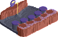
There are several technical choices that hold this back from unanimously crossing the 80 threshold, most notably the ride design as others have mentioned. The landscaping could also be improved upon to avoid jarring transitions and right angles whenever possible. I'm not sure what's going on with that grassy knoll between Happy Tree Friends and the Rabbit Odyssey, but it could use about 90% fewer edges. I believe you could also take your artificial rockwork to the next level by adding some 1K ruins and other rock pieces. You have the right idea with giving your terrain more texture, and I believe the next step for you here would be to work on smoothing the square transitions between different terrain types--the safety net, grass trims and 1J water items work very well for this in addition to the voliere and mowed grass objects.
You've managed to capture a whimsical side of RCT that's rarely seen today, and I sincerely hope the jovial worldbuilding you've brought to DreamLand follows you into every future release of yours! An absolutely wonderful debut park and hopefully the first of many to come.
Interesting park. For all the complaints about the ride design, I thought that the mine train was decent and Happy Tree Friends was well constructed. The Rick and Morty suspended looping coaster didn't seem to work for me but I'm a little behind on the version of Open RCT2. I thought it was well themed overall and I'll be looking at it again to see what I missed. Congrats on the gold and I'll be looking forward to your future work!
wow, this park is fucking wild. its not often you see a kind of new style in rct, so I have to applaud it for that. the entrance is absolutely phenomenal. really one of the best i've ever seen, and I wouldn't be surprised to see it emulated in the future. seriously excellent.
the ride design is obviously not the strong point here, and the selection of franchises is baffling, but I don't even care. its dense and nuts and full of awesome structures. coco is a highlight, and weirdly enough, I think your spirited away bathhouse, on a park design level, actually `fits' better than other, grander attempts I've seen. well done.