Park / Ancient Mesas Theme Park
-
 06-March 09
- Views 5,344
- Downloads 749
- Fans 0
- Comments 10
-

-
 53.08%(required: 50%)
 Bronze

posix 70% FullMetal 65% Xcoaster 65% zodiac 65% chapelz 60% Fr3ak 60% Evil WME 55% Magnus 55% Milo 50% Steve 50% geewhzz 45% CedarPoint6 40% nin 40% RCTFAN 40% 5dave 35% 53.08% -
 No fans of this park
-
 Full-Size Map
-
 Download Park
749
-
 Tags
Tags
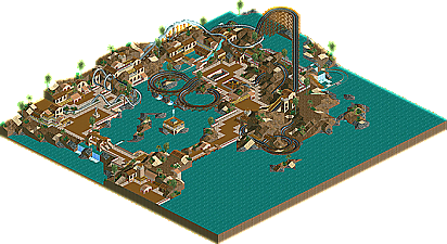

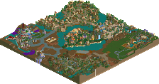
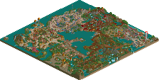
It seems like only yesterday that Cocoa brought us his first NE Design, The Curse. It was a great design that showed us the amount of detail he could put into an RCT2 design. But for those of us who aren't akin to RCT2's flashy graphics and fancy technologies, we needn't panic. Cocoa, it seems, is one of those players who exists in the realm of RCT2 and RCTLL bringing us Ancient Mesas Theme Park! Read On...
Nice work, looking forward to more. For me, seeing "RCTLL" next to game version is always a nice surprise.
For a first attempt at LL its great, and really shows some skill that will be interesting to see develop.
Congratulations on getting Bronze.
Nice work on the bronze!
hopefully it will be a gold or a spotlight next time. : D
As for the trees, there are not many because I originally made the entire park with just brown land. I wanted to keep the bare feel, and there isn't the redish dirt like in rct2 so I didn't know what to do to keep it bare but still with foliage.
As always, thanks for the nice comments, wasn't expecting too many for a bronze park. And expect more LL from me
this was a nice little park. i enjoyed it. i think you're diving into the phase where colour combos really begin to work out for you.
That said, what is there is nice. Next time don't forget the finishing details.
James
There were a lot of negetives but I think you are still someone to watch out for. Your latest screen you've shown looks to be better than this and I look forward to seeing what you can accomplish in the future. The main thing you need to work on, even with the lower detailed style you're going for, is to try and make your themes more believable... this didn't have much of a Greek vibe which is what I assume you were going for. It also lacked the polish that RCTNW mentioned which adds a lot to your finished project.