Park / Eldritch Gardens
-
 27-November 21
- Views 2,829
- Downloads 414
- Fans 7
- Comments 6
-
 72.50%(required: 65%)
 Design

In:Cities 80% bigshootergill 75% chorkiel 75% Liampie 75% ottersalad 75% Terry Inferno 75% CoasterCreator9 70% posix 70% saxman1089 70% Scoop 70% Xtreme97 70% Jappy 65% 72.50% -
 Description
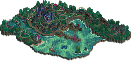
IN THE VILLAGE BENEATH THE CHAPEL THEY CALL AND SHE HEARS FROM THE BLACK BETWEEN THE STARS ANCIENT SEVERED SPHERES INTERTWINE AND THE THREADS OF THE WAKING WORLD WEAR THIN AND INVITE DREAMS OF FLESH ACROSS THE RIFT SHE APPROACHES AND THE CONGREGATION WAITS THEY LONG TO COME HOME THEY LONG TO COME HOME THEY WILL COME HOME SHE APPROACHES AND THE SKY THRUMS WITH COURSING BLOOD AND THE CLOUDS OPEN THEIR JUDGING EYES IT IS BEAUTIFUL BEAUTIFUL SHE APPROACHES THE CHILDREN RISE FROM THE EARTH TO WELCOME THEIR MOTHER THE CONGREGATION AWAITS HER ANSWER TO
RETURN
US
TO
HER
SHE IS HERE
RCTClub Halloween 2021 Contest Winner. -
7 fans
 Fans of this park
-
 Full-Size Map
-
 Download Park
414
-
 Objects
382
-
 Tags
Tags
love this
My only nitpick would be the centre building. Its scale feels a little off. I think making it as big as the woodie station would have had a better effect.
Impressive release, love the overall vibe here and it looks like you improved very quickly.
One of my favorite maps I've seen in a long time. Stunning aerial view, and great macro composition as a whole. Love all of the little details and storytelling elements throughout the map. Landscaping and foliage could have been a bit more dramatic and refined, but whats on the map is still great work. Architecture could be pushed a bit more as well, but again - whats there definitely serves its purpose well and elevates the story. Coasters are cool and well integrated into the map. I love the timed story element, and the reveal of the sky monster really pushed this over the top for me.
Excellent park. Always happy to see work from you!
Most of my knowledge about tthe world of Lovecraft comes from playing the Eldritch Horror board game, so I get a few of the references.
But even if you don't, this still is a great little map that should receive some more attention. The general aesthetic of this is damn cool and captures the feel that any Lovecraftian story does. I especially love the fluorescent water.
The story element is a nice touch, and I recommend ayone to look at this map with the cutaway view.
Foliage and archy serve their purpose well, although I do agree with Ulvenwood that the churhc might be a tad on the large side. I o understand why though, as it would've been difficult to house the ceremony otherwise.
Great map! Looking forward to see more of your work.
This park feels like a H2H map, and one I could vote for in many match-ups too. You picked one theme, one setting, and made that work without any unnecessary bullshit or distractions, and it's all executed to a high level. Nice on the surface, and still nice if you dig a little. The church interior is a fantastic touch.
I voted 75%, easy design winner for me, although one can easily argue this should've been a park submission. If this were H2H, people would question the design category choice I suppose. Anyway, speaking of the coaster... Love the unorthodox colours. They shouldn't work but you made it work!