Park / Terror Bay
-
 29-October 21
- Views 2,926
- Downloads 455
- Fans 1
- Comments 7
-
 53.00%(required: 50%)
 Bronze

CoasterCreator9 65% In:Cities 60% ottersalad 55% RWE 55% saxman1089 55% Scoop 55% Xtreme97 55% chorkiel 50% Liampie 50% Terry Inferno 50% bigshootergill 45% posix 45% 53.00% -
 Description
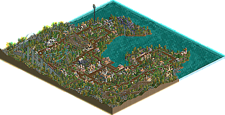
I've been wanting to build a larger park than my usual small contest entries, so for Halloween I built this strictly NCSO, No hack (I tried to avoid even cheats like watering gardens or disabling breakdowns), no trackitecture park.
The landscape was built in the scenario editor, the main OpenRCT2 features I used were the size-adjustable mountain tool, as building the map without it would have taken too long, and the "Refurbish Ride" feature to reduce breakdowns for better viewing.
The file also worked when tested in Vanilla RCT2 and Classic. -
1 fan
 Fans of this park
-
 Full-Size Map
-
 Download Park
455
-
 Objects
212
-
 Tags
Tags
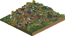
Very charming. I think all of the tracked ride layouts including the maze and mini golf are really strong here. The front entry plaza is nice, I like the Night Stalker queue and station as well as the surrounding landscape.
This is so charming and classic! The map macro is pretty good, i love the shape of the land. Threes so many fun little things in here, all the names are cute too. The woodie and river rapids are my fav part. The rocky outcroppings all over are well done!
Super sweet stuff lurker!
Congrats on the park release. Very pleasant and easy to digest park. I like the spooky park vibes just in time for Halloween. The rides were pretty decent for the most part.. just wasn't a big fan of Midnight Flight... those first two turns seem like they'd hurt lol
One thing I'd consider working on in the future is getting your rides/shops/stalls to fit better with the park flow. It seemed like you build a path network first and then added stuff off to the side as you went. Led to a lot of the rides and shops being less interactive and adjacent to everything. Here's sort of what I mean:
With this screenshot here it was very linear and boxy and the buildings and paths made for an island with a coaster in the middle that wasn't exactly viewable from a peep perspective.
I think a majority of your shops had a 1x1 path that led to them and it made for less variety. Would be nice to see more facades and path coverings that help blend the transition from path to building. But, your archy is good and there was decent variety in the textures and styles of buildings.
Looking forward to seeing more from you!
There's an innocent charm to this park, and though it's largely rudimentary compared to what we're used to seeing here, it does evoke a certain familiarity by representing a style of RCT that appealed to us all at some point; it's a "ghost of RCT past" of sorts.
The strongest aspect of Terror Bay is its ride design, particularly the wooden coasters. Harvester asserts its dominance upon the hill despite its otherwise diminutive size, and the Virginia Reel carved into the hillside uses vertical space quite well. Midnight Flight's opening is somewhat awkward with its launch into two high-speed curves followed by a slow vertical hill, and Night Stalker's post-MCBR finish seems too short to warrant the MCBR (the layout could have been expanded in general since the train approached it at a relatively high speed), but little else seems out of place.
The park as a whole is put together fairly nicely, but it does suffer from a few of the novice NCSO pitfalls, namely in the architecture. Every building in this entire park is "striped" uniformly--4h walls are separated vertically by 1h walls of a different color and/or texture, which creates an unnecessary vertical grid, and often the 1h wall is a jarring color and/or texture that doesn't fit with the 4h wall.
NCSO is infamously limited in its object selection, so often there's a tendency to overcompensate with textures even when they don't fit together. Walls and roofs are especially prone to falling victim to this, and throwing too many wall and roof textures into a single building decreases the readability of an otherwise well-composed structure and gives it an unnecessarily haphazard quality.
Rotwood Manor possesses a strong shape, but it uses five different roof textures and at least that many wall textures despite the fact that many of these objects and textures directly clash with one another.
When adding trims and highlights to buildings, sometimes less is more. In the NCSO realm, architecture often looks better with no trims at all than with variation for the sake of variation. If you can commit to a few textures per building (a single roof texture can take you further than you think), your architecture will be considerably cleaner, and your buildings, along with your style, will each develop their own identity.
Fun and festive!
I attribute some of the above criticisms in past comments to this park's antique/classic style, which is of course intentional, so I won't comment on the mish-mash architecture.
Ride design, macro, landscaping, foliage and atmosphere is strong here. The fun in building conveys to the viewer, which is always important to me.
I'll be looking forward to a park from you with fewer of the restrictions imposed here!
~B-]
A bit repetitive and undeveloped. To make this much park with just one main idea isn't easy. Jappy has done this quite impressively with his EDK if you're interested.
I liked the architectural experimentation you did which sometimes resulted in interesting things. Overall this was too basic for me though to warrant an accolade.
Just had a final look at this to give it the final vote. I can't put my finger on it yet, but something about your style is so old school and so pleasant, despite it being very simple and generic on the surface. Really interested in seeing where you'll take things in the future... Hard to sell to you but some early cso style building would be great. Build like it's 2006. But if you can give 2022 era work the same magic, I'm for it. Keep playing!