Park / Chonky's Wonderland
-
 29-October 21
- Views 2,641
- Downloads 372
- Fans 0
- Comments 9
-
 63.00%(required: 60%)
 Silver

In:Cities 80% Scoop 70% CoasterCreator9 65% Jaguar 65% Liampie 65% RWE 65% Terry Inferno 65% Jappy 60% saxman1089 60% Xtreme97 60% chorkiel 55% posix 50% 63.00% -
 Description
DKMP: Ride Creation for the Multi-Dimensional coaster. I am very much in debt to Jens for stepping in and doing things in my style on a short time-span before the deadline. Thank you.
-
 No fans of this park
-
 Full-Size Map
-
 Download Park
372
-
 Objects
271
-
 Tags
Tags
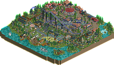
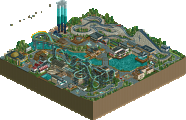
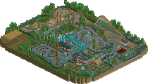

There you go Jens! Immediately identifiable work too, Wacked. Your style is very distinctive. The coaster here is quite nice.. the first drop under that bridge would be intense! Like the idea of using bobsled track as a net. Archy throughout was pretty good, albeit trackitecture heavy. Only area I didn't like was the mini golf.. was a tad too heavy!
Boats were cool.. foliage was nice.. dinosaurs as rocks? Bold choice.. kinda like it!
Lastly, love the little tricks here.. the split sign and the train over the restaurant smoking:
Really cool entry from you guys. Look forward to seeing more.
There has to be dinosaurs in more parks! Thank you! ^^
Loveddd this entry, The shore area is gorge! Especially the swinging ship. The play area and mini golf are a stand out! I really like the layout and supports for the multidim. EEEK makes me wanna make a multidim again.
Oh man this is so cool. Tons of incredible details to pick up on here. There's such a fine grain level of detail throughout this map, and its some of the best NSCO i've ever seen. Excellent path interaction. The holes for the coaster to dive through are so sick haha
Fun park and typical of the Deurklink school. For me too much reliance on trackitecture roof sadly but there are some great thing here. The use of an underused coaster type, the foliage, the playground... My favorite must be the lanterns between the coaster supports. Def worth checking it out.
Wait, was this not a design submission?
Nope, I spoke to Jens who spoke to Wacked, and they thought it was more befitting of a mini park than a design, and I agreed.
I voted as if this were a Design, but I believe it works equally well the way it was submitted. The 4D coaster is nice, but placing emphasis on it would have almost seemed like misdirection away from a very strong map, especially the lower half on the waterfront.
It's no secret that I enjoy trackitecture-heavy realistic NCSO, and though the architecture is largely overtextured, I appreciate the modern building styles you've emulated here, particularly the wooden buildings with the black roofs. Wall textures and colors could have been simplified just about everywhere--the steel lattice wall subtracts more than it adds as a building addition--but the overall look you've pulled off here is very RCT2day-esque. Details like the kayak rack, the playground merry-go-round and the fisherman fishing could all fit seamlessly on one of his maps.
It's also no secret that I'm an absolute stickler when it comes to natural shapes when it comes to landscape features, and yet I see very little here that I would change in that regard apart from a few sudden terrain color changes. The fern and flower "grass" technique is used so fluidly here, the blockiness of that flower object is completely lost, shaping the waterfront areas beautifully. The commitment to taller, pointier trees works also works very well.
I was less impressed with the coaster supports than I was with the rest of the map. There are just too many shapes and textures between the box formations, slanted poles, freefall and observation poles, and WW/TT oil barrels. Between all of these, I found the standard steel support poles to be the biggest source of clutter, likely because they appear grayer than every other support type here even when painted black, and the use of full-tile concrete squares as footers for these is the only visible instance on the map where NCSO's limitations truly surface. Those holes, however, are a top-notch "I wish I had thought of that" feature.
If you can simplify your wall textures without sacrificing the realistic look you've created here, you'll both have some high-scoring works on your hands before you know it!
Aye, the supports were rushed by me and more of an afterthought due to the deadline coming up.
And I love that people approve of the holes as they were one of the first things that were built and stuck with the park from the beginning.
Cheers! =D