Park / Swinging Dragon
-
 29-October 21
- Views 1,391
- Downloads 297
- Fans 0
- Comments 5
-

-
 61.00%(required: 65%)
 Design Submission

ottersalad 70% Scoop 70% Jappy 65% chorkiel 60% In:Cities 60% posix 60% RWE 60% saxman1089 60% Terry Inferno 60% Xtreme97 60% CoasterCreator9 55% Liampie 55% 61.00% -
 Description
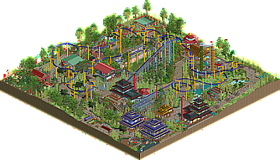
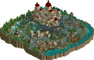
Entry for RCTClub's Swinging Coaster contest.
-
 No fans of this park
-
 Download Park
297
-
 Objects
305
-
 Tags
Tags
![park_4229 [H2H8/8] Valle Del Amanecer](https://www.nedesigns.com/uploads/parks/4229/aerialt3993.png)
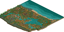
Sorry it took so long to leave a comment! Really pleasant entry here. Wish I knew more about this contest, would imagine this scored pretty well there. The park layout seems a bit uh, interesting. It appears it is a loop with the only access to the rest of a hypothetical park is thru a bunch of tables outside a restaurant? And the chairlift goes off map, but wouldn't it make sense to go over a midway? Nitpick aside, there is a lot to like here.
The coaster is quite domineering in a good way. Support work is top notch. Quite nice sightlines as well as the coaster sort of weaves through clumps of dense trees and interacts well with everything. The last helix complex over the little pond/creek is really atmospheric.
Otherwise, the surrounding rides are neat.. and I enjoy the defunct metro/monorail station. Wish there was more defunct or SBNO stuff littered about like Washuzan. Lastly, the pagodas seemed a bit samey, but overall very good vibes.
Nice colour wise, but way too much custom music. I would've gone with just the oriental style as it fits the theme. The rest is a bit disturbing.
Your filename is called "swining dragon". Looks sloppy. Also the ride breaks down first thing when you open this, and the train just hangs on top of the lift hill. Lots of other rides also break down and aren't being fixed.
You need to improve the hygiene of your park presentation.
Otherwise quite pleasant. The terraforming and landscape composition coming from it are good. The foliage while simple is also quite good. The mild theming is enjoyable, and the ride itself is too, if perhaps somewhat uneventful. But well, it' a suspended. It's good how you made it interact with the park so much.
If this had better presentation and a bit more content, I could see this just crack the 65% margin.
This is surely an enjoyable map to explore. The buildings are constructed in thoughtful locations with some rich details thrown in, and no ride seems out of place. The abandoned monorail station and the man fishing on the dock really sell the atmosphere of the cheap Chinese theme park, which is a concept that has not been explored much outside of Tubiao. The coaster stands tall above its surroundings whilst simultaneously interacting closely with each part of the area. In an era dominated by custom palettes, this map reminds us that the default colors have just as much to offer as any others.
A few key points held this map back from being Design-worthy in my eyes:
- Everything on the map breaks down at once soon after opening the park. In order to see any ride function, the viewer must disable breakdowns and fix all rides, which would not have been necessary had there been an appropriate fleet of mechanics. Run the park for about a year after the final save date (at high speeds of course) without cheats to ensure that nothing obstructs the experience for the viewer.
- Nearly every terrain square is compulsively filled in with grass objects with no real shape to the foliage or the terrain. The color gradient is lovely, but some bare spaces would allow for some textural contrast. The sharp altitude changes consist largely of 3x1 blocks arranged in straight lines.
- The coaster itself seems awkwardly fast and lacking in variation, dipping below 33 MPH exactly zero times between the first drop and the final helix (with no drops, hills or helices exceeding 15 ft/6 units). The layout looks nice from a distance, but it would have definitely benefited from some larger elements, which in turn would have varied the train speed enough to create distinct thrill elements.
With stronger pacing, varied elements and some negative space, I believe your next submission will have the potential to hit the Design mark unanimously. The composition is there, as is the detail, so I'm very much looking forward to what you come up with next!
Pretty good park you got here, but a little too dense and crowded regarding foliage. As others have said, some open patches and negative space would've lifted this to another level.
You do have foliage, landscaping and archy down clearly, and the coaster layout is pretty fun as well. All in all, quite the enjoyable park!
Just gave this the final vote! I thought it was quite nice. I liked the dedication to theming, the nicely organic park layout, and the sprawling nature of the coaster. The coaster lacked flow and any points of interest though. And if you were to remove the coaster, not much would be missing from the map as most of the park seems to ignore the coaster above. The other big drawback for me was the presentation, like a few others have mentioned.
Still a very nice map that shows skill and talent! All these issues are fixable. Definitely looking forward to seeing you develop your game more!