Park / Son of Beast
-
 10-October 21
- Views 2,571
- Downloads 364
- Fans 2
- Comments 7
-
 70.00%(required: 65%)
 Design

CoasterCreator9 75% In:Cities 75% Scoop 75% Xtreme97 75% ottersalad 70% RWE 70% saxman1089 70% WhosLeon 70% G Force 65% Jappy 65% Louis! 65% posix 55% 70.00% -
 Description
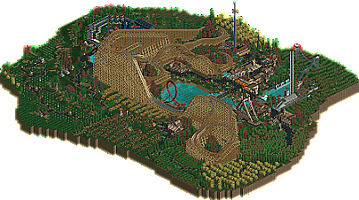
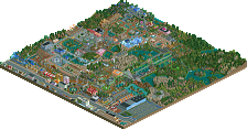
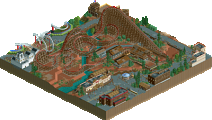
Son of Beast kinda recreation with quite a bit of liberties. Chill vibes.
-
2 fans
 Fans of this park
-
 Full-Size Map
-
 Download Park
364
-
 Objects
223
-
 Tags
Tags
![park_2095 [NEDC] Archimedes - #1/9 (Winner)](https://www.nedesigns.com/uploads/parks/2095/aerialt1885.png)
I really liked it. The coaster wasn't really anything new but well done but the surroundings were different so I rated it higher than I would have for an ordinary recreation. 80 out of 100 for me.
Dang, this ride is massive! Bold choice to do such a tall ride, and I think it was done really well here. Too bad the real ride doesn't exist anymore! Loved the custom supports, the brake run detailing, and the station was awesome. The choice to keep it all monotone was smart. Pulled it off quite well.
The surrounding countryside was neat, but simple. But I think the palette made the forests feel very moody which I enjoyed.
Leave it to AJ to consistently put out some sweet occult-y stuff. Love the vibe your work always has.
Surrounding countryside is awesome. I really love the added context and fun detail you included throughout the map. The orchards and cemetery and fields add so much life - I almost wish that the map size were tripled with just the valley landscape surrounding the coaster lol. Coaster is massive btw, and I greatly enjoy that. Loop supports are tight. And man, that cool little diagonal log flume thing with the backwards drop is sick af.
You've definitely become one of my favorite builders in recent times. Great work!
A definite classic in terms of NE wooden coasters; Son of Beast has always been an inspiration, but we have seen less of that recently. It's very fun to see a modern take on the style of coaster.
I think the layout is fabulous - it really captures that imposing mass of wood that was Son of Beast - and I think you did a nice job with some of the awkward elements like the rose bowls.
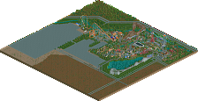
One of my favorite parts of the whole thing is how the loop is next to the water with a big pier and seating area across. That'd be a pretty cool place to sit and watch the thing.
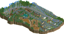
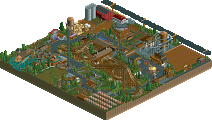
The theming is nice and adds a lot to the submission; though largely not to the layout itself. It's almost like any ride could be there with the same theming and it'd feel about the same. Regardless, the station area and queue is great, I love the graveyard and fields, and the buildings scattered about are nice. They're a bit on the busy side of NCSO that can be hit or miss for me; but they fit with the setting *very* well.
In general; quite nice. I think there are a few smaller details here and there that were missed opportunities, but that didn't detract from my first opinions of it at all. Excited to see more from you in the future.
Giant, nice and speedy. Enjoyable to see this. Full of personality, which if you stick to and keep improving should mean big things can happen. Please do.
I like the size of the size of the coaster in this, and the ayout itself too. The addition of the loop is ridiculous, just like it was in real life, but it's such a great eyecatcher.
I'm not a fan of the palette though, it makes it feels a bit plasticy imo.
Foliage was great though, which isn't that easy to pull off in NCSO I find. So well done on that!
I enjoyed this a lot, just all around lovely