Park / Mulpia
-
 10-October 21
- Views 2,343
- Downloads 460
- Fans 1
- Comments 5
-
-
 Mulpje60%
- Darkoro40%
-
-
 65.00%(required: 60%)
 Silver

Scoop 75% CoasterCreator9 70% In:Cities 70% Jappy 70% bigshootergill 65% Louis! 65% ottersalad 65% RWE 65% CedarPoint6 60% Terry Inferno 60% Xtreme97 60% posix 55% 65.00% -
 Description
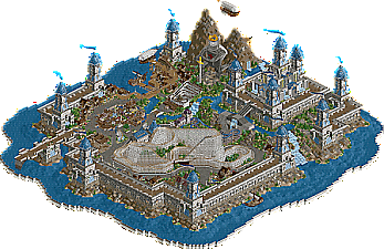
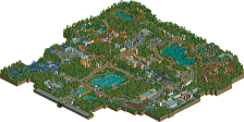
Welcome to the Mythical World of Mulpia, where ships sail both on and above the water that covers 90% of the planet. Scattered across various islands, civilization has blossomed in what little space they have, each island surrounded by massive walls to protect against potential bombardments from enemy pirates or other ship-faring nations.
This park is situated on the island known as "Texas", famed for its off-shore farming of stingrays! So famous, in fact, that they have dedicated an entire large section of their island to a rollercoaster in honour of the fish that shot them through the mercantile stratosphere, becoming one of the richest island kingdoms on the planet. Such riches have afforded them the ability to attract tourists to their land, wanting to ride the coaster, or visit the giant statue of the Ol' King Mekk the first, who slew the "hydraray" and secured the kingdom's dominance over the stingray market. Building upon the tourism that their main attractions have brought, Texas has now expanded their amusement capabilities, attempting to bring in even more money so that they can fund their latest research: reclaiming land from the sea.
This park was made in a collab with Darkoro and its our recreation of the wooden coaster Texas Stingray in a fantastical setting. almost all of the scenery was done by me (Mulpje) and Darkoro made all of the amazing rides. -
1 fan
 Fans of this park
-
 Download Park
460
-
 Objects
356
-
 Tags
Tags
![park_3360 [H2H7 R4] Archelaus](https://www.nedesigns.com/uploads/parks/3360/aerialt3059.png)
![park_3607 [NEOlympics] Abu Al Sheikh Amusement Park](https://www.nedesigns.com/uploads/parks/3607/aerialt3220.png)
Not sure if you came from that side but feels very DKMP: A lot of trachitecture use and great statues (good) but also a bit directionless textually. A lot of the architecture feels like random falls placed just for it to feel busy (been there done that). Highlights include the huge knight, the flags and obviously the sign for the main coaster.
Ships and airships are good. I love how in the middle you used a lot of round edges for the paths (and I'm a bit sad that you didn't use it in otheer parts). Main coaster layout is solid, sadly it's the only stand out ride on the map.
Overall a submission that shows promise. I think it's a decent silver.
Such a wild submission! Theres not really a clear theme here other than using Mekkit's steampunk ships and a giant castle? With a wooden coaster design as sort of just filling a plaza? I guess I'm a bit confused on the randomness of it all.
But that doesn't mean everything individually isn't good. Quite the opposite. The castle is large and quite well done. The little village along the water is cool.. but maybe too spread out for my tastes. The blimps and stuff are cool, but feels like I've seen it all one too many times.
The coaster layout was great, and as I've come to expect from some of the more trackitecture saavy players, the custom supports are great. Maybe not entirely necessary, but I think it's tastefully done here.
I just hope to see more from you where the rides/coasters are the focal point. You've got a great style.
This is so random, but so great haha.
Excellent colors, fun story (definitely shoehorned in, but it works), great details, cool tricks.
Love how gritty you were able to get the paths. Very subtle, but very nicely done. Coaster is nice - it has a pleasant color scheme. Foliage is the weakest thing on the map in my opinion. It felt more like filler as opposed to grown naturally. Try experimenting with more natural clumps of trees and some open spots.
Honestly it's always a joy to see work by you. Beautiful submission!
Huge! But it a bit samey. I dunno, I feel like I've seen this done multiple times before. The giant trackitecture castle thing isn't really doing it for me anymore. Although that's not fair criticism of course towards this map specifically.
Not to say this is bad, far from it! I like the colour scheme, the blimps are nicely done and what's there overall shows great skill and is thought out. Just that trackitecture and those TT pieces stand out a bit too much imo, not a big fan.
Fun little map overall, but I'm hoping to see some more larger maps from you and break out of that DKMP mould. Perhaps even CSO. I feel like you'd excel at that.
Now that's a blue I could get used to!
This landscape is a work of art, and with some refinement, it would not be far behind those found in recent Korean scenario maps. Terrain painting here shows a solid attention to detail, although the outer banks would benefit from less checkerboarding so as to avoid hiding the grid. Excellent use of flowers and bushes around the main castle hall. The flower clusters could be larger, but it's still one of the most convincing displays of NCSO wildflowers I've seen. By contrast, the foliage around the mountains seems unfinished and haphazard; it appears as if someone just dropped a few trees in and hoped for the best. The waterfall area could also use considerably more plant attention. I'm not convinced all of the landscaping was done by the same person.
Texas Stingray is a beaut from all angles (including that top-notch raptor-track support work), and the Virginia Reel works very well in its position before the king; tennis net are one of the riskier NCSO walls, but they work perfectly well in this instance. I always approve of a good curvy monorail curb/fence, and the coaster-adjacent area is monorailed quite nicely.
I think the biggest missed opportunity here was leaving the castle empty and largely static apart from the waterfalls. You've built this phenomenal curved ramp that leads to an empty building! The park essentially ends before guests get a chance to ascend that final staircase. Some interactive elements would have animated this castle the way the docks and the "theme park" area burst with activity.
The map looks great from the furthest zoom point, which means that the macro is there; it's just a matter of refining those smaller-scale techniques in order for those close-ups to pop as much as the zoom-outs(?). I would love to see something as imaginative as this on a larger scale with a consistent level of detail throughout!