Park / Joris en de Draak / DVH
-
 10-October 21
- Views 3,336
- Downloads 439
- Fans 1
- Comments 10
-
-
- Enox50%
-
 Ulvenwood50%
-
 67.50%(required: 65%)
 Design

Scoop 80% saxman1089 75% bigshootergill 70% CoasterCreator9 70% G Force 70% In:Cities 70% Louis! 70% RWE 70% Xtreme97 65% ottersalad 60% Jappy 55% posix 55% 67.50% -
 Description
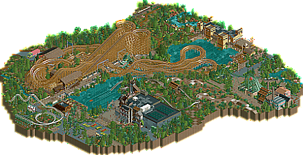
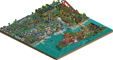
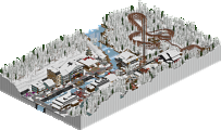
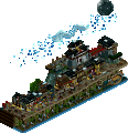
We recreated Joris en de Draak, a GCI racing coaster located in the Efteling, the Netherlands. We also decided to recreate a few surrounding rides. De Vliegende Hollander (The Flying Dutchman) is the only ride we also fully recreated, use cut-away view to see the interiors.
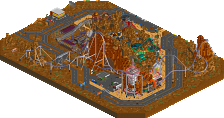
The other rides are partly recreated, because we wanted you to focus on the main rides on our map. The year is 2016, because that was the most recent Google Streetview for Efteling available.
We hope you enjoy our recreation!
POV's
https://www.youtube.com/watch?v=rAkLAH8Hxgw
(vuur)
https://www.youtube.com/watch?v=NVKoVZ6rTuc
(water) -
1 fan
 Fans of this park
-
 Download Park
439
-
 Objects
307
-
 Tags
Tags
Congrats on this release. This is really fun to look at. The woodie is quite good, they duel well and the supports look sick. I love the interaction and the area over the lake. The off-map rides look cool and im glad the dive coaster works too! Wish the corkscrew did that too! The buildings for the water coaster are super nice, thats my fav thing in the whole park.
Nice release yall, love to see it!
I enjoyed the coasters. Very good layout. I guess I'm not as interested in recreations or at least not this particular one so the surroundings didn't interest me as much. Good work and no real faults I could find though, so I rated it 70 out of 100.
Strong NCSO recreation of a very good ride. There are some texture choices that aren't ideal (like the path by the Dutchman and some of its facades) but it overall captures the essence of the park quite well. The dragon statue is strong and the layouts work quite well.
It's obviously also good you included all the rides surrounding this area. Makes it come alive to a certain extent. I like the small details, like the leaking water tank. The map is overall very pleasent and easy to look at.
i liked this submission a lot, its overall really well crafted and in my opinion it captures the efteling quite well! i had some flashbacks to walking around in that area while looking at it so that means the job is well done. i wasnt a fan of some of the object choices, but i think that is just a matter of personal preference. overall i think its deserving of design and im looking forward to seeing what you guys are up to next!
I'm not super familiar with the source material; so my opinions are mostly RCT based.
The layout is nice; V1 and Leon say it's good, so I trust them on the accuracy aside from what I've seen myself online. Pacing and all that seems adequate; last half seems pretty tame, but I'm guessing that's a result of the real ride being as such. The inclusion of nearby supporting rides is a good call; though the way Baron kind of just ends at the edge of the map (and in one case, *before* the edge of the map) is a little weird. Almost wish this had been expanded to include some of the other rides in full, or even a whole park. DVH having an interior was a pleasant surprise.
The architecture in the area is neat; I do agree with Leon that some of the object choices don't mesh well with the overall aesthetic - notably the Georgian wall pieces kind of look like plastic to me. I really like the variety and detail worked into the ride building of DVH. Pirana's station building is quite good, and the dragon is pretty cool. By comparison, Joris's station feels a little plain. I took a look at the real thing, and I suppose it's sort of the best you could do in this situation. It's a shame the gong objects only line up properly from one angle.
Foliage is pretty well structured in general and enhances the presentation; the one thing I don't like is the random scattering of flowers in the underbrush - I just don't think it looks very good, too random and haphazard.
In general, I think you've done a nice job. Good work recreating something fairly tough to do in RCT layout-wise.
Nice coaster! I agree with CC9 that the ride feels a bit tame at the end, but I understand the constraints of a recreation. Pretty good work overall, and I appreciate the surrounding rides to breathe more life into the design submission. Only nitpick was that there was a bit of garden spam.. created a bit too much noise for me. Other than that, the coaster was great, the supporting rides were very well done, and loved details like the custom supports for the woodie in places and some of the little DKMP cameos.
I'm not very familiar with this park - or Dutch things in general. But this seems like a great attempt! You've got just enough of the surroundings to give this a great sense of place, without feeling too crowded or unfocused. I love the dragon. Foliage and landscaping are pretty weak though. The trees seem a bit random, and the various land texture patterns just look messy.
Architecture is on point of course. The station for the water coaster is fantastic.
Always happy to see work from you guys!
It's always nice to see Efteling recreations, and I think you captured the feeling very well in some places.
Like others have said I think you can work on improving the foliage to elevate your work - a good general tip (though not a hard and fast rule) is to try and clump your plants together and avoid scattering lone bushes and flowers.
My favorite part was the station building for Pirana - great job there. Love the look of the tennis nets for rickety wood fencing.
Thanks guys, for the numerous reviews, I am happy to be able to read what to improve upon.
I agree with all of the remarks above. I think the main thing to do better next time is foliage and landscaping. We were a bit short on time, so we rushed the finishing touches a little in the end. I guess, in hindsight, we could have fixed it before submitting here. Oh well.
I am very glad all of you liked the architecture in this park. Some of the expansion textures can be a little awkward to read, I agree, but I still stand by what I used here because it was the object closest to recreating specific parts in the park.
Thanks again.
I like it. It feels Eftelings and succeeds in what it wants to do, which is recreating the atmosphere of this area of the park. My main issues are the expansion objects which in some locations do more harm than good. This is one of the rare instances I'd say the trackitecture movement might've offered a solution.
Good to see you take the main point of criticisms to heart though. You have a lot of potential, that's already obvious from this. Piranha is great and the coaster station is pretty much spot on. You know how to capture atmosphere and translate it to the screen. Keep going, you'll do great!