Park / Evergreen Gardens
-
 10-October 21
- Views 7,051
- Downloads 724
- Fans 18
- Comments 18
-

-
 83.50%(required: 70%)
 Gold
Gold

CedarPoint6 90% no CoasterCreator9 90% yes RWE 90% yes bigshootergill 85% no Jappy 85% yes saxman1089 85% yes WhosLeon 85% no chorkiel 80% no SSSammy 80% yes Xtreme97 80% no G Force 75% no Scoop 75% no 83.50% 41.67% -
18 fans
 Fans of this park
-
 Full-Size Map
-
 Download Park
724
-
 Objects
354
-
 Tags
Tags


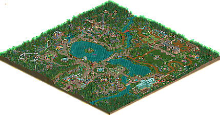
I already love scenario tribute parks, and this one is amazing. The map layout does a great job of being realistic while still being recognizable as the scenario, the use of objects is very clever, and there's some great use of open spaces throughout the park.
This park really has the atmosphere too, so many great takes on the classic scenes in the park, with amazing detail while still being subtle and straightforward.
I really enjoyed browsing this park. I'm sort of biased because I had a similar idea for a park that I would have built in LL but never made. I really liked the custom rides, even though many of them weren't functional. The planetarium swing was a stroke of brilliance. And the before and after screens were a nice addition which helped tie it to the original scenario. I won't rate the screen since I'm biased for having a similar minimalistic garden idea but if I did I'd give it an 80.
the name of the scenario already gives it away. it looks more like a huge realistic garden with some highligts of attractions but they are rather scattered. the NCSO object technology was very cleverly distributed here. it was chosen discreetly and not too dense so that it does not look too cluttered. I like it very much so the park generates more athmosphere than if you shot everything with track architecture full. keep it up I love it very good work alex
Translated with www.DeepL.com/Translator (free version)
after a quick first glance i can't help but share the sentiment that some people just have this innate ability to even make basic stuff look stellar, i mean this map although very little moving parts as a "park" holds so strongly in the sense that the landscape and big picture is so well done it feels like i'm looking at a lecture on the topic...
Sublime work as we've come to expect from you and somehow you never fail to keep astonishing me
Not time for a very long review, but damn alex, you did it again. This park is absolutely fantastic work. This is such a quaint lovely place. The entrance area is composed unbelievably good, the playground is magnificent. Evergreen Express is the perfect coaster for this park, i think its exactly what this park needs ride-wise. While looking low on content from the above, when exploring this park you find a lot of tiny things that show a lot of care, like the abstract art all round.
There are a few things i might have done differently; but they are probably all minor and more personal. For example im not a huge fan of the large portions of mowed grass. No idea how you could do this better in ncso, but it still feels a little bit undercooked to me. I know, very nitpicky...
All in all exceptional work and a great follow up after H2H. Congrats, alex!
the foilage and landscaping in this park is so so good, as is the use of open space and overall composition throughout. It feels traditional and true to rct, yet it has a fresh look to it that feels new. in my opinion the area around the coaster is the weakest part of the park, but still very pleasant. the gardens around the estate were my favourite, with as highlight the zig zag path going up the hill. i think one of the main qualities in your work is that you're making it so easy to imagine that you're there, and this park is no exception. Some of my favourite details are the 'ruin' of the scenic railway, the little log flume waterfall surrounded by mown grass, and the horse sticking its head out of the stable. if i had to name one negative its that to me the architecture felt somewhat random in places, and i wasn't sure what you were going for sometimes. some of the architecture like the greenhouse and estate were brilliant, however.
great work dude, you've inspired me to open up the good old NCSO bench again, like you aways do!
This is a fantastic little park.
The atmosphere and sense of place you're able to accomplish is really very impressive. Everything is positioned with intent and tastefully so. I really appreciated the emphasis on this not simply being an amusement park, but a garden park - art installations, attractions that may not be typical of traditional amusement parks, open green spaces, beautiful nature trails - it's all so great. As always with your work it oozes that atmosphere and genuine sense of class, embracing the natural feel of the base game in a way that is truly timeless.
While not as content heavy as your other work; I find that everything just plays together so well and so nicely - the open grassy areas are not a lack of content but an accessory to the rest of the park. I suspect I may be in the minority for my appreciation of such things - but I highly value the overall feel of a park, and this particular style is what I truly love to see.
Some little highlights I picked out aside from the major, obvious ones:
Lovely use of an otherwise ridiculous marshmallow object. I don't know if it's a first, but it's very effective regardless.
I love this little seating area hidden off to the side and overlooking the rivers.
Beautiful chairlift stations.
I like the fountains all over the park; very clean and fit the environment very well.
As you're well aware, your style of building is one of my absolute favorites - I love how you execute parks, and the true RCT feel is almost nostalgic while being completely new. This is the kind of thing I want to accomplish someday, and I'm very excited to see what you have in store (that postcard is quite the teaser).
I friggin love this park. It's a love letter to the original game, written in the language of Chris Swayer using basic landscaping and in-game objects.
It's a statement to simplicity and skill that you managed to turn this once again into an NCSO masterpiece showcasing you master the skill of macro and composition like no other.
As you know, I'm a great fan of scenario recreations, and the fact you did Evergreen Gardens, one of my favorites, makes me very happy.
The fact that it has very little mechanical rides, but is supplemented by so many smaller things you would be able to do in a park like this is a bold but perfect choice to make the gardens aspect come into light.
My only two remarks would be, it could've used juuuuust one more coaster. I'm thinking something small, like a (wooden) wild mouse, or even a side-friction coaster. Something old-fashioned. Also, where's the train? A park like this most of the times has a train! Even Alton Towers used to have one.
Keep doing what you do best Alex, but please promise to share it all with the rest of us!
I understand why there weren't more coasters, but I'm still sad. The one included was pitch perfect
Congrats on another 80%+ release! Really impressed how seemingly easy this level of parkmaking is for you. And that is not to belittle the time and planning that goes in to it!
This park was very easy on the eyes and I had mentioned in discord that this park feels like a trolley park where I'd imagine the scenic park/garden was a turn-of-the-century railway stop attraction. My head canon is that some rich landowner of the Evergreen Hall wanted to attract paid visitor to his gardens or something. Some of the fairground-esque architecture namely the Rotunda restaurant and the surrounding structures help give the vibe that the gardens came well before the amusement rides and attractions.
The supporting attractions to the gardens are great, yet simple. The water chute slide was neat. Interesting how many "gentle" rides there are as well, with the maze, carousel, observation tower, etc. Makes me wanting more excitement, but it's clear this park isn't trying to be that.
Thus, I'll share some of my favorite bits on the gardens and the park as a whole.
Bridge porn:
These stepping stones into this little structure is simple yet so genius
Fallingwater brought to you by Alex:
All in all, I really enjoyed this. I think this is a park people will draw a lot of foliage and landscaping inspiration from in the future. Congrats again.
I genuinely can't get over this park. I keep looking at every new detail that pops up with the biggest, goofiest grin on my face. It's so detailed and creative yet so readable and so RCT2 at a perfect balance I don't think I've seen executed this well. This is exactly what we needed after watching RCT2 being warped into uncanny shapes during H2H9; a beautiful, beautiful breath of fresh air. One of the best releases of the year and absolutely deserving of the gold, and for a 2021 release that is saying a lot.
You can find my review of the park-- featuring commentary with Alex-- here:
https://youtu.be/IfI06aFBoXc
I love this style of parkmaking.
Incredible park. I've always wanted to re-imagine this map in a similar fashion, so its so nice to see it done so well.
Great video cp6. Loved watching and hearing about the park!
Just wanna say it was interesting to hear in the CP6 vid that you didn't want to use yellow flowers since they are sort of an NCSO meme. I'll admit I use them as sort of a crutch where it's been so common in NCSO and LL over the years that it always looks good somehow. Really cool that you were able to completely avoid the color and it paid off really well.
What a great release. After spending some hours in here, it's time to show some love:
The entrance is wonderful. I think it is a good way of foreshadowing what to expect in the park. Love how it's situated in the valley.
Another highlight for me were the cabins in the forest area. How can such a simple building design look so clean. The use of wooden post fences here is great. Might steal that someday.
Of course, landscaping all around the map is amazing. The way you group your trees, work from small to large and leave so much space to breathe is something to learn from.
My only disappointment was when I looked at the middle of the lake. I guess this works too, but I somehow expected something more there.
Great park!
very lovey, as expected. clean, pristine, and in true alex form, littered with tiny details that elevate the whole scene. in particular, I loved the aviary and the rock wall, and the log flume water feature. understated but full of nostalgia
Rediscovered this today, peak example of understated good design. After the grind of an intense contest, this is the perfect piece of inspiration