Park / Emperor

12 Comments

  • geewhzz%s's Photo


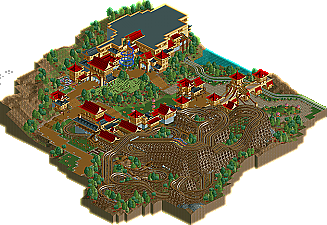
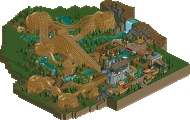
    Louis! has been on a roll lately winning his first NE Design in February with a B&M flyer Chimei. Following that up he was picked 23rd of 54 in the Head-2-Head 5 draft by Magnus who captains the reincarnated Head-2-Head 3 champion Flying German team. Now, he wins yet another Asian themed NE Design with Emperor, a tri-dueling wooden coaster that he says was heavily inspired by his fellow Flying German and #2 pick of the draft RRP's Next Element entry Rampage. Read On...

  • Ozone%s's Photo
    Just from the overview I really like the looks of this. The dueling wooden coasters are beautiful. I wish I could see what's in that building!
  • Kumba%s's Photo
    Id reply, but I wrote the review so Louis knows what I think ;)
  • Xcoaster%s's Photo
    I thought it was a pretty nice park, as was reflected in my score. The coaster was impressive, as triple-duelers tend to be. There were some flaws (I mostly was disappointed by the very cool on the outside, less cool inside, 'Fantasia'), but I generally liked everything I saw. It was very photogenic.
  • Roomie%s's Photo
    its very difficult to make a triple duel coaster. I think you did extremely well here. although i feel the blue track sort of got lost towards the end.

    i also felt the layout to Fantasia was fairly poor once inside the buildings. The Architecture itself was good without being too overpowering. Its never easy to make an oriental theme. (although its a hell of alot easier in RCT2 than LL).
    Overall i'd give this design 15/20
  • Luigi%s's Photo
    Wow, nice to see something different :)

    you did a great job on the dueling! Archy looked nice, really liked the building.

    well done.
  • RCTFAN%s's Photo
    Very good indeed (hence my high score). I loved how one minute your were racing one side and the next you were racing the other!

    It'd be nice to see something different from you now though seeing as your past two designs are Asian themed.
  • RCTNW%s's Photo
    Congrats Louis! on the design. It's tough enough to design a good dueler with two tracks but to get three, that takes some skill to pull it off.

    One of the problems I have with it though is that the middle train does not have a station. The problem is that you can't sysnc the stations if there is a space between them so due to that, I can understand why there isn't one.

    As for the theme, I've never been a big fan or asian themes however yours is a good attempt at it. some of the building seem a bit tall to me however most fit the concept. Well done

    Overall, I would have given it a 14 had I scored it.

    Congrats on the design and I look forward to seeing more.

    James
  • Louis!%s's Photo

    Just from the overview I really like the looks of this. The dueling wooden coasters are beautiful. I wish I could see what's in that building!


    Thanks! Its just a small coaster that unfortnuately unthemed.

    Id reply, but I wrote the review so Louis knows what I think ;)


    Hahaha! Thanks for that dude.

    I thought it was a pretty nice park, as was reflected in my score. The coaster was impressive, as triple-duelers tend to be. There were some flaws (I mostly was disappointed by the very cool on the outside, less cool inside, 'Fantasia'), but I generally liked everything I saw. It was very photogenic.


    Thankyou! Yeh, I was going to theme the inside but I was starting to lose inspiration and didnt want to do a half hearted attempt. I had such fun working out the tri-duelers so im glad you liked them, you should be seeing more ;)

    its very difficult to make a triple duel coaster. I think you did extremely well here. although i feel the blue track sort of got lost towards the end.

    i also felt the layout to Fantasia was fairly poor once inside the buildings. The Architecture itself was good without being too overpowering. Its never easy to make an oriental theme. (although its a hell of alot easier in RCT2 than LL).
    Overall i'd give this design 15/20


    Thanks. See above for the explanation on Fantasia. Haha! I'm yet to try it out in LL :p

    Wow, nice to see something different :)

    you did a great job on the dueling! Archy looked nice, really liked the building.

    well done.


    Thanks!

    Very good indeed (hence my high score). I loved how one minute your were racing one side and the next you were racing the other!

    It'd be nice to see something different from you now though seeing as your past two designs are Asian themed.


    Thanks, your comment means a lot. Haha you now know the reason for the Asian themes :p I promise my next one wont be Asian themed :p

    Congrats Louis! on the design. It's tough enough to design a good dueler with two tracks but to get three, that takes some skill to pull it off.

    One of the problems I have with it though is that the middle train does not have a station. The problem is that you can't sysnc the stations if there is a space between them so due to that, I can understand why there isn't one.

    As for the theme, I've never been a big fan or asian themes however yours is a good attempt at it. some of the building seem a bit tall to me however most fit the concept. Well done

    Overall, I would have given it a 14 had I scored it.

    Congrats on the design and I look forward to seeing more.

    James


    Thankyou. Yeh, but I'm not a big realism fan so I didnt see the problem with it :p


    Thanks for all the comments, please keep them coming, negative or positive, they really help. And I promise my next one (which is at 70% :p ) isnt Asian themed :)
  • Nokia%s's Photo
    not my favorite work from you but still very nice.
    congrats on the win!
  • tracidEdge%s's Photo
    wish i could see this yall
  • Ride6%s's Photo
    I'll admit to being more excited by it before hand than after seeing it in game (sorry). The layouts don't really duel at any point and their pacing is quite strange. But triple racers are still nearly impossible to work out and given that you came fairly close to achieving a three-tracked ride that was both ascetically pleasing, and a decent ride is still a very impressive feat.

    The architecture and theming on the map was well thought out and seemed to be carefully planned and constructed; the overall atmosphere was very warm and welcoming. Fantasia was interesting, and assuming a thematic interior would make a fine indoor adventure coaster with a surprising vertical (!) drop.

    Ride6
  • eyeamthu1%s's Photo
    /\ Ride6's above comment hits the nail on the head, I completely agree. The ride in theory looks much better than it is, and whilst it is obviously very very impressive and exceedingly difficult to pull off, I still didn't find myself liking it as much as I'd hope to. Archy was all good, and yeh, I thought Fantasia looked great from the outside, but its inside layout was not so good. Full marks for a great attempt at the triple-duelling coaster... but I'm not sure I've seen one actually pulled off perfectly yet.

Similar Parks

Members Reading