Park / Adventurers Club
-
 19-September 21
- Views 13,406
- Downloads 566
- Fans 2
- Comments 38
-
-
 78.00%(required: 70%)
 Gold
Gold

bigshootergill 80% CedarPoint6 80% CoasterCreator9 80% Jaguar 80% posix 80% RWE 80% saxman1089 80% Xtreme97 80% Camcorder22 75% chorkiel 75% G Force 70% Cocoa 65% 78.00% -
2 fans
 Fans of this park
-
 Full-Size Map
-
 Download Park
566
-
 Objects
472
-
 Tags
Tags
![park_3806 [NEDC4 2/15] - Interstellar](https://www.nedesigns.com/uploads/parks/3806/aerialt3455.png)
![park_3200 [MM2014 R2] Turtle Rescue and Discovery Center](https://www.nedesigns.com/uploads/parks/3200/aerialt2812.png)

And i thought id built a big coaster themed to Norse Mythology. The Gladsheim park is just absolutely amazing and is my favorite piece of RCT. Well done
So, first impressions from this...
Super Adventure Club:
-The rockwork is some of the best I've ever seen, that must've taken forever. Also nice waterfall... did split do that?
-Layouts are nice... invert is kinda dull but I really love the Busch Gardens-inspired Arrow.
-Love the references to earlier parks and all the little details like the shark and cave with eyes. But it still feels a little... empty(?) for some reason
-Subterranean scenes are always great... the issue is that, just like the croaked park this references, it seems a little unfinished
-Scale is strange, you have huge gothic structures next to little greenhouses. It's overwhelming, but that's not a bad thing.
Glandsheim:
-Wow, the snow effect here is subtle and brilliant! It is, however, noisy and hard to see things.
-That frozen village is such a good idea *moves up* holy shit, fuck scale.
-Custom objects are used very tastefully here... the shields, giant wagon wheel, Valkyries, wolves, etc.
-That RMC is insane, huge and unrealistic... gives me a fright nights feel. This is how coasters should be. The frozen single-rail coaster is also a highlight.
-The color use on this is kinda minimalistic and honestly I can appreciate that... it's mostly white, gray, and red, which means the few splashes of pale green, which would be very dull anywhere else, stand out and capture my attention here like an oasis in this frozen wasteland.
Overall I'm going to go with Gladsheim here... both are definitely very strong parks and if Adventurer's Club didn't have those unfinished-looking portions, both would be top tier. To it's credit, Adventurers did have great architecture and phenomenal landscaping. However, Gladsheim also had this, and threw a few layers of crunch on top of it; and as such, in my opinion, it is very much the park of the contest.
Gladsheim:
I like the opening, great terrain, nice use of custom music. I followed warriors the the way to the hall, it made a nice progression for viewing the park, also some nice build up for the main area. There's a lot I like in the main area, the massive hall, the layers of city clinging to the cliffs, and the impressive supports on the RMC. There's so much going on it can be hard to follow, but I was still able to read it in the end.
Adventurer's Club:
I like the planning/layout, for me it was still very easy to read and looked great. Some great rockwork and foliage, and impressive clean and well done buildings. Solid coasters that fit well into the terrain, and the mine train was fun to watch with the switchbacks.
One thing the park could really use is more interior detail, especially with the theme, although I'm guessing time had something to do with that.
Overall, two great parks, and I loved looking through them to finish reviewing this contest.
Adventurer's Club - fun way to end the season! Would've enjoyed if the park were to encompass more of what you did this season, but that may be a bit too much to ask. Thought this was a splendid park nonetheless. Although there's plenty of tall structures and coasters on the map you did a good job integrating them so they don't get in each others view.
Gladsheim - the things you've created this season have far transcended what rct was and this was no exception. My favorite detail was the frozen track. While this park - and most of what you did this season - was fantastic, I hope we've reached the peak this h2h. That's just a presonal preference towards more traditional rct, I suppose.
Both teams did a fantastic job this season. Thank you for all the parks!
Two great parks to close the H2H9 season.
Congrats to both teams on making it to the finals. It is a great achievement to keep up the motivation in a long season and (almost) finish two amazing parks.
Gladsheim is an absolute stunner to me.
I cannot believe how much the game has evolved and how it is possible to create this out of the limited options the game gives us. Adventurers Club did not fully come together for me personally, the single bits of the park are flawless and show a great level of skill. Still very good work and amazing architecture.
In the end H2H is about the wow effect to me. This being said, my vote has to go to Gladsheim.
Now it is about time to get back to "regular" RCT parks for me.
Love this ha!
Two incredible parks to finish off the season, massive well done for both teams maintaining such a high level for such a long period of time. Your hard work and artistry is really appreciated, from one of the lucky ones who gets to view new parks every few days. Thank you.
TI opening was a moment of cinematography which was rather enjoyable. The visual appeal of this whole scene was quite spectacular and unique looking. I loved the snow, the strong fleshed out theme, the story, and how the custom music amplified it. I did use Open's fast-forward game speed though to make those guys move a little faster. Luckily this doesn't affect the music The big architecture that follows is of course stunning. Unbelievable to see something like this, fully intertwined with the coaster, where even its custom supports are made of decorative theming. Crazy. I loved to see a (semi-)fantasy style park brought to this level. That long vertical drop took me by surprise. Had a bit of frameskip up until that point, and then shit got real very quickly. Pretty incredible design here everywhere. I dare ask if the ratings of the coaster are hacked or not. I'm oldschool enough to care. Tell me after the conclusion. Tons of small little ridiculous details here like the archer guy. Again of course the common criticism that it's too much and too packed, and you cannot take it in too well as a consequence. I see it, but I also see why it happens during H2H. In any case very much a park to be rather proud of.
I loved how AC built a park named after themselves, and that custom message at the beginning is really sweet. This one also had some ridiculous architecture in it. I hope this was done with a lot of healthy scenery manager use, or else I just don't know. Where to lay one's eyes. It's a little hard to decide. There's a lot, and yet there's little that guides you. The macro chemistry of the park somehow doesn't come together, even if factually everything is great and at a rather high level. So instead I found myself focus on individual bits that I loved. The lighthouse's lights for example are just a totally brilliant idea. So simple and effective. The pavilions were beautifully crafted. The whole style in that corner of the park is rather powerful and feels very new. I thought you hurt yourselves a little with the multi level stuff around the map edge. I don't understand it, and it honestly makes it a bit harder to grasp the park. The same is true for the ships that are covered by a path platform. I think this is actually a pretty good idea, but I was sorry to not see the ship stuff properly, that whole little world you had created there. So overall I felt you overshot on the desire to layer so much.
Both were two very worthy finals parks. Thanks for this beautiful match guys.
Gladsheim:
Fantastic park, Inspectors. The opening of the map sets the scene immediately, with a strong storyline that feels like I'm watching an epic. The setting is excellent and very atmospheric, love the swords and the shield especially. It immediately engrosses the viewer into the story and I enjoyed sitting back and following the travellers as the concept unfolded and I began to understand the theme and story more; soldiers that had fallen in battle arriving in Valhalla.
Excellent landscaping, really enjoy the blizzard effect which enhances the "realism" of the scene in the sense of being able to imagine you're there. As you get closer to the big wow moment of the map, the landscaping does become a bit busy, with isometric not being able to add depth it makes it a bit difficult to discern height and scale somewhat.
Moving from the entrance bridge with the coaster dive leading up to the enormous hall is definitely one of my favourite experiences of the season. Really brilliant scene to build up to and the enormity of the buildings is fantastic. The village is another amazing scene to experience when you rotate the screen, with the height of it being very well hidden. Incredible amount of detail here, and love how varied it is while keeping a relatively restrained set of primary colours and textures for the roofs and walls. The high density and stacking does make it a seem a bit overpacked in places, perhaps could have used some relative calm to balance that out. The main coaster is brilliant and epic, dominates the area appropriately and I love the lift segment at the end with the wheels.
The scenery density throughout is just mind boggling, I'm shocked that you managed to place this much in such time. Love the use of various pieces throughout and I was frequently using the scenery picker to figure out how you achieved certain looks and textures, the ice waterfall comes to mind as does the frozen river. The valkyrie magic coaster is also super cool, love the bright contrast of it and the sparkling effect it has.
I wasn't a fan of the blacktile edge, would have just preferred land edges tbh or at the very least some kind of dithering. My only other (minor) complaint might actually be the scale of the hall. At first it's super epic and appropriately big but the more I look the more oversized it feels compared to the rest of the village. You did a good job keeping the look quite fresh though with the roof stacking and the dormers.
Last thing I want to point out is how so many of the smaller details contribute to the world building, everything feels well thought through. I especially liked the peach colour being splattered with a bit of red to give the effect of the peep faces being bloodied.
Fantastic park overall and definitely a fitting conclusion to the season you've had as a team. It continues your signature style of maximalism and abundance of detail, definitely one of the top parks of the season and instantly up there with the best finals parks. Brilliant work.
Adventurers Club:
Really solid park here guys, love the concept a lot and how you've been leading up to it and tying your previous parks into the narrative, but still fleshing it out and giving it its own identity, allowing it to stand on its own merits.
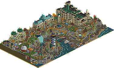
The opening is super gorgeous - I adore the classical architecture with the pops of green and blue in the roofing, and love how spacious this area feels, with the warmth added by the autumn foliage colours. Really great architectural details on the estate building/mansion, feels very grand and inviting. Shame the interior is revealed but not filled in - evidence of the time crunch you guys were under I guess, but I would have loved to see it more fleshed out with interior details.
Turning the map reveals the mine train, nice setting with the lava and the bone bridge which have that adventure movie inspiration, love the little red eyes poking out of the blackness too - that sort of cartoonish look really fits the vibe of the park I find.
The layouts throughout are pretty nice, really interactive (love the invert loop through the rock arch) and quite varied though I'm not sure how they tie into the overall concept as much. The mine train I think achieves this with the adventurous theme but NEssie (nice name) doesn't give the same feeling. Some music would have really helped the atmosphere as well. Something like the jurassic style fits the vibe best in my opinion and turning it on really helps.
Love the central lighthouse - perhaps a bit on the chunky side but the setting is very charming and the cliffwork is solid. The waterfall splitting was a nice revelation as well. Really enjoyed the references to your other parks this season, it acts somewhat as a gimmick I suppose but the concept justifies is pretty easily.
Lovely park overall, really enjoyed exploring it and I like how it contrasts the tile inspectors park in its vibrancy. The foliage might one of my favourite things about it, super pretty throughout.
A fitting finale to close out such a strong season. Loved both parks a lot in their own ways, and both teams can be very proud of their incredible performances this season, so many stunning pieces of work and it's exciting to see where the game can go now given how much innovation there's been. It might possibly be the most radically different H2H from previous seasons.
Adventurers Club - Adventurers Club
First impression is not very good - the readme. Felt like a waste of time to read. First impression of the actual park is very good. I’m instantly greeted with great architecture and nice warm colours. The architecture is certainly one of the best aspects of this map. The castle is fantastic, and the two greenhouses are too. The red brick buildings in that corner are not as grand, but they’re just as well done. The second thing to catch my attention other than the architecture are the coasters. Navigator first. Quite conventional layout, but definitely its own thing, and embedded in its surroundings quite well. Runaway Express has a lot of good stuff going on (the red eyes glowing in the cave!), but it’s hard to follow, to be honest. NEssie is great. Going from one building to another, and from one ride to the next, it’s impossible to miss that the park is held together with some great landscaping. The rockwork attempt is quite successful, the foliage is simply fantastic. The foliage atop the waterfall is 10/10 stuff. About the rockwork… Why the horizontal split between dark and light grey? Doesn’t look good in my opinion. Furthermore I’d like to sum up some of my favourite details I’ve come acros so far: the orchard, the carousel and swinger running in opposite directions, the El Dorado scale model, the aforementioned red eyes in the dark, the parting waterfall treasure (LOVE this idea), the gardens behind the clocktower, and the giant bird cage inside the first invert helix, and the lobster.
Some critical notes: the overall concept is clear but it’s not clear how all the individual elements fit together. What’s with the random entertainers inside the mansion? NEssie, why? Why do the docks have a bunch of paper thing floating paths above them? A lot of the map content simply seems random. As much as I praised the archy, I gotta say the lighthouse stands out negatively. It’s so out of scale… I can list some spots that are unfinished and/or unpolished, but we all know. It’s fine. The park is definitely presentable, and it’s definitely great work. Great way to end your season!
Great archy, 10/10 foliage.
Tile Inspectors - Gladsheim
What a great opening set piece. The sacked village, the giant’s shield, the portal… The procession is quite haunting. The landscaping has a lot of great qualities, but the white pixel snow look is a little ugly at the same time. I’m loving the mystery vibes here. Giant nest, ship atop a mountain peak… And the blizzard overlay object is quite brilliant. Buried village, Fenrir in a cave (nice coincidental parallel to the AC park), this stuff is great. Eventually we come to Arendelle. Looks great, epic approach. A bit massive though, and sadly this is where the typical Tile Inspector low framerate/slideshow experience begins. Thankfully, Thorn quickly turns away from the palace into the village, where the framerate is much better. What a coaster, damn. And this area is my favourite of the map after the blizzard mountain area. Every angle is packed with detail, but carefully composed and pleasing to look at. Not an easy achievement. The levels keep stacking and stacking, forming a wall of perfect theming. It’s hard to fault any of it. I know I can find details for weeks to come. You went quite far with the half diagonals, but it pays off. The consistency is very impressive. Frankly I have trouble processing how good this park really is. I’ll just end with summing up some of my favourite details I haven’t mentioned yet: the ballistas, the man powered custom flat ride in the village (Forum Caeleste rip off!), the arena, the frozen waterfall (great object choice here), the dragon sculptures on the palace roof, fires glowing against the rocks, and the ornamented RMC supports.
All in all: great park, one for the next edition of The List. Great park to end the season, not just for your team, but for the community. It’s the clear winner for me!
Wow!
Firstly, congrats to both teams on making it to this point in the competition and for providing such wonderful RCT over the past few months. It's been a whirlwind of crazy new content and exciting parks.
I think Adventurers Club was pretty cool, but a bit messy perhaps. I had a hard time deciphering the map with the underground bits. The biggest offender is under the apple orchard.. it's just so thin! Same with the curvy path above the submarine and boat docks. I will say that this was a great display of Fisch rock objects! But, there's something about the intense amount of crunch/texture here that it gets overwhelming. The visual noise was intense at times.
Regardless of maybe my displeasure with so much crunch, which I might be in the minority on, the archy here was spotless. Wow. The scene that the park enters on was so good. The lighthouse was great, the observatory was a nice addition. Highlight might've been the structure over the Croaked ride. Ride design was top notch as well.. the mine train was smooth and looked quite fun. The invert had great interaction as well.
Overall a very nice park.. just tough it went up against Gladsheim!
Gladsheim was quite a stunner. That opening scene was great and really set the tone and the story of the park. Storytelling was pretty strong here, and I think other reviews have hammered that point home already. I think when comparing this to AC, the crunch of snowy blizzard vibes in the beginning of the map was a good sort of noise. It was custom weather that eventually eased up when you reached the hall/village/coaster. I liked that transition a lot and as a viewer. The half diagonal structures were very nice, and I think I'm warming up to them! Really helped provide more density and coziness to the various levels of the village over the water. So much activity and attention to detail that I enjoy with making scenes like this. The harbor carts, the colorful shields and decorations made for a lively environment that was such a great contrast to the blizzard. I think I'll keep coming back to this park again and again because it's quite a fun park and full of details. Congrats Tile Inspectors on a wonderful H2H.
Everyone is really impressed by the lobster sculpture. I think it's neat too. I wonder if it's meant to be made of metal or made of concrete. If it's made of concrete one could say it's a rock lobster.
Match Conclusion
H2H9 CHAMPIONS
H2H9 2ND PLACE WINNER
The poll is now closed.
The Tile Inspectors have won this match and the championship with a score of 52–11.
Creators
Tile Inspectors"Gladsheim"
35%Fisch
25%René
20%wheres_walto
10%WhosLeon
10%Sulakke
Adventurers Club"Adventurers Club"
50%hydroportal
30%Scoop
10%RaunchyRussell
5%Hex
5%Iretont
Otsdarva Offline
Congratulations to the Tile Inspectors on achieving first place!! A very well-deserved win; you guys have consistently showed show-stopping high quality parks. I would also like to congratulate everyone involved in the contest for all the incredible talent, creativity, and perseverance displayed in all the entries. Thank you admins for organizing H2H and keeping the standards as the best rct contest out there. Lastly, I would like to congratulate my team for achieving second place - you guys should definitely be proud of this incredible accomplishment. Also, thanks to all of AC - it was great being part of this amazing team and working alongside all of you. Special thanks to our captain, Josh, who held the team together throughout the entire contest. Thank you everyone for all the amazing parks and I cannot wait to see what you guys you continue to create!
Great work from both teams. I personally voted for Adventurer's Club but both parks were incredible. I may have voted differently under different circumstances. Congrats to the Tile Inspectors on winning the contest and all I can say is that I don't know how players will be able to top this next season!
Congratulations Tile Inspectors on winning H2H9. Well deserved.
I already congratulated you guys I think. Deserved. You guys acted like winners from the start. Fake it till you make it!
I'm not surprised Fisch worked on this. He's been in Nordic vibes for a while now. Last time we spoke in voice chat he was showing me this Nordic mythology game, while discussing whether he should sign up for H2H.
Rene, how come you become so next level during H2H? I love the more nostalgic solo stuff you do, but I'm also super interested in seeing you try something of this level outside H2H. So much potential!
I don't think this can be stated enough...this was a L E G E N D A R Y H2H. Raised the bar to a level we never thought possible.
Tile Inspectors and Adventurers Club delivered world-class stuff from start to finish and this really came down to 1a and 1b, rather than 1 and 2. Congrats to both teams for breaking the game in a positive way.
Two great parks and a fitting concolusion to a stellar H2H season. Congrats to both teams on a job well done and pushing the bar even further along as this game continues to advance. Just incredible.
Here's a video reviews for both parks:
Adventurers Club: https://youtu.be/9vyufVfySp8
Gladsheim: https://youtu.be/5n5WuOeJfl0
I re-opened Gladsheim today for the first time in 9 months, it's still hard to believe we pulled it off