Park / Adventurers Club
-
 19-September 21
- Views 13,406
- Downloads 568
- Fans 2
- Comments 38
-
-
 78.00%(required: 70%)
 Gold
Gold

bigshootergill 80% CedarPoint6 80% CoasterCreator9 80% Jaguar 80% posix 80% RWE 80% saxman1089 80% Xtreme97 80% Camcorder22 75% chorkiel 75% G Force 70% Cocoa 65% 78.00% -
2 fans
 Fans of this park
-
 Full-Size Map
-
 Download Park
568
-
 Objects
472
-
 Tags
Tags
![park_3806 [NEDC4 2/15] - Interstellar](https://www.nedesigns.com/uploads/parks/3806/aerialt3455.png)

![park_3200 [MM2014 R2] Turtle Rescue and Discovery Center](https://www.nedesigns.com/uploads/parks/3200/aerialt2812.png)
Grand Final
VS
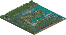
gladsheim: damn, this is epic af. I love a park with a bit of of a visual narrative that unfolds for the viewer, and this is a classic example of that. I again appreciate the choice to have one main ride here which guides you through the park, too---Yggdrasil is huge and sprawling and really beautiful. the vertical lift is probably my favorite bit, with the huge wheels powering it up the side of the cliff. the support work is also killer. the giant hall is extremely readable and vibey for how massive it is, which is a testament to excellent construction. the inside bits we can see are great too, but the highlight for me are those magic icicles. so atmospheric. the village is probably my favorite part of the map, though, nestled into the deep bay. the layered wooden tiers is right up my alley ofc, and the frozen waterfall is a perfect centerpiece. the lower levels with the boats under construction is so cozy and probably the best spot in my opinion. theres a lot to this map, and I'm sure I've not yet spotted it all. Also there seems to be some kind of rune mystery which I don't have the patience to figure out, so I can't wait until someone shows me what that's all about (I am not good at easter eggs lol). One spot I still find funny is the blacktiled map edges. I get why you did it (you didn't want any base-game ground wall texture), but it still sort of looks odd to me. A bit janky and confusing when the map turns. There has got to be some solution for this, but I haven't really loved most of the ones we've seen in h2h so far. But regardless---a great park to cap off an excellent season from one of the best h2h teams in memory.
adventurers club: man this park is... weird? on paper its a great idea- wrap up your season with your namesake park being a kind of victorian style british base with hidden secrets and shit. On an execution level it doesn't quite come together, and its perhaps not just the unfinished bits, which is a shame but I can shrug them off. It seems to be a park composed of like 15 different dioramas, each of which is very good, but don't quite click together. The best part of the map by far is the green-roofed british palace buliding, which is grand and well designed. But when its put right next to a blue-roofed neo-classical-ish building, it turns the whole scene into a muddy mess (technicolor roof spam is my neverending pet peeve though it seems). This is an example for me where the custom cliffs are doing you a disservice- the curves are so sculpted that it totally loses feeling like real landscape. honestly, I just deleted the clifflines track and it improved 10x. on a ride level, the layouts are serviceable but don't exactly 'do' anything for the park. anyway, onto the good stuff. There's a lot of individual bits to like. I love the train turntable (thomas park when?), and the parting waterfall trick, and that waterside brick building in particular is amazing. I would love to see the talent on this team put together an epic british victorian spy kind of park with that level of atmosphere and detail across the whole thing.
congrats on a great end to a great season. It's really been something special this time, and with almost zero drama (fingers crossed) at all, all things considered. My head hasn't exactly been in the RCT world for a while, but its so nice to see this community just thriving. Thanks for everything, everyone. I'm sure I'll see you all back here in a few years for round ten.
Someone hold me. I'm terrified.
Gladsheim: I just went from RCT2 Lord Of The Rings to the slow, dramatic House By The Sea reveal on crack. Wouldn't expect anything less from the good ol' Tile Inspectors. I've been saying presentation is key, and the Tile Inspectors have it mastered. I thought I was blown away once the adventurers entered the gates, but exploring this town has my mind thoroughly blown throw my body and straight out my ass. There's just so much to talk about in this park.
- Beautiful use of Fisch rocks.
- The village. Oh my god. I can't even put my complete thoughts on this village into words. The detail and technicality is overflowing yet it never looks too complex to understand. Perfectly balanced.
- The award for best half diagonals goes to the mountainside houses along the wooden walkways. Absolutely seamless, almost like they're supposed to be a natural part of the game.
- The coaster layouts are absolutely on point and the support work is sublime, although like with many of these scenery-laden parks, they can be a bit hard to follow. The icicles on Valkyrie Magic really make it stand out, although a single two car train seems a bit short for it.
- Tall Like A Giant curving up the mountain was a super unique take on the standard launch tower.
- The man-powered flat rides were a great little touch.
- The archer was a nice little detail.
- I found a bit of an unfortunate oversight on the second look-through, Ridiculing the Nagfar's station which still uses the suspended coaster track and is clipping through the path.
- There's a secret message in this park I think many of us can agree with after this H2H.
I'm frankly overwhelmed. I had no clue what the TI had up their sleeve for their grand finale, but this was definitely worth it.
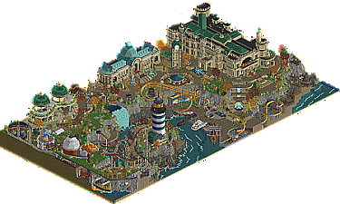
Adventurer's Club: The self-titled park! Seeing that definitely got me pumped to open this sucker up, and doing so confirmed to me this is the finals matchup we deserved. The attention to detail is off the charts, and I adore how it wraps up the AC storyline. I'm gonna grow another beard talking about everything in this park, so I'll keep it short.
- All the callbacks to the previous AC parks was really nice. (Hell, the estate is even a house by the sea!) It's honestly a tiny bit emotional seeing H2H9 come to a close like this, and this was a great way to do it. Hell of a portfolio for every builder on the team.
- The details in the estate and museum are insane considering how huge the buildings themselves are.
- The path layering near the docks. MMMMPPHPHGPHGHGHGHG
- The coaster layouts are are masterful. I love the classic terrain-based B&M inverts, and Navigator takes advantage of that beautifully. The reverse sections in Runaway Train feel so smooth, and seeing that Lost World-themed bridge was a real whoa moment. NEssie is a beautiful Arrow seamlessly integrated into the landscape much like the others.
- I adore the lobster restaurant with the huge lobster head, especially how it's integrated into the rocks.
- Ribbit River is gorgeous with the gardens and the huge glass domes.
- The wooden block coaster as a swinger mechanism is genius.
- The waterfall looks a little awkward near the top, and the bits teleporting in could have been covered up with rapids if possible. However, the way it splits apart revealing the golden treasure collection is really nice.
- I think this park's biggest flaw is disconnect. While an absolutely incredible park all around and a wonderful tribute to the AC's journey, it doesn't come together super fluently. On one glance, you're looking at a huge estate on the side of a bay, and the next thing you know there's pirate ships and lava pools and bone bridges. As cool as it was, there were also times I didn't know what I was looking at.
- A shame to see some of the interiors are unfinished. That's the most unfortunate AC callback.
This was the wrap-up park H2H needed; a look back over the year done incredibly.
The Final Vote: This was the finals H2H needed, with the best teams going head to head in a matchup that went to the last vote before. Whether meticulous and detailed architects or artistic visionaries, both of these teams are filled to the brim with talent. However, I always knew there was something special about the Tile Inspectors. Watching the draft felt like I was watching the 1992 US men's Olympic basketball team being assembled. Tolsimir, AVC, Fisch, WhosLeon; how could anyone top that?
And that's our answer. They couldn't. My vote for the team to win H2H9 is the Tile Inspectors. The Adventurer's Club was almost evenly matched with the TI at times, but today I think they pulled through and they deserve to win this contest.
Head-2-Head 9: This was a contest. More than that, it's unfolding a new era of RCT2. Half-diagonals, Fisch rocks, CTRs out the wazoo, CTRs as dynamic and interactive scenery, games within the game, RCT2 as an art form instead of a theme park simulator; the skill ceiling just got pushed so much higher over the course of the year. Newcomers like A n d r e w, Jens J., and Suormot (among many more) are names to look out for in future contests. No DQs or forfeits was the icing on this big, multi-layered, half-diagonal cake.
As someone who signed up for H2H9 but wasn't drafted, watching this contest makes me want to step up my game. I would love to be part of a H2H team. I'd love to make a crazy Micro Madness run a la ITM and Hoob. The work all 45 builders have done for H2H9 is nothing short of inspiring, and I want to congratulate you all again for an excellent, excellent contest.
Much love from my boys
Incredible work TI squad. You guys have been so consistently excellent from day 1 of this contest, and you deserve all praise coming your way.
Josh
I voted for Adventurers Club because it felt most true to the RCT I like and fell in love with. Just a fun setting, with great architecture and fun coasters. While I agree that the architecture wasn't really fitting together as a whole, I do appreciate the breathing space that everything got.
While technically incredible and full of amazing moments I felt that the Tile Inspectors' park was too much for me. Too mich detail, and too much going on for me to really enjoy it. The textures near the beginning scene weren't doing it for me and felt like a completely different game, in a bad way. Something I regret to have seen a lot from this (incredible, don't get me wrong) H2H season.
Congrats to both teams on a great season!
This might cause a shitstorm but I don't care.
I'm really das about these final parks. Not because they aren't as good as I would have hoped. They are both excellent. They are crowning achievements. Sadly, they are crowning achievements of a trend I hate. I feel ever since the Grand Tour the NE meta has started to turn away from RCT2. The goal doesn't seem to be to build the best possible RCT park anymore. The goal is to make the parks look as little as possible like RCT. Adventurer's Club definitely is going in that direction and Gladsheim is fully encapsulating it. Between the crazy textured landscaping, the half diagonals and the palette it's really difficult for me to still think of this park as a work of RCT2. The creator's can take that as a compliment, as it was surely their goal, but all I can say is that I am saddened that NE seems to be moving away from RCT and into a future that I don't belong in.
Honestly, just go fuck yourself lmao. Pathetic excuse of a human being...
Also AVC, that was really uncalled for, as was V1's reply to you.
How hard is it to just accept that different people have different preferences? It's so simple...
be more like my boy gustav
It's cool how the game is developing. You can build more and more beautiful parks, and everyone should have their own opinion. Through Spacek's tutorial, for example, I have learned to implement beautiful things that we may have been missing for a long time, even if I am not yet as perfectionist as SpaceK or X71, but that is slowly coming. I also really enjoy trying out new things and pushing the boundaries.
I think it's just amazing how much variety there still is in the old game, whether you use it or not is up to you.
I appreciate every creative masterpiece and you always manage to top it again.
....and the other one was unnecessary - we are all adults
Strong performance in any case
I hope soon to be able to participate further in the development of new things that you will love.
I will never reach your class in building - you have too much lead time for that.
Wow, H2H9´s coming to a close, but it´s definitely going out with a bang.
Gladsheim - Tile Inspectors
You guys really know how to push this game to the max. Lovely openingscene with the Valkyries and the wariors coming out of the gate; the giant swords and wolves in the background. The snow and wind effects work wonderfull in combination with this vast snow-covered landscape; and the little scenes of the caves and snow-covered houses break it up perfectly. I was allready blown away by this scene and then I found out there is a giant content-packed city just left of it. The city contains many great statements like the RMC, the frozen waterfall and the frozen coaster, but also has lots of small scenes to explore. I especially liked the ice-hole dive and waterfall sleds and the building of the boat in the harbor. Also the dragonsculptures on the roof look amazing.
Adventurers Club - Adventurers Club
Hell yes, an Adventurers Club Best Of park. Loving all the nods to the previous parks. Landscaping looks incredibly flowy and the way you guys integrated the paths is gorgeous. The architecture is so detailed despite being such huge buildings. All very skillfully done. The greenhouse and the giant building on the left were my favorites. As is typical for most Best of Albums, this park doesn't feel like a complete whole, but who cares if the individual parts are so good.
I guess I'm not supposed to reveal my vote yet, given the poll is not showing scores. So all will be revealed in time.
Thanks all for a great H2H experience. If anyone is looking for a little more classic style of RCT2, you should definetely check out the 3rd/4th place match-up where we're up against the Cereal Killers.
This sort of reaction and language is unacceptable. Even if you feel provoked, you should not respond in this manner and it won't be tolerated. Often saying nothing when provoked is the better course of action.
This kind of comment is not helpful and provokes further negative discourse, which is unnecessary, and diverts attention away from two fantastic parks.
Carry on with the reviews. Both parks are very impressive, and I hope to get my thoughts in over the next few days.
I hope you keep innovating, I have voiced maybe some caution with "rides as scenery".. but I think you have tastefully gone about your business. I hope it isn't true that someone is stifling your creativity and work. You've been a great addition to the community.
Adventurers Club
This is tough. I can tell there was supposed to be a lot more here, but you guys put forward a good fight regardless. The architecture of the main buildings and the Croaked area is really nice. The subtle references dotted about were a good callback and gave some purpose to almost everything.
I'm sure it's readily apparent, but the park would have benefitted a lot from finished interiors. There's some big variations in quality; compare the main structure to the train station next to the lighthouse, the yacht to the sailing ship. The "clifflines" sort of created this strange, artificial feeling to the landscape. I'm not sure which prevailed; too much ambition or too little time.
Probably my favorite section; the domes and water features coupled with the foliage and flowers is very nice.
I liked this a lot, just wishing it wasn't a map edge feature!
Nice boats; the submarine is either really small or that yacht is massive.
Gladsheim
This is pretty incredible. There's a lot to see and a lot to cover. Incredibly atmospheric; tons of life and storytelling throughout. I'm a big fan of height variations, and I love how the big fortress is positioned overlooking the harbor. The rides are great, I really can't say much more than that - they're very well done and well integrated into the cliffs and wooden structures. The subtle details on the supports are really nice. The huge scale of everything is pretty effective; it feels very grand and imposing.
Maybe the extra space used for the hike to valhalla could have been utilized more effectively? That's reaching a bit, but it's kind of all I've got. I also thought the valkyries just floating about was a bit of an unnecessary detail, just adding visual noise and not a lot else, but that's minor.
Very well done, and most importantly, tastefully made sculptures; they're not out of place at all.
The harbor is great, the dark water suits that fjord vibe nicely.
The drop towers along the cliff were great, excellent use of the space.
<3
Wow. Gladsheim is absolutely insane. I spent the first five minutes just poking around the frozen wastes and thought that was pretty good. The fort stuff looked cool, that huge viking hall... amazing. Then I rotated and discovered the fort area is like three times the size I thought it was, and it's just the most amazingly intricately layered mass of..... well, brown, but lots of wood, stone, rides, crazy custom supports... and that epic frozen waterfall. There are so many little details here that could absolutely make a Design or a section of a park on their own - the pulley looking system for Thorn's final lift hill, the sunken/frozen over town in the valley, the custom supports managing to be both chaotic and ornate, the biggest viking hall in the history of RCT... but all of it together, just holy crap.
Adventurer's Club - what a cool idea. Reminds me a lot of EVIL. I was expecting different rides or maybe different sections to be dedicated to certain players but I didn't really see anything like that. The mansion/grounds/secret areas are all super dope, unfortunately some of it does feel a little empty and the coaster layouts are kind of random. Why a mine train? Navigator feels the most like it belongs IMO - the layered dock area is so cool. Could probably have used some more supports, though I assume that was planned.