Park / The Siege of Frostgard
-
 29-August 21
- Views 11,135
- Downloads 515
- Fans 1
- Comments 30
-
 77.50%(required: 70%)
 Gold
Gold

Cocoa 90% CoasterCreator9 80% In:Cities 80% saxman1089 80% Scoop 80% WhosLeon 80% bigshootergill 75% chorkiel 75% G Force 75% Louis! 75% posix 75% RWE 75% 77.50% -
1 fan
 Fans of this park
-
 Full-Size Map
-
 Download Park
515
-
 Objects
517
-
 Tags
Tags
Semi-finals
VS
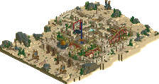
Some people have already spotted what's happening on Github. Yes, it's true; Madinat Al-Hareer is best viewed using OpenRCT2 develop version. Thankfully the LS bug is fixed, so it will be no problem!
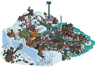
The Siege of Frostgard:
I wanted to write a quick review saying that I really liked this park. The insane hacks were a standout for me. Definitely the best ride hacking we have seen in this contest so far. Everything from the elevator lift and downward spike on Mine Patrol, to the water coaster, to War Hammer and even the star flyer were just so cool. I still have not figured out how the star flyer was done. The architecture was also really cool and enjoyable as well. The overall theme was also very cool, with the big army putting Frostgard under siege. I do wish the ice wall had collapsed a little bit less in-uniform, though I do not know if that is even possible. In short, this was a great park Logan's Run! I thoroughly enjoyed it and I do not have any major gripes with it at all.
Madinat:
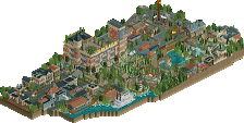
Honestly, I didn't really like this park when opening it. Doesn't really look much like rct. At first I thougt it may have been the objects. However when I switched around with different palettes it became clear that that was my main issue with this park. Other than that this park was outstanding. A comparison to Zerzura feels right to me. The map was full of rich details which made it feel very lived in.
Frostgard:
Compared to Madinat, this park lacked in storytelling. For a city under siege, it didn't really like many people cared. The city itself also didn't shine in legibility. The strong suit of this park was obviously the rides. Mine Patrol and War Machine had very enjoyable layouts and hacks.
Difficult vote. Thanks for the strong matchup and the parks
Pure insanity boys.
Mammoth Ice City Hack Battle
Man this is a gorgeous park. The hacking itself is particularly noteworthy - but the style choices are what do it for me. Colors and contrast is on point. Dense parks usually suffer greatly from readability, but this park is surprisingly easy to view. I can definitely tell that it had a big push to meet the deadline - a week or so of little refinements and detailing could have really brought it to life. But this is by no means an "unfinished park" in my eyes. So many little spots of brilliance. I love how tall and imposing much of the architecture is. The factory in particular is a favorite. And man I have to say - the ice texturing throughout this entire map is top notch. Great use of the snow covering/leafs to sell the concept. Beautiful colors.
Some things:
Big window next to the hot air balloon. Awesome visuals
Could immediately tell that these were generators upon first view. Very cool and effective structures. I enjoy the repetition
I love this little scene. The snow piled up against the walls is brilliant. The contrast of the coaster colors against the water and ice is nice. Wish it had a little more detail and life, but still a very effective area. Again - the verticality is pulled off so nicely.
The whitewater/ice detail here is so good. Perfectly executed in my opinion.
Is that blood? brutal
Mountain Aladdin
Wtf. Can we all just crown you guys the winners of h2h already. This park is stupid good. Like - I don't want to play this game anymore haha. Colors, textures, contrasts, layers - it's all thoughtfully composed and done so well. This is such a unique theme, and it's pulled off to such an astoundingly high level. Screw the haters - this palette is great. Yes my eyes work. Cry about it haters. Great stylistic choices. The differences between the opulent palaces and grand architecture and the lower city is strikingly perfect. I really love how the lower city is still surrounded by greenery. I think if that weren't the case, this map would be a big blur. Color contrast was needed, and applied perfectly. I love the black rocks. Even more so than the LR park - elevation plays a massive role in this map. Seems so aggravating to have built on haha. But I am not one to speak of course. if my squad beats the dutchman, can we just combine both of our teams and release one giant superpark for finals and crown ourselves the joint RCT champions of the world? I'm kindof actually serious.
Some things:
I think this area was my favorite part of the map. The silk cocoons, the bright green against the dark rocks, the elevation changes, the subtle half-diagonals. Very very nice.
including whirling dervishes is such a brilliant idea. Such a cool structure too. I like the spiral staircase. I do think thats my only real criticism with this park though - because the main coasters use wooden track, using wooden track for path stuff is a little too visually redundant. Would have loved to see a slightly different approach, because the idea itself is really cool.
God this is one of the sickest scenes I've ever seen in this game. Very reminiscent of a certain micro madness entry by a member on this team haha. The sheer amount of people crowding this area makes for a spectacular visual.
I know if I were on this park - I would have been super extra and made all of these peeps as animated crowd objects. But i'm kind of glad you guys didnt do that, because the stillness makes it kind of ominous. I love this scene.
Oh come on, now you guys are being extra extra for the sake of it
Screens don't do this justice. Open it in game and fix the rides. I love the dynamic it adds to the map. So awesome.
This park is crunchy af. This area is composed so perfectly. Love the wall texturing. For so many overlapping parts, the readability is still at the forefront, which I appreciate. Brilliant.
Up there with as one of the greatest park entrances of all time in my book. Love the incorporation of the sphinxes. Good call with those pops of blue and purple colors.
ugh
Madinat Al-Hareer
+ Great architecture
+ A lot of life
+ Cool scene with all the people waiting for the rug thingy
+ Good theme
+ Some excellent custom rides
+ Good use of collor accents
- Bit of a mess, visually
- Overloaded (plays into point above)
- Palette
The Siege of Frostgard
+ Great opening scene
+ Great architecture
+ I like the coaster a lot
+ Very good architecture
+ Atmosphere
- maybe could extracted some more from the landscaping
Conclusion: Sometimes less is more, my vote goes to Logan's Run
Madinat
So, Eye of Namibia meets Zerzura meets Rajasthan. Interesting combination of realism elements with major fantasy elements. The loom ride is probably my favorite part because of the creative features surrounding it. It's pretty impressive the sheer density you guys pulled off. The architecture and ride design is a highlight, and there is no shortage of detail across the park.
I'm team "not a fan of the palette" - instead of saying "screw you if you think otherwise", I'll detail why I don't like it. The park is super content heavy, and there's a ton of stuff to see. The palette is very loud and distracts me further from a piece of RCT that is already a challenge to fully take in. I actually found that when it began raining the overall appearance struck more of a comfortable balance for me. Sort of the opposite problem Lost World had - that was very dark with some bright features, this is very bright with some dark features.
It shouldn't come as a surprise that the density of this park is also its downfall in my eyes. There's so much stuff stacked and layered and tucked into every nook and cranny...I'm sure I'm missing things and I have trouble following the park in places. For a long time I thought Beggar and Resurrection were the same ride! This also kind of led to an Uncanny Valley effect in places where things seemed to be on a single level from one side only to be massively separated vertically when I looked from another side. The birds and flying carpets are nice features, but didn't help the overwhelming nature of the park. I know a lot of people love this kind of thing - I simply don't.
Quick example of what I was referring to with the "Uncanny Valley" effect.
I do love this a lot. Perfect balance for me here.
Frostgard
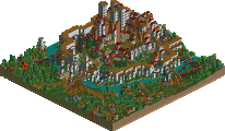
Frontier's Keep meets Le Coeur! Another mashup. This is so far up my alley. The architecture is pretty fresh and interesting (I like the Legend of Korra style combination of traditional Asian styles with an industrialized spin) and I love the overall concept. Definitely a theme I personally enjoyed! The ride design is pretty strong, and there are some really nice, technically strong hacks. My favorite part is actually Power Surge. I love how it's been positioned among the tops of the buildings.
I might have liked to see the theme of an impending siege pushed a little more heavily. It seems like business as usual in Frostgard, which doesn't seem to fit with the huge army just outside the walls. The landscaping might be seen as a bit featureless, but I like the barren tundra look that sits on the edges of the city. Additionally, I really like the structures embedded into the ice. There's a nice contrast between the bustling port town and the desolate tundra just outside.
Like Madinat, this is a quite dense park - there's a lot to see. I do think Frostgard struck a better balance than Madinat did. The half frozen rivers and icy scenes really did a lot for me here. I found this park to be refreshing, in a way.
The choice to tuck Power Surge into these rooftops was a great one in my opinion!
Lovely and very unique ship, perfect for the theme.
Honestly think it's going to be quite underrated what you guys did with the red army outside the walls. Each group of soldiers holding weapons plus the amount of detail added to these mammoths was a great feature.
Here's my review that I wrote with all of the energy I have left after months of H2H:
Frostgard
Initially, the color palette and style gave me strong AquaVelva 1945 vibes but it stands out on it's own for a fun Frostpunk park
Hareer
As much as I love this one's style and theme, the colors started to blend together when looking at it. The micro was nice but the macro felt a little same-y. Still a very fun park
Head2Head9
Why is this competition so long; I'm so tired; I am physically exhausted; I have zero mental energy; Nothing feels real anymore; I left my wife and kids so I could dedicate all my time to the only thing that is real: RollerCoaster Tycoon; I am living alone, somewhere in the Himalayas, far from society, full of people who could distract me from RollerCoaster Tycoon; The blood, oh god, the blood, it's everywhere; I don't know, I blacked out, and when I came to, there was only the blood, I would investigate the strange symbols formed by the blood but that would distract from RollerCoaster Tycoon; How did I even connect electricity to this remote mountain shack to; I don't remember how I got here; I don't remember who I am anymore; I only remember RollerCoaster Tycoon; Man is made by his belief. As he believes, so he is;
Summary
Both parks are great, but I like Frostgard more. I'm getting coffee, you guys want anything?
Two really great parks, what a way to kick off semis.
Frostgard - really great opening scene, the ice wall falling was impressive, and the siege engine is up there with the best structures i've seen. I would have loved to have seen a couple more of these - three huge engines breaking the ice wall down would have been amazing.
Super high level of detail all around, with space to breathe. Ice landscapes are always a struggle, this is definitely one of the few that gets it right. Feels realistic without feeling underdetailed, especially within the walls. I could have maybe done with a bit more going on over by the mine train, felt underdone compared to the center of the map. Yellow was a bold color choice for a large part of the architecture, a warm color that doesn't really fit the setting, but one that I liked overall. Not sure if swapping out all the yellow with another color would have been better or not. The yellow and green together definitely gave off submarine steampunk vibes, so that works I guess.
The coaster could have been another color I think, yellow in front of all the yellow architecture made me lose it a bit. Overall really cool coaster that I felt was kinda hard to follow. My favorite part of the map was the section over in the corner with the really neat buildings, the balloons on top and the ice melting turbine. That bottom corner felt really cool and believable.
Overall a really great park, that had a couple of issues with density in places (too dense in the middle, not quite enough at the edges maybe).
Silk Festival - this is a perfect example of how an abstract idea (silk festival) can take ideas from a ton of other places (Aladdin probably) and end up with something totally magical. First off, i'm not a massive fan of the palette, although I understand why you've gone for it. The bright angle compared to the super dark shadow creates a kind of sunset look that does add to the magical feeling. It just makes it kinda hard to see whats going on in a lot of places, which makes stuff hard to critique.
Where to start. I almost can't pick out all the thing I like about this, there's so much there. Verging on too much stuff, but you juuuuuust stayed this side of "things are too difficult to look at". The entrance and the bridge is really majestic. LOVE the scale here. The sideways sphinxes are great, another really good idea. The canyon to the bottom of the map is a really great setting - tons going on, a welcome swathe of greenery, cool rides. Same goes for the orange temple to the top left, and the coaster there. Just a ridiculous idea for a coaster, that's executed perfectly to get the point across, and make it fit with the overall theme.
That's my favorite thing about this whole map. Such an abstract idea, with SO much going on. And every, single, thing, fits the theme. Not only fits, but adds to it. I could screenshot twenty things on the map as examples of this, it's so well thought out.
I voted for Silk Road.
Initially this was a really tough choice for me, two sorta fantasy vibes that sorta felt a bit similar in terms of planning, just one being warmer desert and the other obviously being snowy. I felt the LR park might have been a little undercooked in places, mostly around the siege scene and some of the landscape. The rides we're cool as was the archy. Lot of the snowiness felt super believable and real to me, the right amount of detail too, honestly probably the best we've ever seen in terms of snow in a RCT park, which is great.
Initially when looking at TI's the palette obviously was a pretty big roadblock and I think works against the finer details of the park a lot. It took a while and multiple viewings for me to find all of the details and levels of the park, perhaps intentional, and very impressive, but maybe a little frustrating too. Having to work to discover all the good bits of a park isn't a thing I really enjoy (there was an aspect of this in LR too tho) and I sorta wish that the palette wouldn't have been quite so stylized. Overall though the RCT here is absolutely fantastic, looking back at what we've seen late in H2H seasons over the past it's really incredible how far we've come recently. It's almost a whole new game now with all the new assets and objects that have been created, and they're used to the fullest here. Highlights for me here are probably the Sacred Loon coaster and the center of the festival/crowd scene in the back of the park. Really cool stuff that we've never really seen in RCT done this well.
Overall went with TI here, and while not my favorite park of the contest, or from the team, it was a very strong entry and definitely is deserving of a Final's birth in my eyes.
The Siege of Frostguard:
I like the opening scene here, before you really get into the park. Once I got in I started to notice the great technical stuff through the park, I still have no idea how that elevator track works, and the timing of the switchbacks, and the forward and backwards train must have been amazingly difficult. The buildings are great, although I had some trouble looking through them with how closely packed they are in the main city.
Madinat-Al-Hareer:
Personally I like the palette in this park, even if it was slightly hard on the eyes after a lot of viewing. I think it does a great job setting the atmosphere, along with the custom music. And with the great detail and multiple levels, it was so fun to wander around and explore. A couple of my favorite areas were the bridge and area below it, and the loom itself.
Two amazing parks. Great effort by both teams and the level of detail is breathtaking.
At the same time I feel this is the biggest downside of both parks. They are too packed with details, stacked in different layers and sometimes difficult to view.
Difficult matchup to vote. I went with TI in the end. A very close matchup in my eyes.
Wow, the gloves come of for the Semi-Finals. Madinat Al-Hareer is an amazing insanely good park. Rich in details, beautiful use of textures and still very readible. I love the clear storyline around silk. The combinations of trackitecture and CSO make for so many diverse rooftop shapes. The palette fits perfectly and it even makes some of the normally 'somewhat awkward' objects blend in well. That working loom is just the cherry on top.
I guess the h2h tile limit means that when people throw a ton of time at these, sometimes that means we get incredibly dense parks with tons of details and it appears overwhelming
To me that’s what we have here
Sometimes less is more as impressive as the details are
Great parks all the same. Easy vote for me though to the tile inspectors. Two great parks; one just a more complete vision without any obvious flaws. With frostgard I was a little underwhelmed by the opening set piece which is crazy to say as a few months ago it would have blown me away but… gangland…
Match Conclusion
The poll is now closed.
The Tile Inspectors have won this match with a score of 34–13.
They are now qualified for the H2H9 Grand Final.
Creators
Tile Inspectors"Madinat Al-Hareer"
45%WhosLeon
35%AvanineCommuter
19%Tolsimir
1%zxbiohazardzx (f)
Logan's Run"The Siege of Frostgard"
80%Xtreme97
10%Zarathustra
7%Bubbsy41
3%SSSammy (F)
i got internet back at my house about a day before the deadline, im so glad I got the chance to build again with x, zara, and bub
I promised you a review, Logans so I'll do one now. First of all great park, I think we had a very nice semi final and I think you can be proud of what you achieved.
The general setting and theme of the park is a great choice, it reminded me somewhat of Frostpunk which I played with a friend a good year ago where we ended up 'surviving' the big snowstorm with an utterly fascist city. Not saying your city looks fascist but it somewhat gleams with a dytopic feel all around, which I like. The drastic metallic archy makes absolute sense is very empowering and works throughout. The large use of the new pieces of megalite supports really helps to give it its own style and signature and perfectly sells the feeling of some base. Favourites of mine were the large factory hall but also the station at the top of the mine train lift. That one had a great structure all around. The interplay with the snow and warm building colors make everything pop nicely without being hard on the eyes, great job on that. I agree with others mentioning that the inclusion of asian type rooves felt a bit out of place.
In terms of coasters I really liked the mine coaster, how it went in and out of the mountain and of course also the hacks on it were impressing. As said, the lift area was really set into scene. However, the dead end 'fallen' track where the train turns direction wasn't quite clear why the track 'broke down' or ended like this there in the first place. I couldn't see any indications of a broken down bridge or where that track would have gone originally.
For the yellow coaster I didn't care much though. The supports were even more careless than in our park, which made it appear rather sloppy, also it was a bit hard to follow. The purpose of the different directional trains wasn't also quite clear to me other than for the sake of it.
The other supporting rides were well done, especially finally a starflyer with the proper split in the train to make it look smooth. I wondered if it was possible to make it look that clean and I must say you did a great job in achieving that!
Now I want to come to the in my opinion biggest weakness of the park which was also already mentioned by others before. The premise of the park and its execution don't fit together. You have the word siege in the name of. A large portion of the map dedicated to the enemy army in front of the town's gates (which I loved btw, the troops, the big siege machine and the themed mammoths were all great) and then there is the opening scene with the fall of the city wall. But that's it. Inside the city nothing feels like its under war. It's completely unconnected to the big theme of the map. This makes the opening scene also quite anticlimatic imo, it builds up big expectations which weren't fulfilled. I missed small details all around filling the storyline with life.
Also the landscaping around the map was rather rough and featureless. It helps setting the environment but I think it could have been done a bit more convincing/detailed (e.g. rocks/cliffs showing , the snow/ice covering inside the city was great though.
By being less critical on the story aspect this is still a considerably great map with especially outstanding archy and convincing and thus almost perfect color/texture/material work. I don't know the circumstances of the construction but in total it feels like a park 1 day before the deadline which now is just missing the little extra on the micro level to make it standout as one of the top parks of the season and what would have made our park lose a lot more sweat during the vote.