Park / Hyatt's Lake Scarlett Resort
-
 29-March 09
- Views 6,241
- Downloads 1,109
- Fans 0
- Comments 14
-

-
 70.63%(required: 70%)
 Gold
Gold

Austin55 85% In:Cities 80% 5dave 75% MCI 75% geewhzz 70% Ling 70% inthemanual 65% Liampie 65% Poke 65% robbie92 65% 70.63% -
 No fans of this park
-
 Full-Size Map
-
 Download Park
1,109
-
 Tags
Tags
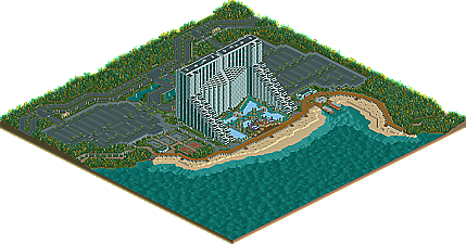
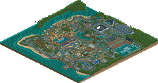
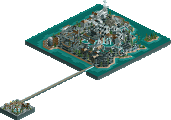
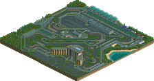
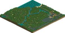
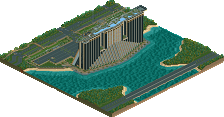
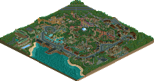
Congrats and your third CC.
RCTNW.
that is the worst hotel ive ever seen.
...lied sammy. (gotcha!)
that is truly spectacular.
when zoomed out fully, the side facing the lake is really, really pleasant. the curve on the roof is sensual
pretty majr waterslides and ventalation systems.
just to be anal, im gonna inform you youve forgotten one tiny brick on one of the stps to the beach haha.
managed to glitch yourself a little stall there haha.
really, this is some pretty epic parkmaking.
better than i could have predicted. the only complaint i have is the pools are abit funny.
the roads are seamless.
you must have the patience of a saint.
a structure of that magnitude must have taken about 13 yeaars.
im gonna shuttup now, and congratulate you on this accolade.
congratulations on this accolade.
Edited by SSSammy, 30 March 2009 - 09:25 AM.
once again, sorry for the long wait. we're aware it shouldn't take that long.
can't wait to see more of project aries in the future
SSSammy – You noticed the glitched stall also. Have no idea how it got there or how to get rid of it. Good think you can’t see it. Glad you liked it
Todd – Yea, I thought about that after it was finished. I tried to fit too much in that space. I did take not of that for the next resort though
Phil – You are correct in that I’m inspired by real life structures but have a real problem with non real life structures as I often hit mental blocks. I’m finding that out with the parks of late. Hopefully I’ll get the parking map finished so it can be submitted.
ClockworkMyr – Thanks. Glad you liked it
gee – Thanks for the write up. You captured exactly what I was going for!
As for the map, I was very happy with several aspects of the end result. I want to thank gee once again for his road objects. Most would not waste building time or object slots on these however, they have become vital to just about every map on this project and is one of the key elements to this project. Being able to have curves and diagonal roads really helps it from being forced IMHO. I also want to thank Havingfun for the dark tarmac paths as they too allow me the flexibility in the roads. Lastly, thanks again to HPG for the kick ass logo. I love it!
All in all, this is my signature resort to date as I’ve always wanted to do something to this scale and although very tall, it still fits the rct scale. It reminds me of Vegas in some ways. That said, there are plans for an even taller resort in the future as I’m hoping to hit the 50 story mark. However the economy is placing that on hold
Again, many thanks to those that have enjoyed it.
James
Very realistic and its nice to see something different on the site. Keep up the good work.
On a slighly more sadistic note:
I'm sorry for abusing your map. but this is by far the most fun i've had with the remove scenery tool in a long time
Removing vast swaths of land and taking out a wing of a structure that big seems to have a very calming effect
Taken from: Here
I love the handicap parking spots you included for the hotel! Nice touch!
One thing though, ever get tired of the beach and palm tree setting? It always works yes, but maybe something a little different in the future which takes you out of your element a bit, but could be alot of fun. I really enjoyed your forest/ mountain resorts, so... for your next 1,000 map project, how about something in a desert area? WHO HERE WANTS TO SEE JAMES CREATE HIS OWN VERSION OF DUBAI?
Edited by FantastiCo, 01 April 2009 - 08:24 AM.
Dark_Horse
Alpengeistfan1 - Thanks.
Todd - I know what you are talking about and I think it had something to do with the actual graphic when I created it. I do plan on fixing it though
TC - That was my first attempt at ventilation systems and I know what I need to change in the future. As for Dubai, ummmmmmm...... maybe? As for the treeing, I really hate the trees in RCT and I find myself leaning more towards the palms. That said, I am trying to vary it a bit more in the next set of maps. Thanks
Dark Horse - A tiny bit, yes however, most of the inspiration came from the South Beach Resort on the Marriott Project. In fact, I'm surprised no one has dinged me on that as there is a huge similarity to it.
Again, thanks to everyone how took the time to look at it.
James